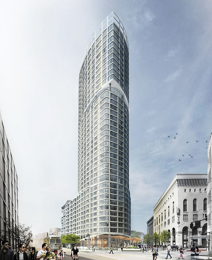
While Build Inc.’s plans for a 40-story, 319-unit tower to rise up to 420 feet in height at the intersection of Market, Oak and Van Ness Avenue were approved by Planning and entitled back in 2017, the signature “One Oak” project has yet to break ground.
And as we revealed earlier this year, with the entitlements for the tower slated to expire anew next June, having originally been set to expire last year but successfully extended by Build without breaking ground, a revision to the approved plans has been requested.
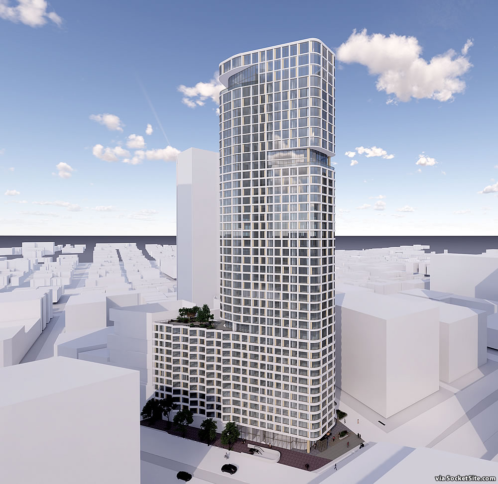
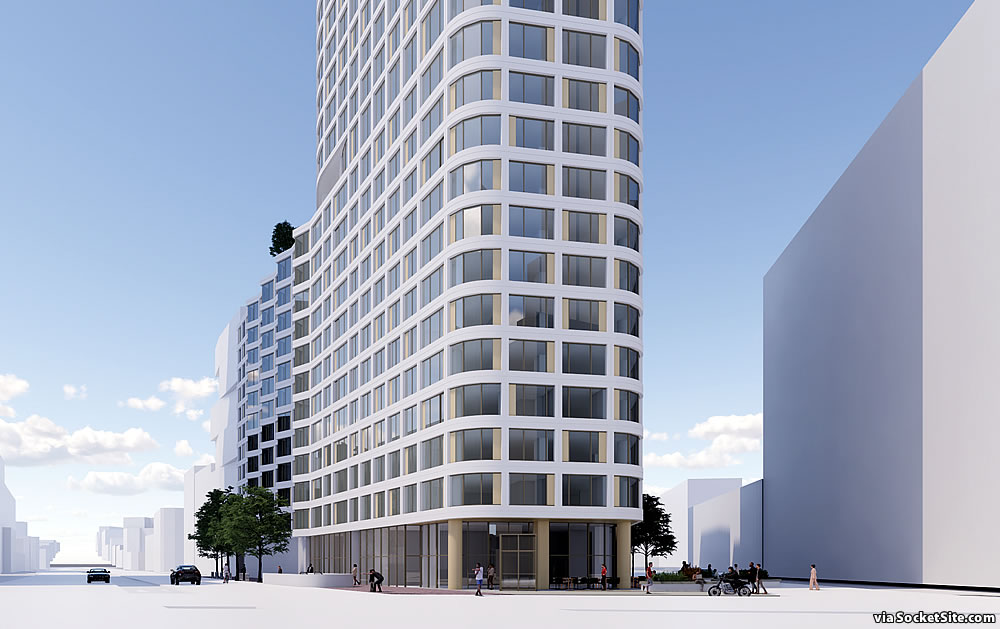
The proposed revision would increase the unit count for the tower from 319 to 453 units, primarily by reducing the average unit size from 1,030 to 791 square feet, within a “slightly modified building form” as newly rendered by SCB below:
The approved plans for the signature Oak Plaza at the base of the tower, which had been designed by Snøhetta, have been “slightly modified” as well:
And no, a building permit for the modified tower has yet to be requested nor has a demolition permit for the site. But we’ll keep you posted and plugged-in.
getting more and more bland with each revision.
DONT worry! We will not be holding our breaths. That All Star doughnuts just wont give up! Surprised the city isn’t preserving it…
Word. Let’s spot zone donut shops like laundromats.
Yuck. What a downgrade (not that I give it much chance of being built in this new, 8-bit form either).
Tetris! Fine with me though so long the beloved All Star Cafe moves back in. /s
Somehow the revision changes it from a residential tower to an office building, impressive
I see… so, more boring.
D….PRESSING, a serious downgrade in the overall form and articulation.
The bait and switch from the Snohetta designed plaza that was paraded in front of Planning is an affront.
Yeah, the building looks fine to me but that plaza is really a loss
So you want more places for the homeless to congregate (because that’s what the plaza at this location would be).
No, he wants a plaza, you clown.
They’ve given up all pretense of public amenities. No wind mitigation, ugly bland “plaza”, no help with the BART entrance. Screw these guys.
Smart move to wait for more financing availability than during the late stage of the cycle. Wonder where cost of construction prices are these days. Softer condo market pricing probably brought sq ft/unit down some.
Condo prices have slipped while construction and material costs have gone up significantly. This probably does not pencil in today’s market. The developer seems to be trying to bank the site indefinitely. How many permit extensions can they get?
IMO Planning should reserve the right to demand no design changes when granting an extension. This project is being value engineered away. In any case I suspect Build Inc. plans to eventually flip the entitlement rather than actually build.
I’ve never loved any of the design versions of this project—so no harm, no foul there—but I would very much love to see something go up before the 30s. Here’s to hoping.
Require a future doughnut and coffee shop, gotta have life on that corner. But require Van Mess solution and link the BRT south to Cesar Chavez than east to T-Line so we can see CPMC, St. Luke’s and SFGH connected closer via mass transit BRT… What a mess…
Why has socketsite not wrote something on the rejection of the 500 unit project at 6th st with 100 bmrs by the Supes? Plugged in??
Yeah, I’m very interested to hear more about that crazy situation.
Same developer as this one that was approved 4 years ago but still hasn’t been built.
Ugh. It wasn’t all that interesting to begin with. But at least the previous design was fine in a conventional “blend into the Market Street background” sort of way. This version is simply ugly.
It’s… Fine. And it has more units. Build it already. What’s going on with the site across the street that used to be a car dealership?
The (from out of town) developers of NEMA bought the property a few years back. They came up with renderings of another apartment tower a couple years ago. My thoughts at the time – they must have missed how the BART tunnels run underneath. Conventional wisdom has it that sticking a highrise in the spot isn’t in the cards, so they may end up building a fitness center or tennis courts for their tenants at NEMA or something like that.
I wondered about that too. If it is the parcel I think it is they had proposed a 600 foot tower yet there is the maze of underground tunnels for BART and Muni that crisscross the site.
The Refined Plans for 966-Unit Hub District Tower to rise on the 10 South Van Ness (Honda) site have been approved. But neither demolition nor building permits for the development have been requested. Which brings us back to the project and project team at hand…
Ambition v. gravity
So I got off my behind this morning and pulled the draft EIR from SF Planning. It is claimed that the structure would stay within load limits but the design needs BART approval. I did a little more digging on the web but couldn’t find anything where that might stand.
While BART will need to sign off on the structural design, the project has been approved and entitled by Planning.
It’s not exactly a work of art, but it doesn’t need to be. I’d be happy to see this get built to add more housing next to transit.
If this gets built I’m curious to see how similar it is to the new tower at van ness and mission. The offset window grid with white precast tile facade treatment will be one of the signature looks of this era of construction.
The developer here, Build, Inc. just had their 469 Stevenson project jettisoned by the BOS to many boos and a legal investigation by the state. Maybe the fact that Build won’t be building that project anytime soon means they might move forward with this one. I’m hoping.
Considering Build hadn’t requested any building permits for the 469 Stevenson project, they weren’t going to be building that project anytime soon anyway, regardless of any approvals. Which brings us back to the project at hand, which was approved back in 2017, and Build’s track record with respect to high-rise projects.
Yup. Build Inc. has a hard time actually building anything. Was the 20 story tower near 10th/Mission, plans for which were abandoned last year, a Build Inc. project?
Holy Shadows Batman! This intersection will turn into a constant dark alley from all angles throughout various times of day. SF is slowly turning into that dystopian Judge Dredd city where the wealthy bask in light at the top and the plebs all shiver in the chilly dark and windy void at street level.
AstrosFan, as a recent resident of that neighborhood, I can assure you that the intersection of two six-lane streets isn’t going to suffer immensely adverse shadow impacts from an offset tower.
Keep in mind that there are four towers on the boards for the intersection, not just one (hence the City’s Public Realm plan, a central component of which is, or at least was, Oak Plaza).
Gosh that cluster is going to have such a wind tunnel effect that drivers will have a hard time not being swept through the intersection at above the freshly posted “20 mph” speed limit!
Wasn’t wind mitigation part of the reason for the canopies over the plaza? Maybe they just aren’t showing it in this rendering, but I had thought wind mitigation was required in spots like this…
As rendered above, the modified plans, with a flattened building prow, exclude the previously approved canopies.
I don’t understand the complaints about the appearance of this building. The renderings where you could see the complete building profile are either from very far away, or from hundreds of feet above the ground, or eliminate obstructing buildings. At street level, standing in front of it, wouldn’t most folks just see the first few stories? The factors that create a poor city experience – the large blank walls, the loading docks, the wide curb cuts, the wind-tunnel effects – seem much more important to quality of the building than if the building is ‘ugly’.
From very far away is how most people view buildings…in every sense of the word; the Empire State Building isn’t very remarkable to look at when you’re standing in the doorway…nor is most any other.
I disagree. Traditional, well crafted architecture made with real organic materials and evident detailing is very much appreciated at the pedestrian, close-up level. Only now does the priority seem to be iconic megastructures that indeed have little appeal at street level. See, for my “favorite” example, the Borg Death Star that Maoist nut Mayne designed for the federal government on Seventh Street.
All right, then…how ’bout both ?? I don’t think there’s some rule that precludes both a good ensemble design (from afar) and good detailing (from anear). There are (all too) many buildings that have neither.
Fair enough. 🙂
Exactly! It’s the details and the function at street level that I think most folks notice the most. A building might not win awards, but if it works for the visitors, that seems more important than the visual appeal from one thousand yards away, right?
Ecce Homo
original was better… this is a snooze