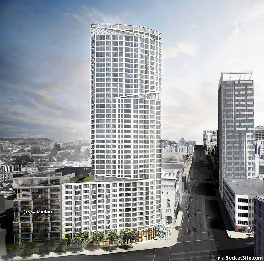
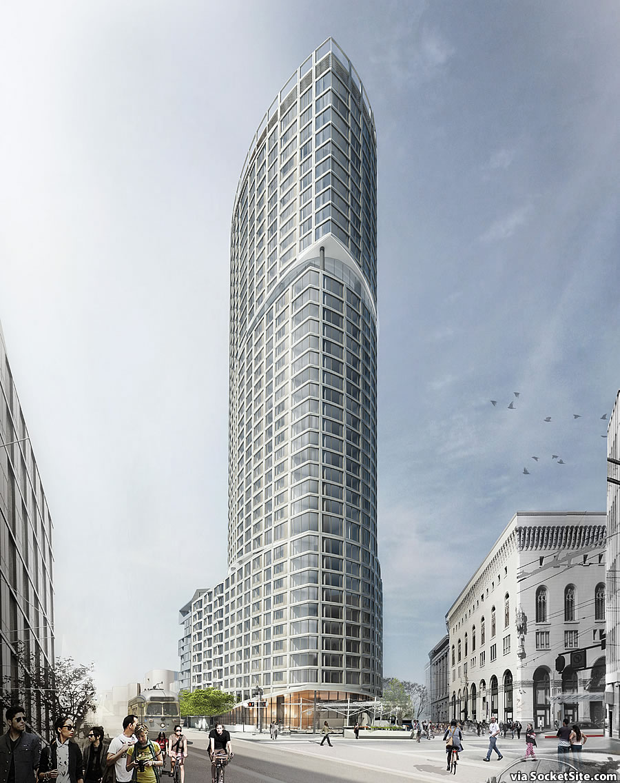
The paperwork to secure the building permits for the proposed 40-story Hub District tower to rise up to 435 feet in height at One Oak Street – at the prominent intersection of Oak, Market and Van Ness Avenue – has been filed.
And with the project team preparing for the public hearing at which the 304-unit development could be approved and its Impact Report certified, SCB and Snohetta have refined the design for the tower and its podium, as rendered with Trumark Urban’s adjacent 12-story building to rise at 1554 Market Street for context.
The proposed development includes 4,000 square feet of restaurant/retail space at the base of the tower, primarily fronting Market Street and adjacent to a new 15,000-square-foot “Oak Plaza” on the corner and upon the existing Oak Street right-of-way.
Assuming the One Oak project is approved, it will take an estimated 32 months for Build Inc. to build once the ground is broken.
And once again, the condominium development will be 100 percent market rate as the team plans to pay an in-lieu fee to meet the City’s inclusionary housing requirements, a fee which is envisioned to fund the development of below market rate (BMR) units along Octavia Boulevard on former Central Freeway Parcels R, S and U.


SS and it’s crazy idioms! is this one “closer to reality” like the Raiders “closer to reality” or is it actually moving ahead…sans financial dramatics?
If only there were some way to tell! (Like by reading the fist two sentences in our report above.)
I’m ready for something to get going on that corner, and would be nice if all 4 projects are building during the coming slump. But should be even taller!
Nice handsome building.
I wonder if the All Star Cafe will move back into the retail space of the new building 🙂 Nice to see a potential reality progressing to make the most of this prime SF intersection.
I’d be okay with that. Apple fritters…FOREVER.
Regular commentators know that I’m not part of the knee-jerk “build it taller” crowd – but this should be taller. It looks so squat in that side view, and given the other developments proposed for the “Hub”, this is not going to wind up being the outstanding landmark building that it should be.
(Aside: That side view up Van Ness is a horrible rendering from a political standpoint – it depicts Van Ness as a dark, shadowed street with no life. Whoever did this rendering should be fired; they should have depicted Van Ness at midday, when its sunlit, and with street vegetation (at least, whatever street vegetation is going to survive BRT…)
The base is way too big and bulky which makes the tower look squat. A 3/4 story base would be more appropriate but they gotta squeeze every last unit possible into the building and so the massive base .
The Market Street side of the building when combined with 1554 will be a 10 story wall hugging the narrow sidewalk. It won’t be pedestrian/retail friendly.
Totally ridiculous assertion that a 10-story street wall on the City’s main stem will somehow prove “unfriendly.” Actually, the plans of the French School for Oak/Franklin include a spur out to Market of comparable height which will very nicely complete this urban tableau for the entire block.
Of the parade of absurdities you regularly drop on here, this is one of the most egregious. This is Van Ness and Market, not Winnipeg or your beloved Oakland. The most important thing in this hood is that we add many more residents and activate the streets. The low rise fantasy you seem to favor would lead to a less secure neighborhood with higher rents. All because you seem to have this idea that people shouldn’t live in tall buildings. Give your head a shake, amigo.
Not only is the base too tall, it’s also built all the way to the lot line (a complete atrocity). They really should have put some shrubs between the two buildings.
I agree w/ regard to the “no life” observation – though my memory of the area is that it IS rather forlorn – but w/ regard to the shadow(s(, they sort of had to make THIS building look good, so that meant an eastern sun and the resultant shadowing of Van Ness.
The renderings are bad, but so is the design. It’s a complete mess. Not surprising for either SNohetta. I’ll keep hoping for better design and renderings.
That’s one sexy building.
I want one. I will have one.
I’m most stoked that final approval for One Oak should finally trigger Build’s BMR obligation paving way for the start of the long-delayed Octavia Blvd projects.
It also appears the 1554 Market project is finally about to actually get underway as the site was recent cleared.
I assume the 12th floor green space, on top of the podium, is shared???
Yeah, and so is the 29th floor terrace, according to past coverage on this site… but the open space at the very top is private.
An uninspired ugly mess, far too tall. I don’t see anything about reducing the wind tunnel effect of a monster building on an already windy corner. And dwarfs the lovely Beaux Arts building next door. Should be refused permits.
The lack of appropriate bulk controls is what will ruin this corner when built out. Its the reason this proposal looks so stumpy/bulky. The proposed building across the street will have a 10 foot podium also. This intersection could become a visual mess lacking any scalable pedestrian experience.
What on earth is an “appropriate bulk control”?
Even better is what the hell is “scalable pedestrian experience”?
Check out the Embarcadero and Golden Gateway Center.
A picture is better than words. Google the Embarcadero Center and you’ll see a development with appropriate bulk controls. The podiums are three stories and the towers have a relatively small footprint. As in this case, the EC blocks are generally small. A very pedestrian friendly environment that remains so to this day – I believe the Embarcadero Center is development is 40 years old or so. The Golden Gateway Center is similarly a beautiful complex
I can’t believe I’d ever see the Embarcadero Center’s slab-like buildings commended as a good example of massing a structure.
you have gone off your rocker. the embarcadero center is one of the worst examples of design in all of SF. The Golden Gateway is as bad, if not slightly worse
If by appropriate design you mean bland, bleak, and vaguely Staliniesque in character, sure. Whatever you say.
Golden Gateway is better, but pretty much lifeless and inward facing. Not a good design concept for this 100% corner.
High five for sticking Century City the Second smack in the middle of low slung mid-market. I’m just waiting for Beautiful Downtown Burbank to be perched atop Twin Peaks. Great job sell-outs to developer money. GREAT job!
Ridiculous hyperbole much? 100 van ness (400′) was built in 1974. There are multiple highrises on the block between south van ness and 10th. Fox plaza, trinity place?
Do you live here? If so, why are you willfully mischaracterizing the area as “low slung”
Well, the fenced-in parking lot and little flower stand this will replace *are* low-slung, I’ll grant you that.
Very good news indeed, perhaps by 2027 we will see a tower there 🙂
tell them to make it twice as tall and nothing but apartments. An affordable rent is the new American dream. Stop building homes that only the wealthy can afford.
Love it. Build it.
So sorry to see that the Oak St. facing metro entrance is no longer a part of this project. The current Van Ness Station configuration turns its back on Hayes Valley and Polk Gulch, the predominant group that use it; with density increasing along Grove, Octavia, Fulton and others there really should be a subway portal to the north.
UPDATE: Plaza to Transform Market at Van Ness Redesigned (Again)