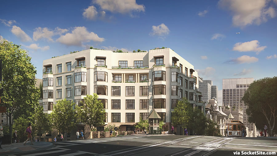
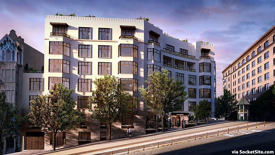
The proposed seven-story building to rise on the prominent southeast corner of California and Powell has been rendered in place, designed by Robert A.M. Stern Architects and BDE Architecture and finished in granite, stucco, stone and bronze.
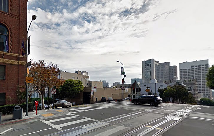
A surface parking lot for 16 cars since 1970, plans for a 100-unit building to rise up to 26 stories in height on the 770 Powell Street parcel were drawn in 1974 but subsequently abandoned.
The current proposal for the site, which includes the adjacent garage parcel at 875 California Street, will yield a total of 44 market rate condos over parking for 48 cars and 86 bikes.
The original plans for a circular drive and drop-off on the corner have been nixed in favor of a gated court, rendered above with the gates wide open.
And if approved next week as expected recommended by Planning, the Nob Hill Garage will be razed, the two parcels will be merged, and Grosvenor Americas will push forward with the development.
Great structural look, great Nob Hill view! Build it.
Yay for nixing the circular drive and drop off.
You know, I’m generally not a big fan of the work by Stern, but I understand the historic context, and “traditional” character of this neighborhood.
In this case, the detailing seems subtle and understated, classic, restrained, traditional fenestration and appealing light color of the façade. I think it works here and would be a good addition to this very prominent corner.
Must be the sunny weather we’re having. Are you wearing Topsiders with no socks and a pink polo with the collar flipped up today?
Ah, no. Wouldn’t be caught dead in that getup. More like my typical black jeans, black t shirt and boots, while I ponder the importance of understanding a more “conservative” architecture, that fits well for a particular place, and at the same time, continuing my admiration for International style pure modernism.
Are they special boots for backpedaling?
Oh I see what you did there!
For you, yes. for others who understand architectural criticism and the reality of fitting buildings into very sensitive sites, no.
Sensitve sites = 1%ers nearby
As I suspected, it seems like the materials and finish will result in a much more attractive and interesting building than the initial poor quality renderings portend.
Let’s see your portfolio. Your pontification and tone certainly implies significant accomplishment.
Mr Frank. It’s not going to happen as much as you whine on and on. What I do or what I did as an architect is not relevant to the discussions here. You need to understand that.
And if you find architectural criticism with a certain EARNED level of intelligence and experience to be annoying to you, then perhaps you need to spend time reading about it. Try Architectural Record, Architect among two well respected professional magazines that deal with this subject.
I’m glad to see you’ve given yourself an A+, now if everyone else would just agree damn it.
I know. Damn it!
Love to see you in those 1991-hot-fashion black jeans, too. And I’m straight!
And calling me a whiner, oh mercy. I love tweaking you. You’re the most pompous, pedantic NIMBY I’ve ever seen on this site.
But Frank, why are you so obsessed with what I say? Does it really matter that much to you that I speak an authentic architectural language?
I’m sorry you don’t understand it.
Entertainment. I love calling out self-absorption and pretentiousness when I have a few moments.
Well, I thank you for paying attention to me and what I have to say. Much appreciated.
Bravo, Futurist! That might be the most honest thing anyone has ever written on an internet forum.
What’s the little structure at the corner, the one with the pointy roof? Is it some MUNI thing?
“This accounts for the little signal house at the intersection Powell and California. The signal house man shines a green light if the intersection is clear of cars and a red one if another cable car is approaching it. This way both operators know if they have clear passage, thus avoiding obvious problems.”
From CableCarMuseum.org
Thanks for the info!
Maybe one more story?
Can all developers please hire Stern? Pretty please? Look how well this respects the neighborhood and is pleasing to the eye. It has a nice art deco feel to it (especially the parapet); I reckon that in 20 year’s time this will still look okay. Unlike much of the dreck that’s been churned out over the course of the past decade which looks dated a year after completion. Then again, the 60s and 70s did much more damage to SF’s architecture (a la Richmond District Specials).
stern’s buildings in nyc are commanding $5K per sqaure foot. This might be a good deal here.
Robert Stern is the Ralph Lauren of architecture. He is very skillful at tastefully cribbing the work of earlier architects. Usually, this turns out quite well. Sometimes not, as we can see in the Gap Building on the Embarcadero. It’s a clear miss. A lame attempt to echo the Ferry Building with no architecture; merit of its own. It is better than the dreck that is usually built – I am looking at you, Intercontinental Hotel – but disappointing from an A List architect.
That seems like a good interpretation. Although the Gap HQ on the Embarcadero is not terrible. Yes they tried to play off the clock tower at the Ferry Building, but the overall look seems to have survived the test of time (albeit just 15 years). It is reminiscent of the brick warehouses at the Northeast Waterfront district and does a good job at mimicking the warehouses.
Where are the no parking screamers? I always notice that if the development is for the wealthy, nobody seems to mind a minimum of one parking space per unit, but if it is for a slightly less wealthy buyer, the finger waggers demand that parking spaces be reduced, especially in “transit rich” neighborhoods like this.
I am FOR allowing builders to provide off street parking to both the rich, middle and low income residents, but why is there such a double standard shown by those who feel they should have a say in restricting parking?
Do the anti off street parking screamers feel parking should not be allowed or reduced ONLY for lower and middle income projects as some sort of punishment for people who work and struggle to keep financially stable?
Ok, fine: it should have less parking. And I approve of the elimination of the unnecessary driveway.
But I am not nearly as opposed to builders voluntarily building more parking as I am to the city forbidding new housing construction unless it is accompanied by expensive parking garages. And that’s a practice that significantly reduces the amount of lower-cost housing that is built, particularly lower-cost market rate housing.
Your framing of the issue as a “punishment” for people with less money is bizarre. If someone expresses a wish that more housing is built that doesn’t feature wine cellars, 24-hour doormen and two bathrooms for every bedroom, would you accuse them of punishing poor people by denying them these luxuries?
Justin – Location, not social status or wealth is the factor here.
The three little set-in balconies on the 6th floor are awful and signal a gloomy dark room behind each of them.
It’s a nice structure, if too short. I appreciate the restrained traditional style, but not sure why it takes a tip tier architect. Make a style book of old buildings, anything that’a a copy gets a design review exception.
Maybe we should do the same for art, literature and technology too.
That is a scarey statement you just made.
No one dies if a building is unattractive. Architecture is overrated.
It’s just the environment that we (city dwellers) live our lives in.
New York City has no design review. Somehow, life goes on.
There actually is a “style” book of old buildings. It’s called “A History of Architecture on the Comparative Method”, by Sir Banister Fletcher, published in 1896.
It’s essentially the bible of every authentic architectural style, form and detailing from every major period from Egyptian to the International Style of Modernism. Pretty amazing book of 1366 pages.
Closer to what the city needs but they could have gone a notch more classical, especially with the windows that look very 80’s condo’ish, and are intended to appeal to those looking for more traditional.
This vacant lot and the one on the northwest corner of Kearny & Pine have been the mystery vacant lots as long as I have lived in San Francisco. It is good to see both will soon be in construction.
Nails it!
Actually, they’re well along with construction of the building abutting St. Mary’s Square.
We have an affordable parking crisis in this city! I am sick of greedy developers ruining our parking lots with condos for the 1%. Where will the working class and homeless park? We need to fight to preserve our city’s character!
The circling….the endless circling as I try to find a place to park my Chevy Suburban! That alone will cause Traffic Armageddon in the heart of the City!
looks nice – good design in character for the area – now add 10 floors and build it
No thanks. We don’t need another t**rd like One Rincon Hill/The Harrison, or whatever it’s called these days… Appropriate size, parking & albeit conservative styling.
Are there any other art deco buildings on Nob Hill that this one is echoing?
Not only has the building — now dubbed Crescent Nob Hill — been completed since the above post, but certain units that were sold by the developer shortly after initial completion are returning to market and might offer some indication of the state of play for resales.
For example, 875 California St Apt 202, a 2 bedroom, 2 bathroom, 1,474 ft.² unit purchased for $2,343,500 in October of 2022. It was listed early last month with the asking price of $2.5 million and then reduced to $2.1 million three days later ($1,425 per ft.²), an “at asking!” sale at which would represent a gross 10.4 percent decrease in value for the condo over the last 29 months.
The same unit is also on the market as a rental, you can lease it for $15,000 per month. OTOH, If you purchased it today, putting $420k down on a 30-year fixed at 6.714 percent, adding the PITI of $13,569 to the HOA fees of $18,539 monthly (!) would bring your monthly payment to $32,108. If you think you know the “buy vs rent” economics of new-ish condos in the Nob Hill neighborhood, now’s the time to tell.
I think someone mistyped the HOA fees. Redfin is now showing that as $1,764/mo. It doesn’t change your main point, but it does save me from enquiring about what could be on offer at $18k/month.
My bad. Even realtor dot com is now showing that correct amount in its listing. I should have not taken that amount at face value when I read it and double checked against the listing agent’s own site before posting. I appreciate the correction.