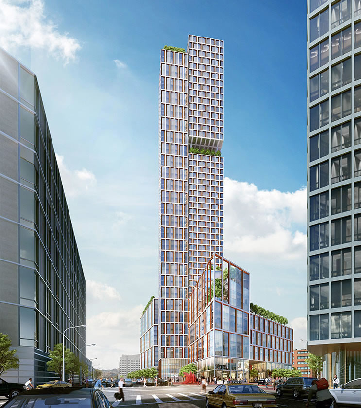
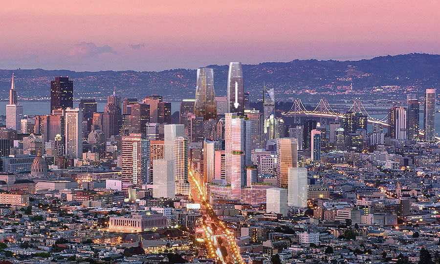
While plans for a pair of 41-story towers with a total of 984 residential units to rise on the former San Francisco Honda site at 10 South Van Ness were drawn, an alternative proposal for a single 55-story tower to rise up to 590 feet in height on the site, which is currently only zoned for a maximum of 400 feet, have been in the works as well, as we first reported back in 2017.
And with the anticipated passage of San Francisco’s Hub District Plan, which would up-zone the corner for development up to 600 feet in height, Crescent Heights is now formally proposing to pursue a single tower design by Handel Architects Kohn Pedersen Fox (KPF) Associates as their preferred plan for moving forward.
The 55-story tower would yield the same number of (slightly larger) residential units and retail space (30,000 square feet) as the two-tower design, but with around 240 off-street parking spaces as now envisioned (versus 518 as originally proposed) and an enclosed mid-block pedestrian connection between Market and 12th Street, the sidewalk for which would be widened and specially paved.
And with the support of San Francisco’s Planning Department, the preferred plan will be presented to the San Francisco’s Planning Commission on Thursday, with the hopes of having the project’s Environmental Impact Report (EIR) certified this April and securing the project’s approval circa July.
We’ll keep you posted and plugged-in.


THANK YOU PLANNING COMMISSION.
The ugly, cube-shaped, 20 story block-wide building has been overdone so many times. Tall and skinny is much better for the city aesthetically.
thank god… that stretch of 12th street is a nightmare
So true. Any change is good change here. Also, notches in the tower will help hugely with reducing wind tunnel effect – check out 181 Fremont’s notch and wind shear reduction.
Hubba Hubba for the taller single tower!
Looks amazing!!! Build baby build!
A totally unremarkable design – par for the course in SF. If they are going to go to 600 feet then do something spectacular as this tower will be more visible than those around Transbay. As to timing, given that One Oak – across the way – has been abandoned due to market conditions, it is hard to see this moving forward anytime soon.
What’s the source for One Oak. Still in the works from what I know.
Ta da. Sadface.
Seattle’s new developments aren’t exactly aesthetically inspired for the most part. Actually, most cities’ aren’t.
Planning will probably request some kind of signature silhouette because of the height, and we’ll get another wonky crown like Handel’s Nema tower.
more height, less parking, and even a (seeming) nod to the demolished Jack Tar’s checkerboard windows. 😉
What’s not to like?
I like it. Race to the top now for other neighboring buildings. Much better than the race to the bottom in other hoods.
Nice addition and I too prefer the single tower too. Kind of reminds me of the Park Tower with the Balcony.
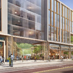
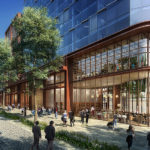
I really like the glassy triangular restaurant space! Tall skinny tower + good pedestrian facades will be great for this location and it would have been a bummer not to have some big windows to look in anymore. (I’m not sad to see the car dealership go, but there are actually some cool little architectural details on the existing building, now that some of the awnings have come off.)
I of course don’t have the plans in front of me, but I’m struggling to understand how a (single) 55 story building yields the same number of units as two 41-story ones: 2×41=55…”new math”?
Granted, the sleight-of-hand could be accomplished if it were two slim towers vs. one bulky one, but the opposite seems to be the case; if both have similar podiums, the ratio of actual residential floors is slightly less skewed, but that alone doesn’t do it.
Where are they going to place the mirror need for this magic act?
Different mix of studios, 1 bedrooms, 2 bedrooms, and 3 bedrooms.
The tower itself can be larger/wider, and the podium redistributed (less elevator cores).
Possibilities – and of course there’s the fact that there will be less parking – but if, as ’emanon’ suggests, there is a wholly different mix of sizes, then the claim of “same number…slightly larger” units seems thoroughly misleading: is 328 each studios/1Br/2Br really the same as 900/14/14 (or whatever the actual numbers would be to make this work out)??
What’s your issue? You think they’re lying? Read the DEIR. It’s all there in the Project Description.
More Uber/Lyft in the area, to block the new BRT, and clog the already overflowing Muni platform…Why no linkages south of Market with the BRT to St.Luke’s and around Ceasar Chavez to the T-Line make a loop a link and a secondary system to pick up traffic around the SFGH and over to the chase center and new hospital there? Make a system the fixes, not leaving us in ditches….
Wake up SF, this is getting to be hysterical…. Planning Commission is approving anything that moves upward, but forgetting what is down below, and needed all around…..
Who cares man. That’s why this is near a muni station and the future BRT. To encourage public transportation. What do you expect from these developments that go up? Ghost towns? Geezus. Get over it already. Go move to Oakley if you don’t like traffic.
This project is freeway oriented development.
A project located directly on top of underground MUNI and BART is freeway oriented development. Have we just decided that words have no meaning?
I love it I think it looks beautiful. Too bad it can’t be 700 feet! SF needs more density. And it’s good that this is near public transportation.
Agreed, except it should be 1,200ft….take the spotlight of the phalic & encourage a new peak in the sky closer into the geo center of the city. totally on transit too, should be able to support.
Where is the planning gain for this undistinguished slab?
Will the developer improve Van Ness Muni station?
Does it block the view of the beautiful and iconic City Hall?
Does the design mitigate or exacerbate the already windy Intersection?
Why should there be parking allowed in a public transport rich area?
Is a road diet planned for the area?
As most of these high-rise developments are largely investment boltholes, how does it help the housing shortage or does it pull in high net worth Individuals?
A competent Planning process would consider these points.
Where is the planning gain for this undistinguished slab? – Almost a thousand units of new housing for a housing starved city.
Will the developer improve Van Ness Muni station? – What needs improvement here? It’s clean and rarely crowded.
Does it block the view of the beautiful and iconic City Hall? – Views are not protected and also not aware you can see City Hall from behind this currently.
Does the design mitigate or exacerbate the already windy Intersection? – Towers proposed in Mid-Market have to mitigate wind.
Why should there be parking allowed in a public transport rich area? – Because people own cars even if they do not use them daily. I live in a building a stone’s throw away and we own a car for trips to wine country, to see my relatives nearby, etc. We rarely if ever use it within city limits and never for commutes.
Is a road diet planned for the area? – Clarify?
As most of these high-rise developments are largely investment boltholes, how does it help the housing shortage or does it pull in high net worth Individuals? – As somebody who lives in a very similar building a stone’s throw away, it is a 754 unit rental building that is always over 95% occupied so I’d hazard a guess that yes, this is helping our housing crisis and see no reason to believe this building is any different.
see matier and ross article today, BRT and the muck and morass of transit planning that will not improve this area till 2100, if we are lucky…
SocketSite, I checked in with a rep from Crescent Heights and the design is by KPF, Kohn Pederson Fox, not Handel. Can you issue a correction? Thanks.
UPDATE: Proposed 966-Unit Hub District Tower Closer to Reality