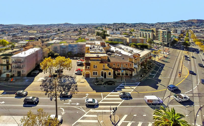
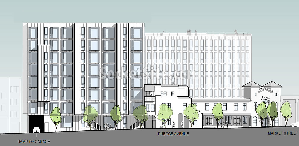
The big plans for a 96-unit building to rise up to 85 feet in height at the intersection of Market and Duboce, behind the historic façade of the former Gantner Brothers’ Funeral Home building at 1965 Market Street, have just qualified for a streamlined environmental review and approval.
While the site is currently zoned for development up to 85 feet in height on the corner, it’s only zoned for 50 feet in height upon its parking lot parcel fronting Duboce. But the project team is proposing to invoke California’s Affordable Housing Bonus Program in order to build up to eight stories (85 feet) along Duboce with seven setback stories rising up to 75 feet in height behind the historic facade, the detailing for which is still being refined by David Baker Architects for Keller Grover Properties.
And in addition to the 96 condos, 14 of which would be offered at below market rates (BMRs), the proposed development would yield 3,800 square feet of new retail space and underground parking for 48 cars, including one space which would be dedicated to a car sharing program.


Looks good.
Great – walked by here last weekend, and infilling this parcel with this building will help complete a consistent level of density from Duboce all the way to Church… now if only we could redevelop the Safeway parcel, and get some mid-level height built closer to Castro…
Redevelop the RC Gas station already! And, relocating the Chevron would be fantastic (but likely unrealistic)
[Editor’s Note: Prominent Market and Castro Street Site Back in Play]
And the Petco building and it’s parking lot. Dolores deserves a better ending!
Considering that Dolores addresses start at Market, it deserves a better beginning.
I can handle and support the boring mission bay boxy buildings a bit more when intermixed with fun classic older yellow painted (OMG it stands out, shudder!) buildings. This is what creats character. I love this project.
I sure hope [the RC Station] is really back in play. Been to this dance before!
Anything that will help mask the disaster that is Linea across the street.
I don’t even think it’s a bad design, just in the wrong spot. The lack of destination retail or anything interesting doesn’t help it (H&R Block and urgent care currently grace the street level). Better streetscaping and planting would/could help add some life—which is undoubtedly Market Street’s biggest missed opportunity.
Agreed. And I think even Linea will look better once it’s part of a mix of mid-rises, instead of standing out on its own so much.
Dude, you can walk up and down Market st and on to the Castro to hit tons of retail. Not following you.
I think it’s in the wrong spot AND bad design. Looks like an office building. No balconies or other domestic touches make it pretty damned soul-less. And the dark glass curtain wall down to street level makes the retail undesirable even if it were in a better space for retail. They are lucky to have an urgent care and HR Block.
Destination Retail is only needed when you have a shopping mall or an old downtown trying to revitalize. Urban areas don’t need destination retail, or parking either, for that matter. Maybe Golden Produce is the neighborhood destination retail.
The change to the current black or green glass deadens the building and suffocates the design. The original skin seems quite interesting no? The current structure is inelegant and looks like a bland office building.
A friend of a friend told me that building gets quite hot in the afternoons on a sunny day. They might have switched window skins to help with this.
linea is beautiful compared to 8 Octavia, which is a terrible eyesore
I like Linea. I think it’s much better than 38 Dolores which has too many exterior materials that do not compliment each other…
The difference is that Octavia is executed as it was intended. Linea was either poorly built or value-engineered from its original design.
But I am not a fan of either.
8 Octavia is beautiful. Stanley Saitowitz’s best work.
Niave question– I thought developments over 12 units or something had to have 25% BMR units. This is closer to 14-15%. Was it grandfathered in before the proposition was passed to last year?
In addition to a grandfathering clause for projects that were already in the works prior to the passage of the higher Inclusionary Housing requirements, units which are attributed to having been added to a project by way of a State Density Bonus are exempt from the calculations.
Wish they would knock down the building with 24 hours fitness and build that to nine stories
9 stories would also be perfect for the entire safeway plaza. could add 2000 housing unites there
Jimbo,
Agreed. Safeway plaza is owned by three separate interests. They won’t agree on how to sell until the entire block is developed. Imagine how much the land is worth..
Goodwill on Mission and Van Ness got 65 million
its high time that they upzone some of the areas like this one which is catered by good transit. Cities needs higher density as we should stop expanding into more suburbs and shredding off existing farmlands and trees. Looking forward for more YIMBY movements
This area was upzoned in the late 2000s as part of the Upper Market Plan which allowed Linea, the Whole Foods project, and all the other midrise building on Upper Market.
I whole-heatedly support this project, but why does have it be another neo-new brutalist edifice? Surely there are other architectural style which can be used in San Francisco.
David Baker’s work is far from “New Brutalism,” whatever that is. Too many new buildings are sporting Mid Century Modern flourishes, which developers like because it’s cheap to build and hipsters think it’s still cool.
If you don’t know what New Brutalism is, how can you say this isn’t?
UPDATE: Prominent Market Street Development Closer to Reality