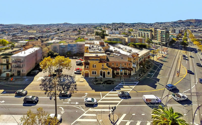
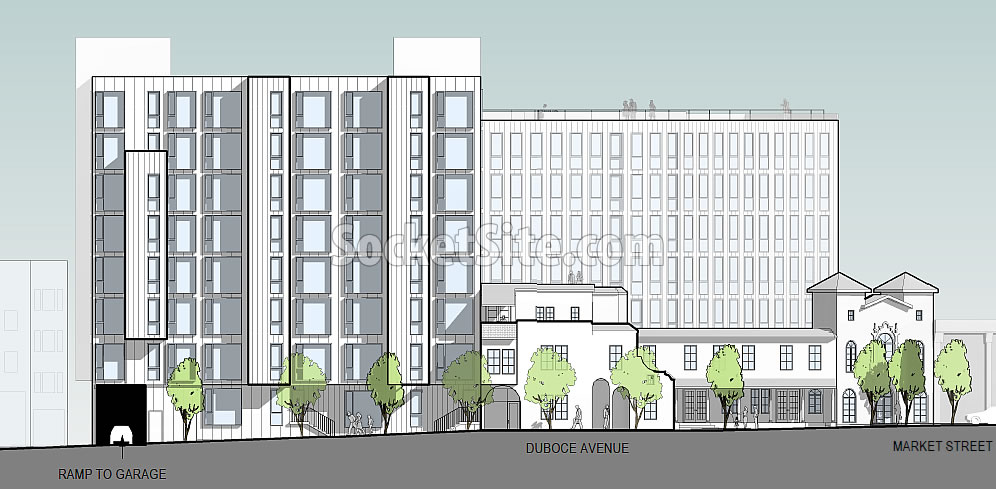
The formal application for a 96-unit building to rise up to 85 feet in height at the intersection of Market and Duboce, behind the historic façade of the former Gantner Brothers’ Funeral Home building at 1965 Market Street, has been submitted to Planning.
While the site is currently zoned for development up to 85 feet in height on the corner but only 50 feet upon its parking lot parcel fronting Duboce, the project team is proposing to invoke California’s Affordable Housing Bonus Program in order to build up to seven eight stories in height along Duboce with eight seven setback stories behind the existing facade on the corner.
And once again, in addition to the 96 condos,the proposed development would yield 3,600 square feet of new retail space and underground parking for 47 cars as designed by David Baker Architects for Keller Grover Properties.
UPDATE: Our post originally included the previous set of designs for the proposed project. The refined design, as newly rendered and outlined above, has reduced the proposed height on the corner, shifting its mass to the parking lot parcel, with detailing and colors that have “yet to be developed.”


Decades from now, even the most uninformed individual will be able to look at this building, with its projections and multicolor facade, shake their heads, and exclaim with authority, “that thing was clearly built in the teens!”
We don’t know – yet – what’s coming next…. that may end up being a compliment.
The good (if it can be called that) news is that these multi-colored panels are basically Formica covered particle board and can be (theoretically) changed out over time. If you watch how they are installed, they are on tracks and there is open space behind and next to them. They have the added bonus of being exceptionally tacky looking from afar and up close!
exactly!!! this whole “breaking up the massing with different colored metal panels” is the bane of the architecture world. it’s trendy and cheap (and not in a good way).
I agree. It looks cheap and ugly.
It’s everywhere. I was just in Seattle and they have the same look, also Los Angeles, etc.
Saw them in Portland too and on a taller scale in Chicago
I really have mixed feelings about the affordabable housing density bonus. On one hand, we need more affordable housing and jurisdictions downzone too much to prevent development. On the other hand, sometimes the zoning is well thought out and appropriate to the neighborhood, and the products of the affordable housing density bonus will stick out as weirdly out of scale. This could be one such case.
like many of the 6-10 story apartment buildings built in SF on prominent corners in the 20s-30s before height limits were ratcheted down. I’m thankful that there is a mechanism to escape the dread 40′ rule.
Let’s keep recalling that this is on a prominent corner of the second widest, most transit rich boulevard in the city. It’s hard to imagine how it could be “out of scale”. The surrounding parcels all ned to be redeveloped to a much larger scale.
Agreed! And with the Whole Foods building and the Arquitectonica one across the street, this fits perfectly in the area. What’s REALLY needed is for the Safeway parking lot / store to be redeveloped in the 8-20 story range.
OK, maybe I’m convinceable….
well that’s not curmudegeonly at all! 😉
I’m going to make some popcorn while awaiting the DTNA response.
I count 12 surface parking lots / gas stations remaining along Market from Castro to Van Ness after making nice progress in this cycle. Look forward to getting that number closer to zero in the next one. Does anyone know the status of the Sullivan’s Funeral Home project @ 2254 Market? Haven’t seen anything in a while.
Good shape but meh color scheme. And it’s nuts that you need a density bonus just to build to this midrise height on Market. Should be taller.
Update: New shape is not an improvement. I want that curve back!
UPDATE: Our post originally included the previous set of designs for the proposed project. The refined design, as newly rendered and outlined above, has reduced the height on the corner, shifting its mass to the parking lot parcel, with detailing and colors that have “yet to be developed.”
In some ways this is worse. The idea that the city would encourage a reduction in height on the side closest to Market is crazy. It should be stepping up not down.
Regardless, it shouldn’t come as a surprise. As we wrote when we revealed the original plans last year, “the Planning Department is recommending that the height of the project behind the existing façade along Market Street be reduced to six stories in height and further setback in order to avoid overpowering “the existing spatial relationships and features” of the historic resource.”
It’s horrible and too tall.
It’s fine, but too short.
let’s stay on track with destroying SF’s charm. I’m loving the increase in density and congestion!!!
UPDATE: Plans for Prominent Market Street Site Qualify for Streamlined Review