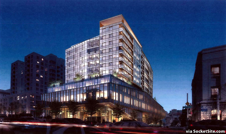
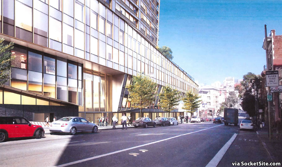
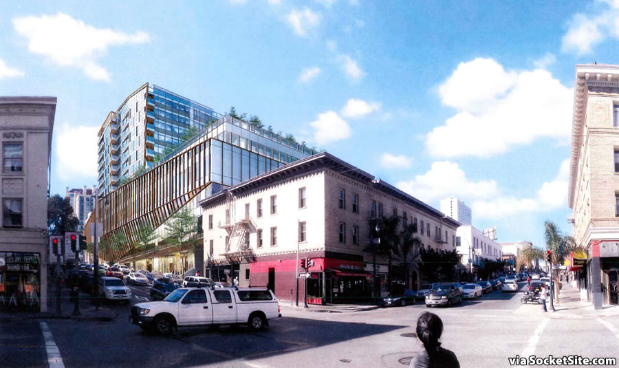
The proposed designs for the bold 13-story building to rise at 1200 Van Ness Avenue have been refined by Woods Bagot, shifting the mass of its eight-story residential tower towards Van Ness as requested by Planning, but eschewing Planning’s “support” for an integration of the existing building on the site.
In addition, while the proposed number of residential units to rise over the five-story Medical Office Building had been increased from 84 to 135, it’s now back down to 95 (71 one-bedrooms and 24 two-bedrooms) while the number of underground parking spaces has been bumped up from 357 to 368.
And last week, the formal application to secure approval for the 1200 Van Ness development – which still includes the potential for a 25,000-square-foot, full-service grocery store at its base – was submitted to the City and the project’s environmental review is underway.


Wow, there’s nothing delicate or low key about that.
This isn’t the Shire.
Since when is Van Ness a “delicate” street? It’s a six-lane traffic sewer, not a village alley.
I was referring to the Post St. view. Looks to be so massive and uninviting at street level. But hey, it’s just my opinion. I’m old and SF changes. Can’t stop progress.
I don’t think the post street elevation is significantly different from the building that’s currently there, tower portion excluded.
Nope the village alleys are located in western soma, exactly where they are dumping 600 foot monsters, less than 50 feet away.
Prior building and tower design looked sleeker, now it looks more like the tower shifted incorrectly over the pedestal base. The tower element should be more sleek, sharp, and taller as an element.
Yeah prior version was much more interesting.
They both look pretty good imo, but aside from looks I think this new design creates a better space for residents. Now more of the outdoor space is facing away from Van Ness which will be far more pleasant. Also, while I’m not one to panic over shadows, this will cast a larger shadow over Van Ness and less over Polk. Polk street matters more for this. It’s a logical choice.
It’s starting to resemble the Jack Tar Hotel. And that’s a *lot* of parking.
Presumably mostly for the potential grocery store and five floors of medical offices. After all you can’t really ask sick people to ride a bike to their doctor.
Not everyone who visits a doctor is sick.
Not all sick people are immobile.
Not everyone who’s so sick that they’re immobile has a car or can drive.
Sure, go ahead and allocate parking for the medical offices. But do it because some people prefer to drive, not because it is required.
More the residential/commercial analogue to the institutional de Young than the Jack Tar.
I liked the Jack Tarr, especially when it was still turquoise and salmon. It was an artifact (a very large one) of its time.
This is difficult to rendering discern. It could be quite good if it is developed and executed well. And it could be an awkward, flop with an ugly base and a cheap disconnected, stubby resi tower. (I know, zoning is responsible for the stubbiness, but have to turn it into something.)
Clearly the tower is separate from and intended to fade from the near sidewalk (and away from Van Ness noise) so hope they focus on the base and make it beautiful. Not a lot of history of that in this town, requires very expensive materials (i.e.not pre-case, not “kawneer” storefront) and details, and also not screwing up the retail design, visibility, signage and light.
The arcqutectonia-designed building on Market near Safeway is a good example of how to do everything wrong and have the ground floor and retail a total failure. Might learn something from the old auto showrooms — Height, visibility, great windows, clear entrances, sense of being someplace…the new Apple store has all of that, and is successful as very good urban architecture. I know its for a single very unusual tenant (just like cars were …) but still lessons to learn.
agree. another important consideration is the parking ingress on post. it should be moved to the lane like the CPMC office building and whatever plan they had to activate the lane should take a back seat to the important issue: post street.
also, couldn’t agree more. the commercial spaces in the fort-breschia building on market, which i was initially quite excited about, are failing essentially by design. i see a renovation inside of 10 years. architectonica is one of these firms that needs to heed local firms’ advice because their team out of miami is just building for a different clientele.
if the city will permit 500 – 600 feet at so van ness and mission, they can certainly spread the wealth and up the heights on this part of van ness!
The podium’s still fugly, and Post is no where near as level as depicted in the 2nd rendering.
The base on Post looks like a giant accordion was opened up on the sidewalk. Ugh.
This may get the award for the most horribly value engineered building in recent history with the only redeeming feature of the previous design – its deeply mullioned, well-proportioned curtain wall now apparently scrapped. Go back to the drawing boards, please!
368 parking spaces? WTF?
With the hospital and medical building a block away moving towards completion I thought I would bump this thread to see if anyone has heard about the 1200 Van Ness project moving ahead?
It sounds like environmental review is still underway: according to the notice I’ve seen the comment period is open until October 8, and the proposed number of parking spaces has been reduced to 275.
UPDATE: Modern Van Ness Corridor Development Even Closer to Reality