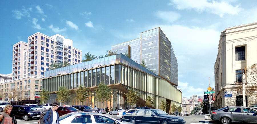
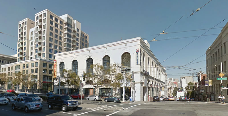
The plans for a modern 265,000-square-foot building to rise up to thirteen stories at 1200 Van Ness Avenue, the corridor parcel upon which the former Circuit City building and 24 Hour Fitness currently stand, have been submitted to Planning and are under review.
From Woods Bagot, the architects of the project:
The development is composed of intersecting glass volumes containing commercial, retail and office space in the four-level podium and residential units rising eight stories above in a more slender tower. A series of strategically placed vertical fins wrap the podium along the descending Post Street facade, suggesting texture, scale and movement, as well as providing sun shading for interior spaces.
The set back of the tower allows for ample open space and building amenities atop the podium. In addition to an open green space overlooking Van Ness Avenue, the roof terrace design also includes a private garden reserved for residents and “garden residences” with private patios. The project also will include five levels of below grade parking.
The development would cover 80 percent of the block bounded by Hemlock, Van Ness and Post, but would stop short of Polk.
Vacant for years following Circuit City’s demise in 2009, the ground floor of the existing building on the site has been leased to Sutter Health since 2013.


At the risk of irking Futurist (he said good-naturedly) – fugly.
And the tower should be on Van Ness, not set back – most of the rest of Van Ness is built out (or being built out) to the sidewalk; it’ll look odd (and turn the rooftop terrace into a shadowed windswept emptiness) to have this tower set back.
Looks like the reason is to avoid opposition from the residential building on the left.
My consistent concern: much of the “new stuff” is going to look horrid in 5-10 years once the grime settles. Comparable architecture from the 50’s/60’s has been horrifying most for decades, and now we’re basically repeating the same mistakes. No one has a cleaning budget to keep that many fins and glass panels sparkling. The “New” Federal Building, for example: looks more and more like a dirty pancake griddle withe every passing day.
Someday a new owner will replace the glass fins with metal or wood, or just remove them all together. Other inconsiderate design changes will be made and over time people will think the building was always an ugly hulk. A lowly news reporter will lament the decline of the area in a piece titled “Once Grant, Now Gritty -Van Ness Ave Today”
The Federal Building looks like an ugly pancake griddle precisely because it is not glass. All that steel was a stupid idea to being with and just gets uglier with every passing year.
I think the Federal Building looks ugly because the architect is a religiously and ideologically doctrinaire Maoist who designed an oppressive hulkish monster because he thinks the federal government is a repressive hulkish monster. The crime is that the client still bought into the design.
That is EXACTLY what I have been saying. When the 50s/60s boxes were being built, it was new and hip to do design buildings like that. Now we wish it never happened. It’s almost as if people forget that once you build something, you are stuck with it for upwards of a century or more.
Although this new building is not terrible, what it is replacing looks just fine.
I dont understand why this is so short compared to everything else being built on Van Ness
and the setback seems overdone
Wow; I didn’t realize this building was in play. The design as submitted actually mirrors the setback of Daniel Burnham Court’s rooftop pool and deck across Van Ness very nicely. Not that the current incarnation of the 24 Hour Fitness is amenity-rich but that place is a mill at least 20 hours a day–a ton of foot traffic. Not having a gym there (too much to hope they’d be the commercial tenant when the building is done?–my trainer there had NO idea about this when I asked him yesterday) would be a big loss for Nob Hill, Pac Heights, Western Addition, and Civic Center.
Oh no, that’s my 24 hour Fitness. Are they going out of business?
I think this is the best 24 Hour Fitness in the City (though that’s damning with faint praise, for those in the know). It would be a shame to lose this – and if this space and the old Circuit City space is replaced with 4 or 5 “retail spaces” of 900 square feet each, it’ll be a huge negative change. We need to provide larger retail and commercial spaces, in addition to the small storefronts.
How old is the original building? Not everything should be torn down for brand spanking new.
Tax records say built in 1911. Over 100 years old and the existing building looks perfectly fine. I highly doubt the new building will be lauded as much in 100 years.
After doing some research, the building looked nothing like this when built. Either way, the current building looks fine and original building looked great too.
Can you share this research? I live in the area and would love to see the original façade.
I posted a few links to photos, but the comment was pending and did not get approved by Socketsite, for some reason.
Here is a link to photos of the dealership (H.O. Harrison) that built the property. It is was an Art Deco style building.
The first image and last few images are of the building.
I wonder how old the existing building is. It looks like an old and rather graceful building that had the first floor modernized at some point. At any rate, it might be nice to have the original base restored and then a modern tower added.
That would be nice, too. A modern tower set back the same way the proposed design has. The existing building looks very nice. Would be a pity to have it go.
I agree. That is also usually more interesting urban architecture, exposing the layers of history, when the base building is as fine as this. Not a totally new concept to SF: I am especially fond of how the building(s) housing Saison came out (3rd and Townsend).
Has some potential but don’t really get the Van Ness vision — site after site seemingly in isolation. Is there an actual plan and vision for this traffic-y boulevard? What’s with the suburban height guidelines for one of our main corridors? I get Rincon, Octavia, Market/Van Ness. Planning — Anyone home?
Nope, they’re on lunch break – they’ll be back when Lennar shows up.
if they’re going to basically tear down the older building then why build something so small? Agree that the tower should be along Van Ness. It’s a wider street so the taller building will have less of an adverse effect on light/air to the street below.
Too short.
1200 Van Ness was built in 1911 but has since been completely altered and had historic elements removed. You can get a sense of the original facade from Hemlock Street (the alley behind it).
The Van Ness Avenue Plan was adapted in 1989, height limits are set from 40 (on the north end by Russian Hill go figure) to 130 in the central part.
Looking at the street view on Hemlock St towards Polk, it looks like the facade of the property was a warehouse. Is it possible that the building had a different facade on Van Ness and Post even in 1911?
uh, people really don’t realize the obvious reason that the tower is so far set back? it’s because of the adjacent residential tower and maximization of value. if you’re going condo especially, wouldn’t you want unimpeded views on all sides?
otherwise, i echo the critiques about the squat van ness frontage, highly weird.
Except if your existing neighbor to the north is a tower set back from the street, then by your (correct) reasoning shouldn’t this tower be along Van Ness? Otherwise the developer is essentially sacrificing all northern views from the new building, by putting the new tower in alignment with the existing neighbor.
Etta’s tower (to north) is slightly set back. 1200 is WAY set back so, they will be able to look north past Etta’s east side. 1200 is nearly the whole block almost to Polk. They have plenty of room to work with.
The podium roof deck across the street at Daniel Burnham is a nice place to hang out so I think the residents will like having the recreation area there on Van Ness. I do get that if not for views the tower on VN would be better though.
Probably won’t fly. Look at what happened to the CPMC MOB. Modern designed was dulled down to fit surrounding historical architecture.
1200 Van Ness is a Category B – Potential Historic Resource, defined as follows: “Category B – Properties Requiring Further Consultation and Review”
IMHO it’s a quite attractive building and I would hate to see it go.
UPDATE: Don’t Get Too Attached (Or Worked Up If You Don’t Like It)