As we first reported yesterday, Woods Bagot’s bold design for the proposed development to rise up to 13 stories at 1200 Van Ness is being revised, with San Francisco’s Planning Department “supporting” an incorporation of the existing building on the site into the plans.
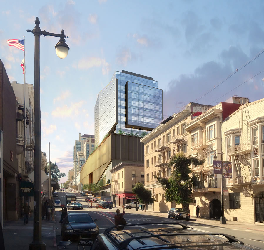
And as we reported when the plans were originally revealed, the proposed development would cover 80 percent of the Van Ness Corridor block bounded by Hemlock, Van Ness and Post, but would stop one parcel short of Polk, as rendered above in a new perspective which isn’t likely to become reality.
The tower’s actually somewhat interesting. But this perspective really underscores (for me) the inappropriateness of the podium – it’s a hulking presence on the street.
SIERRA JEFF: And I agree!
Ditto – ruins that whole block between Van Ness and Polk.
If there is a singular constant refrain of architectural critique at these pages, it is a yearning for something “new and different” from the same perceived mundane. Yet, when anything “bold” (as the Editor characterized this proposal) is presented, the predictable objection is that it is temporally and stylistically out of context.
As to the “inappropriateness” of the podium the length of Post. St. (too bad it falls a lot short as its presence on Polk could be invigorating), consider what you can see of that from Polk to Larkin — an unbroken block of buildings. That is what the proposal presents, an unbroken block. Just new and different.
Sadly, the more I regard the original proposal, the more I do love it, but recognize the likelihood of its being built is slight.
The obvious comparison is as the commercial analogue to the institutional DeYoung. As to Planning’s criticism of the podium’s horizontal element being out of keeping with its surroundings, there is no established, coherent theme in the neighborhood worth emulating. DeYoung benefits from the fact that it is in absolute isolation in its site. This building might as well be for all nearby that might contextually influence it.
As for the suggestion that whatever is built at this location should incorporate the existing structure, it has even less merit than the objections which were raised to the New De Young’s abject rejection of its “classic” progenitor.
The one constructive criticism is with the De Young-like eccentric placement of the tower upon the podium. I would agree that it be reversed to put it at the Van Ness end of the longitudinal axis. Otherwise, one of the best new buildings in SF in years.
Yes, but the DeYoung exists in a completely different context, where such strong massing lends a certain permanence in amongst trees and nature, and the materials choices seem to fit in to the park, almost like a giant stone. This proposed building, however, just looks like a hulk on both Van Ness and even worse on the side street. From the picture above the podium reminds me more of the crappy Holiday Inn on Van Ness (which no current or past facelifts have succeeded in softening) than the DeYoung.
Yeah, well I kind pointed out the contextual difference between the de Young’s setting and that of the Van Ness corridor on my own. But, please tell me, what in its surroundings is so worthy of emulating that it should inform the design of this building.
Obviously, I totally disagree with your comparison of its design elements to that which is there. If anything, its greatest fault is that it “out grands” the 2 Billion dollar edifice rising across the street.
That shot is a little deceptive, the street slopes down and away from Van Ness. The podium is appropriate at Van Ness, but it becomes a beast down the side street.
agreed, looks like a crappy 1980s bank building from the rear.
Looks that way from the front too.
I tend to agree with Orland, and find these arguments about what is and is not “contextual” to be wholly tiresome.
The building is a polemic on the changing city, which I think (hope) was Woods Bagot’s intention, and for that reason is entirely contextually appropriate. I appreciate that someone in this city is endeavoring to build a polemical architecture, and challenge the pussyfooters at Planning. Formal contextualism cannot always be the architectural response to the contextual appropriateness of a building, as it almost always works to render a neighborhood monotonously uniform.
Whether or not the project represents good urbanism remains to be seen. The renderings thus far have not provided enough information about the function of the podium and accessibility to the street. Something about it screams shopping mall to me, but the large panes of glass fronting Van Ness suggest something more civic, like a performance space…but if all that’s proposed is a giant transparent fortress, then I think it’s a missed opportunity.
I actually am really growing to like it. The call about the De Young references is spot on.
Not to over do the de Young comparison, but the eccentric placement of the tower on the podium affords an obvious opportunity for a potentially incredible public space lending itself to any multiple uses. I think this militates even more strongly for an orientation of the tower closer to Van Ness thus shielding such space from its traffic and opening it to the City skyline.
Come to think of it, just what purpose is de Young ‘ s roof put? Last time I was out there, I noticed that a plastic enshrouded space was bring created for a cafe outside the western end of the building. .. HUH?!?!?!
The design present is simplistic and reductive-looking.
The building as proposed is a “one-liner” — one large scale gesture with no nuance.
It needs “medium-scale” elements to help mitigate the overwhelming size.
Also cities are about “verticality” (proclaiming the efficient use of valuable land resources) — from the bay windows in SF residential buildings to high-rises — both have the potential to gracefully draw your eye skywards.
This proposal looks confused and has a predominantly horizontal and awkwardly heavy and clumsy feel to it.
It would be more appropriate as an “accent building: in a “horizontal” suburban context — where, ostensibly, one is responding more to the prone line a (quasi) rural landscape.
I think this firm can do good work, but this project does not look like it has a strong underlying guiding concept.
Remember: “design safely” by first have a strong concept.
This smacks of the babble in the quoted language of Planning’s response to the PPA.
I suspect a mole.
LOL. This is both bland and ugly. The de young is certainly not the gold standard of architecture by any stretch of the imagination. No thanks!
Funny, in a response to me above you criticize Socketsite commenters in general for their “singular constant refrain” and “predictable objection[s]”. Yet when someone offers detailed and specific comments, you criticize them for spouting “babble”. If you think there’s a shilling mole with an agenda here, perhaps you should start the search by looking in the mirror.
“Midge Ure” is not an SS commenter. You doubt a Planning staffer?
I’d rather the city be broken down into smaller parcels again instead of hulking block sized monoliths.
The bad 1960s bank analogy works for me. I especially hate the brassy color of the metal on the podium. And there’s no excuse for the monstrous blank walls facing the streets in this neighborhood where streets are and should be lined with store fronts.
I hope the PD sticks to its guns and makes them adapt the existing building, which is rather nice, into the podium. Then they they can raise their tower. . . on the Van Ness side of the lot.