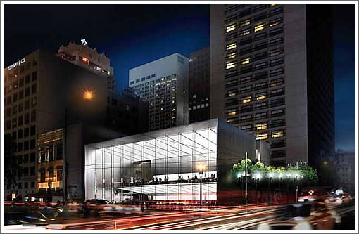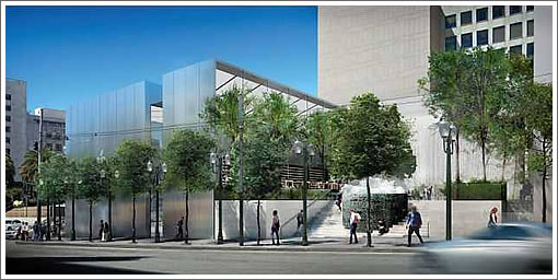
While Ruth Asawa’s San Francisco Fountain will still be moved to make way for Apple’s proposed flagship store on Union Square, it won’t be moved off-site if the revised designs for Apple’s store and the plaza behind are approved.

Instead, the fountain will be moved “slightly to the north and closer to the sidewalk” while the north edge of the existing plaza “will be pulled back several feet from the sidewalk to improve views of the fountain from the sidewalk.”
From John King with respect to the revised design for Apple’s proposed new store:
The building itself remains a tall, taut cube of glass and steel entered on Post Street. But instead of Stockton Street being walled off by steel panels 80 feet long and more than 20 feet high, the design includes an 8-foot-wide glass “window” that will be notched deep into the wall and extend from the floor to the roof. It then will continue across to create a skylight for the retail space below.
The thrust of the new design remains more about Apple than the historic Union Square setting. But the glass wall on Post has been pulled back several feet from the outer metal frame, allowing for shadows and depth. The broad, tall cut along Stockton adds a provocative and visually porous element to the scene.
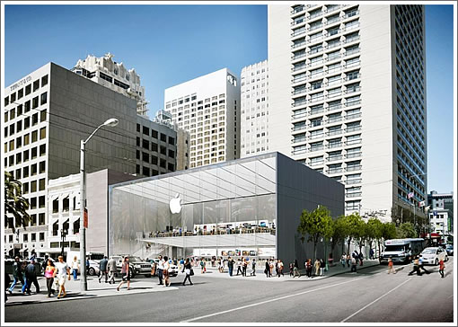
The building design which Apple had originally proposed for the site:

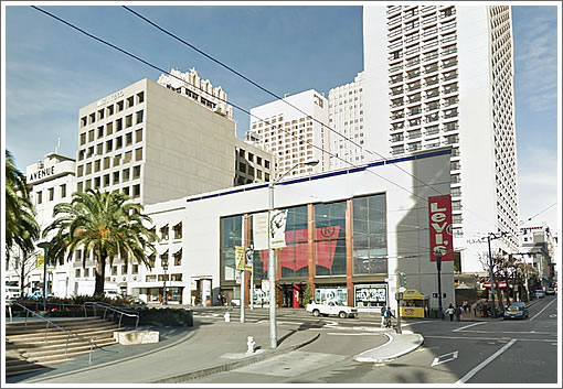
And once again, as the corner currently appears:

∙ Apple’s Plan For A Flagship Store On Union Square [SocketSite]
∙ Apple Store’s new design preserves fountain [SFGate]
This is a great improvement and a nice example of how sometimes pushback against an original ‘perfect’ design can result in something even better. Love the idea of the side window cleaving the building in two. And its great that the Asawa sculpture stays on-site, where it was intended to be.
Only concern might be that it will be harder to control lighting inside the building but I suppose Apple is more confident that the latest generation of displays will be bright enough.
The new nighttime rendering helps obscure the awful slab to the left and the fact that it still doesn’t even meet the roofline of its neighbors.
Still a terrible solution: the all glass box facing Union Square acts like a big open mouth trying to suck you in to the allure of the overpriced plastic products made in China.
The building design respects none of the context and texture of the surrounding area and buildings; shiny and cold (like the late Apple founder?) and can’t even take the steps to align with the building rooftop to the left.
Moving the Asawa fountain slightly is, at least, commendable. The fountain should never be moved from the original “site specific” location.
I was never a fan of the fountain, but with this design, at least it will be noticed. I think most people forgot it was even there until the Apple store controversy.
This is the first time we’ve seen a render from the back side of the project and it shows that the back is also glass. Interesting. The current building is a hot mess of a design disaster and the apple store replacing it not much better. I do wish they would wrap around the glass on stockton street just a little bit to further open up the space on the corner.
I’m not concerned about moving the fountain slightly. Yes, it is “site specific” in that it was designed to be integral to the steps. However, the kitchy hippy-dippy sanfrancisciana of it could go anywhere highly trafficked (particularly by tourists). Great that the designers are taking steps to highlight it…as Etslee says it has been rather forgotten.
I definitely don’t think this is Asawa’s best work, (her wire mobiles are so refined and beautiful compared to this) but I DO think it’s very important to preserve, for it’s historical moment as much (or more)than for its artistic value.
super cool improvement – love it!
(but agree that aligning the roof line is still a miss that should be fixed.)
The Levi’s bldg was pretty fugly and not in keeping with the rest of union square architecture too. So might as well put in a mostly glass box.
Hope this thing ages well. Apple = Microsoft in 2-5 years anyways.
It’d be better if they rotated it 90 degrees so the fountain was on the corner instead of behind the building.
Agreed that more glass should be incorporated into the Stockton side. The rendering at night makes me want to avoid walking on Stockton at a late hour. So uninviting.
In addition to more glass I also wish more can be done with the building in terms of height. Adding another story or two would do the site more justice. Add an Apple cafe on an additional top floor with views of the square.
Looks like the intersection itself’s been modified. The only thing missing is 6 years of central subway construction outside the door.
Better. Add another notch in the building along Stockton and I’ll Like it.
A great instance of asking for 120% of what you want.
What is so hard about putting a lit display window along Stockton Street. At night it still looks foreboding there. A long horizontal display window would do the trick and not compromise the design at all.
No hot dog stand. =-(
I simply don’t want to see a new building that short in this location. Whatever design they settle on, IMHO it needs to be as tall or taller than the rest of the block and it needs to have store fronts or something else interesting (not any form of blank wall) facing Stockton. If Apple can do a totally clear cube on 5th Ave, they can do a totally clear (on all side facing the sidewalk) something on Union Square.
I’m glad architects don’t take feedback from this group. It’s as if we’re in a city full of 1890’s Sears Roebuck architecture.
Oh.
I’m with Toady. Also, nice name.
It needs cornices. Lots of them. Amirite people?
Seeing as an 8′ gap in a 60′ solid surface has been seen as a success by Planning, I’ll reiterate my suggestion from the first proposal:
“Line the Stockton side with very small ground-floor storefronts, say 15’w x 20’d or so. Small showrooms essentially. These would ideally be filled with a rotating cast of up-and-coming start-up/app companies that are involved in the Applesphere.
Win-win.
1. Apple can showcase some of the latest and greatest innovations facilitated by their devices.
2. Gives a Union Square presence for the start-up/pop-up culture so prevalent in SF. As it stands, the casual visitor to Union Square gets no indication that he/she is in the tech capital of the world which also happens to be a hotbed of small and local businesses.
3. The Stockton side is activated, replacing the failed, silent public stairs with a continuous frontage of active retail rather than another blank wall.
Apple wins, the city wins.”
This is how to properly activate a street. Not with one 8′ recessed window. Even according to Rahaim, “This still leaves a 50-foot section of wall that doesn’t have a window, but it is a much stronger piece of architecture.”
Inspiring.
I just hope that “notch” doesn’t become a “urinal”
Sad we even have to think about these kinds of things.
Such an UGLY fountain. Level it already.
UPDATE: Façade For Apple’s Flagship Store Redesigned with 45-foot sliding glass doors that open the store to the street.