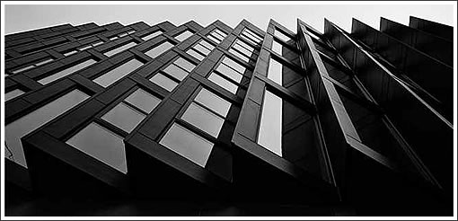
The sales office gallery for the sixteen Stanley Saitowitz designed Dogpatch condos at 616 20th Street is slated to open its doors mid-October. Behind the sawtooth façade, the minimalist units will feature “ultra-modern” finishes and “open-concept” layouts:
A rooftop deck atop the five-story building will provide a communal entertaining area while eleven parking spaces and a commercial space will compose the ground floor.
Hmmmm..”Minimalist and ultramodern” I guess replaceplaces the phrase “Charm free”.
I agree, Mark. It also seemingly means that every entry way MUST open into the kitchen or the dining room. Oh well… I’m not in the market anyway. Just “gritching”!
This building has an imposing front from the outside. I have driven by it several times wondering what it was. It is a typical Saitowitz design – essentially one very large connected room with little wasted space devoted to halls etc.
I am currently looking at this building from my office directly across the street and have watched (and listened) to the construction for about a year. I’m generally a fan of Saitowitzian brutalism, but this thing is like gazing into a black abyss. It’s terrible and steadily getting worse.
Another horrid Saitowitz design. This one looks like a prison!
I’m sure Saitowitz would say that “Charm” in a residence is an outdated, nostalgic concept.
The point, of course, is ego gratification for the architect. Everyone who sees this will know it’s a Saitowitz design even if they hate it, and if it turns out to be difficult to live with, well that’s just tough for everyone other than Stanley Saitowitz.
That said, I’m certain the Dwell-reading crowd will love these, they probably won’t be all that high-priced and they’ll sell briskly.
But God I hope not.
“I agree, Mark. It also seemingly means that every entry way MUST open into the kitchen or the dining room. Oh well… I’m not in the market anyway. Just “gritching”!”
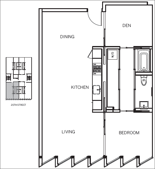
These units are all less than 800 square feet. Having a formal entry way is somewhat of a luxury. I actually really like the floorplan. Very functional. The den off to the side can always double up as a small guest bedroom and there is room for a dining table. My only quibble is that there is only one closet. I like it. What is pricing expected to be?
Saitowitz doesn’t care what anyone thinks about his work. He has no concern for site and neighborhood context.
He doesn’t care, or perhaps has no skills in designing livable, humane, living spaces.
His work is always about one more monument, one more “statement” about him. He likes to shock. He likes to stand out.
Like one more rat warren of a dark prison.
wow when viewed from the left side such as in the second picture, none of the front windows are even visible and it looks like a solid block wall.
I think that is the first time I have read a negative architecture review from futurist! You know the building is a poor design if you have lost futurist who rightly has sympathy for most new projects because of the difficulties getting anything built here.
It appears to be a NSA data center.
The HVAC cage of 555 California has landed.
Hi anonandon: Welcome to SS!
Guess you haven’t been on here before, because if you had you would know my posts more than you imply.
I am supportive of many projects. And I am critical of many projects. Quite often, I reserve judgment simply because the initial info/renderings are not sufficient for me to make design comments.
The difficulties of getting work built here, due to the bureaucracy and narrow-mindedness of the Planning Commission (and plenty of SF residents) has little if anything to do with design quality.
I’ve never liked the work of Saitowitz and I still don’t.
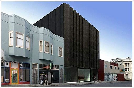
This is an artful building which shows nuanced context as the building bows to the historical industrial shipyard fabrication structures, but also touches on the brand newness of Mission Bay.
A walk on the street and area shows just how well this building marries the amazing Pier 70 buildings with that of new style and construction nearby. These units will be snapped up.
More please!
No sawtooth for the northside units?
I wasn’t sure what to think of this building but reading how much certain regular “plugged in” posters hate it makes me adore it.
yeah, typical socketsite idiots, going on about nothing. great building, fantastic addition to the area, a fantastic break from the pablum developers usually throw up in this town.
In SF if its not familiar / status-quo architecture being proposed, most people get all bent out of shape – as evidenced by most of the comments above.
I feel obliged once again to note (like numerous times before on socketsite): there are many many examples of modern architecture far more progressive than anything here, built in cities all over Europe, often sited right up against (sometimes, radically, on top of) buildings much older, more substantial and more historically relevant than any building in this entire city.
Are the European people in fear of every new building because its not dumbed down to the level of mediocrity? No, they’re more sophisticated about the relationship between old and new – they simply deal with it, or even enjoy the juxtaposition. Here, the closed-minded majority conservatively clings to the past and rejects anything in the built environment that’s not familiar or banal (hence the endless miserable stream of crappy bay window and/or ‘ass-hat’ permutations stuck on 95% of new buildings in SF).
This state of affairs is a sad and dispiriting situation for the art of architecture in SF, but worse, its a regressive rather than progressive cultural attitude…maybe one day it’ll change, but at this rate not for a long long time. This Saitowitz design, though far from being “shocking” (as posited above), at the very least aims well beyond the banality and mediocrity increasingly engulfing us in this city and region at large.
Totally agree with you Citricritter. Having a diversity of buildings and styles makes for an interesting urban landscape. SF is perfect for this style.
Seems pretty simple, a sawtooth front facade, a kind of angled
bay window.
Not that different from Phillip Johnson’s 101 California building,
where it looks solid from one view, and all glass from the other.
And the floor plan seems simple as well. Most remodels or new
flats, the public space is all one big space, like this one. A lot of the people that are buying this type of unit are single, so the den gives you the option of a work area, or a second bedroom.
Nice design with a workable floor plan.
Relax citicritter: We get your rant. Banality and mediocre is not “engulfing” our city.
Yes, there’s plenty of average, boring, banal buildings being built. And diversity of styles is good for our city. But crap like this?
You act like we MUST have this Saitowitz type of prison crap, or nothing else. His work loves to riff on shock value, harshness, screaming out “look at me” without regard for other factors, including context and the human habitant.
Successful architecture is as much about the interior functionality as the exterior expression.
In this project we have entries that slam into a “dining room”, a bathtub in a closet, and angled glazing that still forces the viewer to partially look at the solid edge of the saw tooth profile, laundry in a bedroom closet and a kitchen smaller than in some RV campers.
And so the “front” elevation warrants some design edginess, but (if I am reading the plan correctly) the rear elevation is flat? So much for design substance. It’s all about the façade.
And yes, critics love his work because he’s a “bad boy” of the design world. I can’t wait to hear John King gush over this one.
Pretty nice for a hotel room.
my first reaction to the rending was a big ‘ewww’ and I am usually a fan of Saitowitz work.
But the more I look at the rendering the problem isn’t Saitowitz’s building, although I understand how others could hate on the facade, it’s the total crap buildings next to it.
Saitowitz is certainly not everyone’s taste but this building is so far ahead of the uber bland architecture next to it I find it difficult to actually judge the building on it’s own merits.
Now if you had some better architecture next door the effect would be far more interesting, take the Spertus Institute for example. while the Facade is modern and even harsh, next to it’s peers it blends in more and even shows a wonderful timeline of architectural styles.
Well said, Citicritter. SF is so unoriginal when it comes to new architecture. Seriously, what has been built here in the last 30 years that would be worthy of, say, a postcard? The new De Young and SFMOMA – OK they’re museum buildings, they ought to be remarkable, but what else? Nothing.
I kinda like it. For those that don’t like the windows remember that it is a south facing lot. Those windows will bring in the morning light and only bring in reflected light in the evenings and afternoon. A nice solution to the usual ignorance of light by builders intent on throwing huge windows on every surface.
At the very least this is a far better building than the one the Isis Restaurant was in. Now that was an ugly building.
After looking at the street scape here I can see another reason aside from light to orient the windows this way – the building across the street is awful to look at. These windows give some privacy as well as a much nicer view across Illinois to the old brick warehouses.
For those crying about him not caring about the setting, perhaps you are looking at it from the wrong angle (Outside vs. Inside).
Some of the projects futurist defends makes me question his taste and professional opinions. The project on Howard and 6th comes to mind.
Well, sure: don’t we all question others tastes and opinions here?
What’s the problem?
I don’t like it, I think it is ugly and looms over the adjacent buildings with too dark a presence. Maybe it looks better from the inside, I don’t know. If it does, I will like it a little bit but still wouldn’t want to live across the street from it.
I am very glad to see something interesting and controversial built though. I am kind of astonished that it got built at all in this most NIMBY of cities.
BTW, the built design is actually different than the rendering shown above – the windows tilt toward the bay (relative to the street), and the black ‘fins’ are perpendicular to the street/facade. The result is that its a bit more transparent…
And yes, this facade is a kind of play on bay windows, but in an abstract rather than literal manner…
Onan – “Those windows will bring in the morning light and only bring in reflected light in the evenings and afternoon.”
– Not much reflected light off the dark solid surfaces made of metal panels(?), concrete(?), stone (?).
The real problem is in the floor plans. There is one source of natural light (either the north or south elevations). To get any natural light in the den (if even possible), one has to keep the sliding door open. Granted, by definition a den is “a wild animal’s lair or habitation” or “a small, comfortable room in a house where a person can pursue an activity in private,” so keeping the door closed may be preferable.
The closet tub/shower is impractical. Who wants to step out of a shower or bath and be in the closet dripping wet?
If you look at Saitowitz’s illustration of the interior space, one can almost feel the claustrophobic quality of the space (even with the natural light) and understand why one should not put any furniture into the space. Saitowitz’s architecture has a sterile quality to it that only minimalists can love. There is no romanticism with objects, materials, or people.
In the Saitowitz’s own words in describing the Shaw Residence (1113 Green St), “Serene, reflective and empty, the house provides a peaceful refuge in the city.”
I do not understand how they can give floor plans to a condo they are selling without giving the dimensions ! Isn’t that important for a potential buyer to know? “Will my bed fit? Will my dresser fit?” How much square footage am I purchasing? These are basic details that the “New” real estate business has decided to no longer share. Well, when you are selling the Emperor’s New Clothes, it must be truly hard to take any honest measurements.