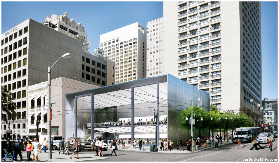
The Post Street façade for Apple’s proposed flagship store on Union Square has been redesigned by Foster + Partners to feature two full-height sliding glass doors, each measuring 23 feet wide and 44.5 feet tall, allowing the store to be opened to the street.

When closed, the columns of the steel-framed doors would divide the façade into four discrete glass bays of 23 to 31 feet each. A six-bay design was also rendered, but the four-bay design above is Apple’s preferred execution. Click images to enlarge.

How green is that when the store will be air conditioned 24/7. Also, the Stockton side is still dark and uninviting.
Good thing there are no pigeons in Union Square…
While I applaud the bold lines, abundant glass and open floor plan of this building, I am not sure this would blend well with the area. It doesn’t appear that it would compliment the other store fronts around Union Square. I find it a little jarring. But maybe that is the point?
It will be for Apple what Tiffany has at 57th Street & Fifth, NYC.
Striking and soon to be world famous.
It will “blend” better than the already lackluster Levi’s or the nuclear bunker of a store that Saks has on the opposite side of the block.
Interesting but impractical. If it was some place other than San Francisco, where the weather is better it would be fantastic but I can’t see those “doors” open during a rain/wind storm or when it’s really cold outside.
I don’t get the point of this.
A thieves paradise.
What exactly is wrong with the existing store on Stockton? Too small?
A large part of the Apple mystique is based on image and a showplace is needed to further this image.
Build it! But the pigeons issue seems like valid one – maybe they’ll have invisible pigeon repelling lightrays or soundwaves or something…
While an interesting engineering feat, seems wholly impractical for too may reasons to list. Mainly weather related. If this were in Santa Monica or a warmer climate this could be more practicle. In San Francisco it is just too cold and windy most of the time.
Do they intend to keep this store open 24/7?
Also, seems like too many opportunities for “Windows” jokes.
It’s the same building as before, but they added a gimmick! I assume the next iteration will have pastel plastic sides.
Looks great
A real standout
Who ever was whining about this not fitting it – That’s exactly the point….ANd if STeve Jobs wanted to fit in – Apple would never have been….
As for the ‘Windows” in this cold climate – get a clue….howe do glass towers get built in Moscow or Olso….?
Dumb & Dumber
@MDG: Uh, we’re not talking about glass towers. We’re talking about 40+ foot sliding glass doors which will be constantly open to the SF elements. Also, we’re not asking for cookie cutter architecture here…we’re looking for a design that’s unique, yet practical and fitting with its surroundings.
Dumbest.
UPDATE: Another set of renderings for the redesigned facade. And to be clear, the primary entrance to the store would be two sets of regular sized doors in the non-sliding bays and the sliding doors would not be opened in inclement weather.
And I vote for a new version of Godwin’s law – any argument mentioning Steve Jobs with respect to anything Apple’s doing today (he’s been dead 2 1/2 years!) automatically loses.
I’d vote against that Sierrajeff, The design of the new, circular 2.8-million ft.² “iCon” building designed by Foster + Partners was driven by Steve Jobs’ vision, and although —as you mentioned— he’s been dead for a bit, it still will represent a legacy project for him because he started it and championed it at the beginning of the planning process until he couldn’t do it anymore.
The current executives of Apple and the Board of Directors could have abandoned the project and decided to rent more existing commercial buildings in and around Cupertino. The don’t dare do that because they want to honor Steve’s legacy and they aren’t hurting for money.
@Brahma – uh, OK… but this post isn’t about the spaceship campus. This post is about a new retail store in Union Square.
I expect lots of bird deaths, since the façade will be reflecting all the greenery in Union Square.
Rain/Wind? Pigeons? Just two things that will make this very impractical…I like the open feel but how is this going to work?