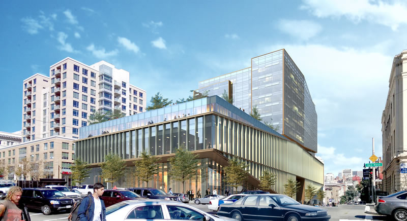
While the bold design for the proposed 13-story building to rise at 1200 Van Ness Avenue remains under review and is likely to be refined, with Planning “supporting” an integration of the existing building on site and a shift of the tower mass towards Van Ness, the development team has changed the plan for what’s proposed to rise under the skin.
In addition to increasing the number of proposed residential units from 84 to 135, the revised plan includes the potential for a 25,000-square foot grocery, which would be large enough for a full-service store.
The proposed Medical Office Building component of the development remains the same, while the plan for the underground garage now includes parking for 357 cars, up from 339 as originally proposed.
Still seems like all the best design and architecture is reserved for the North/West side of the city for whatever reason. Why don’t they do stuff like this in SoMa and Mission Bay?!?!
because SOMA is the dumping ground for anything that cannot “fly” in other parts of the city!
I hope this design doesn’t get value engineered away. I’d definitely love another grocery store in the neighborhood as well.
Well, very unfortunately, the entire design concept is likely to be revised. Dunno why. I love the proposed structure.
You don’t like stucco?
Come on guys; jack up the height; we need housing; Van Ness can easily handle 20 stories, lower it is as it goes towards Polk.
The site is zoned for development up to 130-feet in height, the height of the proposed building above.
If they can increase the approved height at the goodwill site from 320 to over 400, then surely they can increase the height here!
Increasing the height anywhere in the city requires a legislative change and is always a very contentious process. There were not as many NIMBYs immediately around the Goodwill site, and the height increase was part of a larger rezoning that took some years to implement.
“Spot zoning” is much more likely to be challenged in court. Also, this site on Van Ness has neighbors that are more likely to sue.
Inadequate only meager height width of Van Ness taller building bring justice. High density zoned for 60 or 80fl great with views successful introduction new concepts. Near Polk and Van Ness guess NIMBY somewhere in the neighborhood!
Glad to welcome another grocery store to the neighborhood.
“bold”, LOL. That design was pretty hotly debated the last time around… and I for one hope it goes away. Hate that podium. The tower’s fine, but the podium’s got to go.
I agree with Sierrajeff that the podium is very oppressive and does not make for a good pedestrian streetscape on Post.
To the contrary, it would present extreme transparency of the interior to the street. See absolutely no reason to retain the existing building.
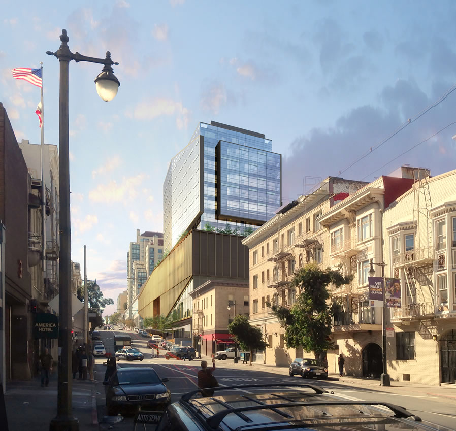
I’m not worried so much about the Van Ness side. I’d like to see a render of the Post Street side. From what I can make out it’s too horizontal and doesn’t connect well with the sidewalk. I’m not trying to argue for preserving the existing building.
Grocery store is very badly needed here. Closest store is Whole Foods or TJs several blocks north, or Market Square several blocks south.
FWIW – very little I suppose but here goes: there were some Q’s about the history of the existing building, which never really got answered, or ended up deleted, from the earlier stories. Built in 1911 for the H. O. Harrison Co (they sold Hudsons) (go to pp 21) and looking largely unaltered in the 50’s.
Looks like the windows were modified; other than that it was – and is – a very “utilitarian” building.
Wow, good looking development in an interesting neighborhood. SHould be a good one.
Agree about the podium. Is it a satellite Moscone convention center? Very brutal for the street experience…
Maybe you would prefer some of Dave’s shrubbery at the streetwall line.
It’s not about shrubbery, it’s about granularity and permeability. Granularity means having some changes every 25 feet or so instead of the same thing for the entire long block. Permeability means having multiple entrances instead of one grand entrance in the center. I don’t know whether they’re proposing office space or retail along the Post Street sidewalk, but it looks like the former, which does not create a pleasant pedestrian environment.
Much more distinct rendering of the Post St. elevation among those at the architect’s website.
I honestly don’t get the hate for the podium. It isn’t significantly taller than the existing building on the site, so it doesn’t really have any different massing: the only difference is that it’s more horizontally-oriented than punctuated vertically with windows. If anything, the dip and subsequent rise along Post looks more interesting than what is currently there.
Thanks for the link, Orland. The perspective on the photoshopping of the render onto the photo looks off. I also can’t figure out the sidewalk. It looks like it’s only two feet wide and then there’s a pony wall? I also don’t get where the overhang is. Is it over the sidewalk like one giant bay window? The Post Street render also really brings out the gold color. Was Trump on the design team?
But yes, the problem is that it’s “more horizontally-oriented”. Given that it’s 300 or 400 feet long along Post, that creates a problem.
In any case, that’s something easily fixed without incorporating the existing building or changing the interior layout.
i love the idea of a grocery store and I like the design.
The parking podium in the 2nd rendering does kind of make it look like the old Jack Tar though…
The American Flag waving in the 2nd rendering just makes me want to salute! Going forward, Childe Hassam should do all the renders for every project.
I don’t like the base myself. It reminds me of a nuclear power plant: Diablo. I’d do something to break down the scale of the base’s mass. It looks totally out of place and cries for human scale. As is, it’d be like coming home to a colossal casket; maybe the building could house “Casket Groceries” “If the design doesn’t kill you our prices will: We guarantee it!”
UPDATE: Refined Designs and Momentum for a Bold Van Ness Development