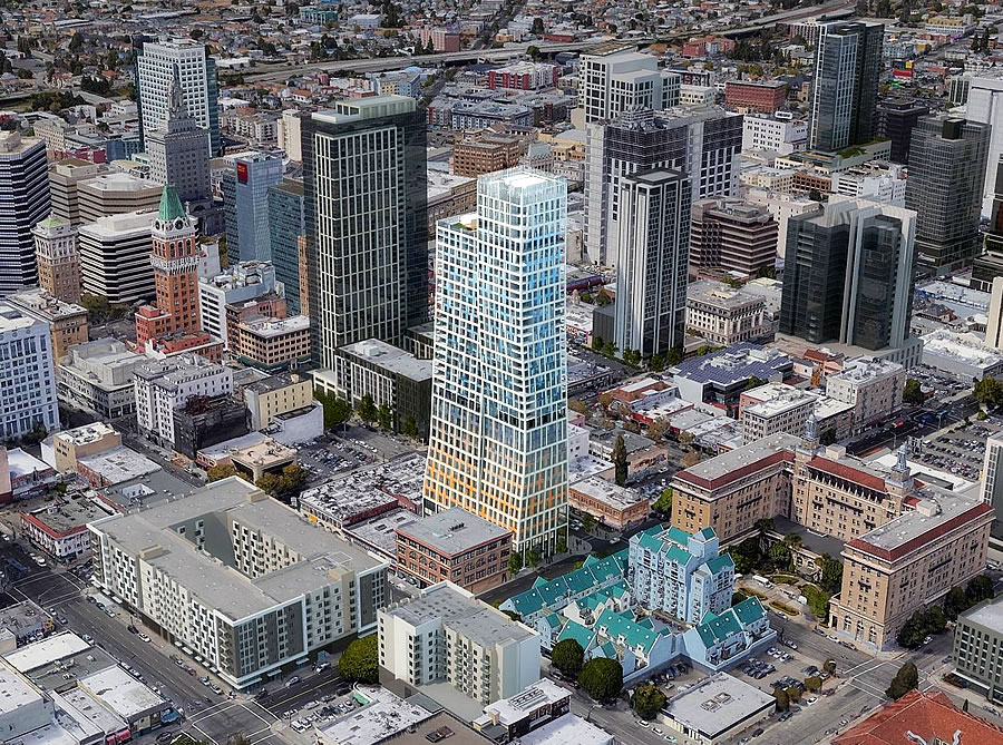
As we first reported earlier this year, with Oakland’s Planning Commission having formally rejected the plans for a proposed 460-foot-tall, and seemingly split, tower to rise on the historic King Block in Downtown Oakland, a move which shouldn’t have caught any plugged-in readers by surprise, the project team has been working on a new approach/plan for the site (as we first reported last year as well).
And having presented a series of alternative massing scenarios for the potential redevelopment of the block to the City’s Landmarks Preservation Advisory Board, all of which had incorporated the façade of the existing building on the historic site into their plans for a new tower, the preferred gridded approach has been further refined as newly rendered below and slated to be presented to the City next week.
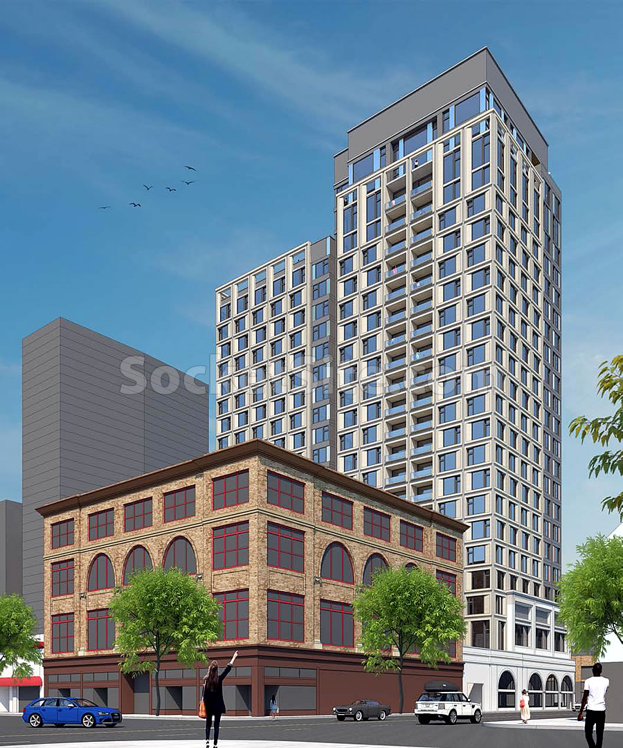
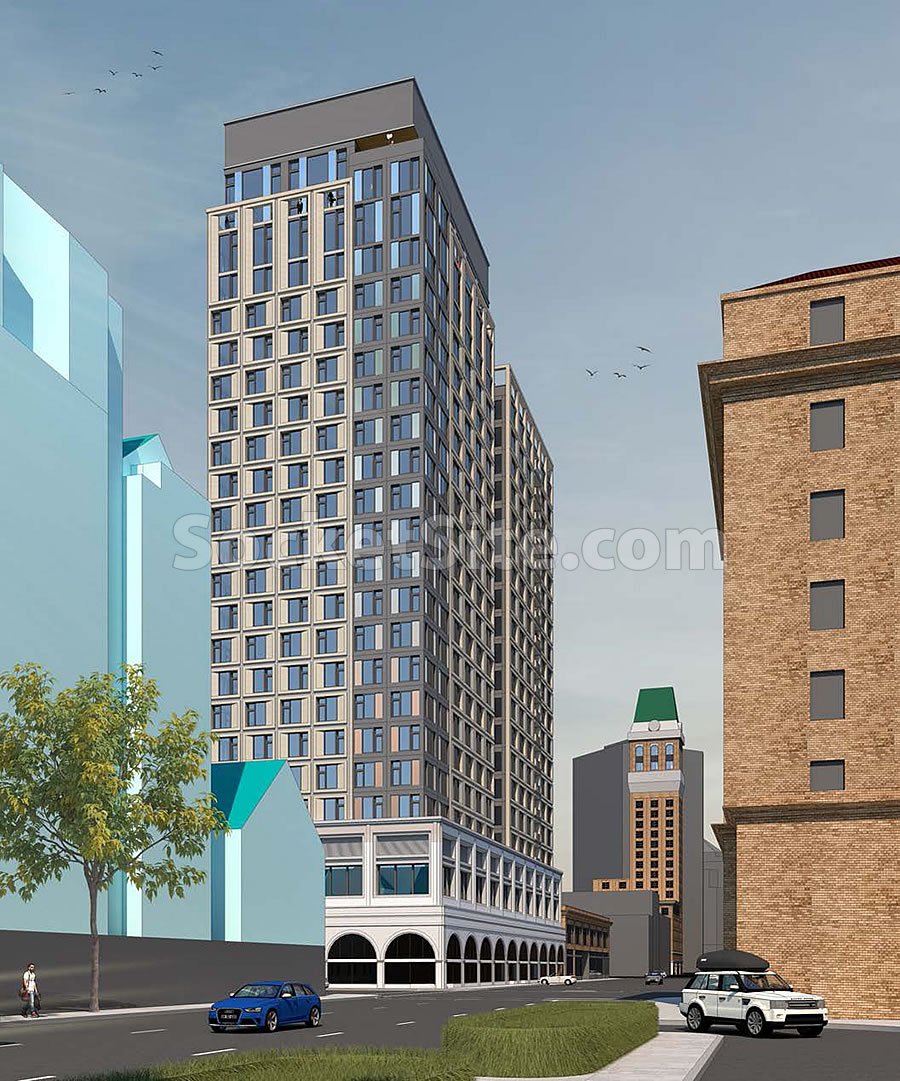
The revised design for the 1261 Harrison Street tower would only rise up to 250 feet in height, which is still higher than the height for which the parcel is principally zoned but for which a conditional use permit and density bonus, versus special waiver, would be employed and could yield up to 185 units of housing over a ground floor market and retail space as well.
We’ll keep you posted and plugged-in.
More small-town thinking, typical of the Bay Area (INCLUDING SF).
Yeah, let’s build less, so we can make living and doing business here much more expensive…so we can accelerate displacement. Smart thinking activists.
If I can interrupt the bleating of the density crowd for some actual comment on the project: the lower floor window configuration now seems to mimic the other corner of the block at 12/Webster (large rectangular second floor windows over an arcade)…was that deliberate? And if so, then nice – i guess…or at lest some thought was involved – but why not carry it to the end of the Harrison frontage? This approach just makes it look tacked on.
Nice. This saves the facade of the historic block and is definitely much better than the previous itertion. I think it’s a really effective compromise.
Looks generic and blah. I much preferred the original, modern design. Historic preservationists are turning the whole Bay Area into a stuffy museum for themselves, and I wish they’d get a new hobby.
And as a cherry on top, now this bad design will fuel anti-development attitudes by providing more evidence that “new buildings all look boxy and the same.” It’s an Ouroboros of architectural stagnation.
I too preferred the original, creative design. This one is OK, but nothing exciting like the first one.
“Exciting,” or just ugly and obtrusive?
Topsy-turvy, angular designs (like the original) are all the rage these days. This, too, shall pass.
Hate to say it, but the original design was so much better. This innovative design was dumped in the blender and now looks like just another high-rise. Downtown Oakland is hot real-estate right now, but won’t be forever. The city fathers and mothers who oversee development should err on the side of creativity and not homogeneity. This window will close soon and if City Planning doesn’t act, it will get nothing. Just drive around the neighborhood and check out all the vacant lots and empty store fronts. Not a happy sight.
if you look at architecture history of the world… EVERY single design idea is a trend that passes…
That design wasn’t innovative; it’s an ungainly insult to its surroundings — a freak show. It isn’t even all that original: if you think so, you can go gawk at “Fred and Ginger” in Prague.
Picking up the arched windows from the historic structure next door, the new design respects its “uniquely Oakland” context — far better than a flashy, second-rate eyesore that screams “inferiority complex.”
Is it going to clean up the blight from that horrible block and have Range Rovers and Austin Martins driving around town? It’s fine with me.
The original design may have not been that elegant, but putting highrise residential in the urban core near a BART station is a no-brainer. I have wished Oakland could get a few taller signature towers for years, especially residential.
There is nothing horrible about that block or the surrounding 2 or 3 blocks. It’s a pretty nice part of downtown that Chinatown is fading into downtown area.
Reply fail. That’s for the post above.
Everyone that looks at all the new construction and asks why it’s all so boring and generic… You can thank your local planning office for torpedoing anything that isn’t a bland beige-and-grey rectangle. One can only imagine how vibrant and interesting the cityscape would be if we didn’t have those provincial milquetoasts holding us back!
The sign of a “provincial” is an inability to appreciate a city unless there’s something blaring and obtrusive to spice it up.
There’s not a city in the world that doesn’t consist mostly of generic architecture (what constitutes generic varies by region). Not everything needs to be an icon, or even particularly unique.
“Vibrant” is to articles on urban planning as “slurp” is to ramen reviews. Talk about predictability and lack of imagination!
Very unfortunate that the building was reduced in height. That being said, I think the arches on the lowest floor look a bit silly, closed off and out of place for the proposed building. Would prefer a taller first floor, more open and with a more inviting appeal to the street front. And the crown on the building? Cut it off – totally lacking in grace – clunky and insipid.
The Oakland Planning Department is a joke. They have completely missed the building boom through horrible bureaucratic handwringing and their attempts to ‘design by committee’ this and every other project in Oakland results in flaccid, boring, poor quality, generic, offensive and drab crap like this. What a horrible forced redesign. Shame on you Oakland for pushing this poor quality crap down our throats, not everyone wants beige, old, out of touch, boring old rich white person type of design.
Completely!*
*other than the several dozen major projects under construction or already completed.
Oakland is probably the most developer-friendly planning department in the inner Bay Area (compare Oakland, where you can go from conceptual design to certificate of occupancy in 3 years or less to Berkeley or SF, where it can take an average of 3 years just to go through planning). Oakland is on track to build more units than S.F. this year.
I don’t know about this facadist architecture (we already have this on two under construction projects in Broadway Auto Row), but we need the housing and this part of DTO could use some investment. In terms of architectural homogeneity, DTO will always have a great mix due to the many 1920s and 1930s buildings lining its streets.
Actually I think the award – if that be the right term – goes to Emeryville, whose approval process would probably be measured in hours if it weren’t for a high degree of citizen blowback. And of course Oakland is trying to avoid being another – and larger – Emeryville, which bulldozed much of its (already small) stock of potentially useful older buildings for colorful pasteboard c$%^.
The prrevious design was better — better skyline silhouette and better at the street level.
The Planning Department is not at fault here — the fault lies, first and foremost, with the Landmarks Preservation Advisory Board; followed by the Planning Commission.
Lame.
The original design was exciting and interesting. The revised submission is unimaginative, cheap-looking, and inadequate (high towers adjacent to transit centers are the most logical place to build them) for housing pressures. And how long do you think the squat, 4 story brick building is going to last? Anyone who is paying attention to urban development in Bay Area cities (apparently not Oakland’s Planning Commission) knows the clock’s tickin’ on those 3 and 4 story buildings staying around much longer. Earlier poster was correct in stating Oakland’s departments at least move projects along. Berkeley is so much worse that most construction professionals refuse to work in Berkeley anymore. It’s a sanity thing.
Oakland needs residential high-rises making “bold” statements similar to 2201 Valley St.
UPDATE: Rejected Oakland Tower Take Two Déjà Vu