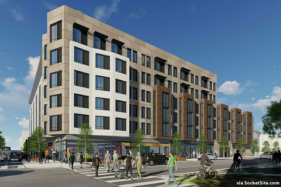
In the works since mid-2015, plans to level the Divisadero Touchless Carwash and Roy’s Shell station on the corner of Divisadero and Oak and develop a six-story building upon the 41,000-square-foot site could be approved by San Francisco’s Planning Commission next week.
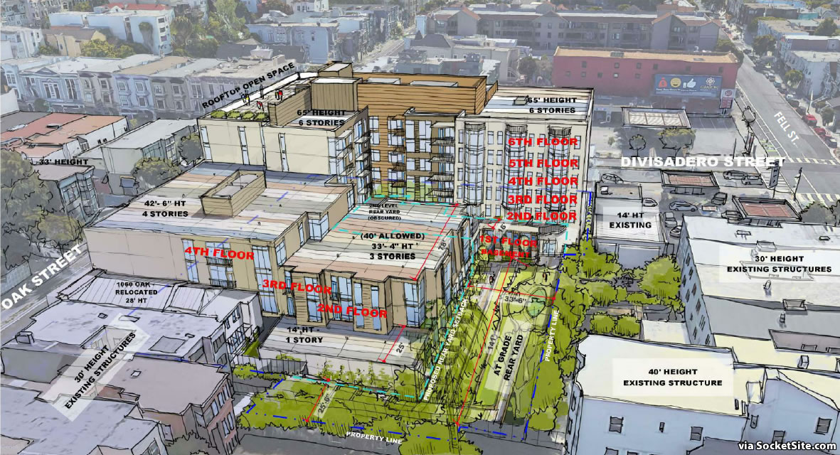
In addition to leveling the corner Shell station and car wash, the proposed development includes razing the existing residential buildings at 1048-1052 Oak and moving the two-story Victorian at 1060 Oak Street fifty feet to the east in order to provide more room for the project which would rise up to 65 feet in height, stepping down to 4 stories along Oak, with a 5,800-square-foot courtyard behind the building, a 3,600 square foot terrace on the second floor and 7,100 square feet of open space for building residents on its roof.
As proposed, the refined plans would yield 184 apartments (a mix of 89 studios, 21 one-bedrooms and 74 twos), of which 37 are slated to be offered at below market rates (BMR); stacked parking for 57 cars (including one car share space) and 170 bikes; and 8,100 square feet of commercial/retail space fronting (mainly) Divisadero and Oak, space which could be divided to accommodate up to 10 individual tenants.
While Planning has received six letters in opposition to the project (citing expected adverse effects on existing infrastructure and the existing neighborhood character, as well as increased traffic and congestion, along with decreased pedestrian safety and a need for higher levels of affordable homes, not to mention greater “benefits to existing Divisadero area residents”), it has also received 122 letters in support (including 25 letters from merchants, 8 letters from neighborhood organizations and form letters containing 89 signatures).
With all that in mind, San Francisco’s Planning Department has deemed the development “necessary, desirable, and compatible with the surrounding neighborhood” and is recommending its approval next week. But we’ll note, permits for the project have yet to be requested. And once again, here’s the site specific answer to “How Much Gas Does a Gas Station Pump in San Francisco?”
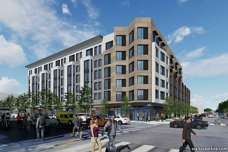
This is my neighborhood and I’m stoked for new neighbors instead of a gas station. That said… the design of the building is pretty lame. It’s like they couldn’t decide on a single bland theme, so they mushed (at least) three together.
Agree. Love that this space will be developed but why so ugly? This type of pedestrian design is ubiquitous in SF. Is it the only type of build that pencils out?
Agree. But I guess it’s better than a gas station.
The other big issue with this was how long it took. Four years? I don’t understand why we can’t get the parties together and negotiate density and affordable requirements in a few months. How does taking four years to do this help create a better outcome? In that time, I’ve lost several close friends in this neighborhood due to affordability.
Finally, what are the chances that middle income folks can get the “affordable” units? 1 in 100? 1 in 1000?
Blandtastic.
I’m all for building up and maxing out height limits, but something about a six story building there seems like too much height. The tallest buildings on the other three corners are half that height. It could also be just because Divis is a fairly narrow street given the pedestrian and car traffic it gets.
But hey…184 units of housing is amazing.
It seems like a lot of height, but there’s a 7 story apartment building just a few blocks north. Quite a few of the older Victorian structures are probably close to 60ft in height even though they’re only 3-4 stories. If we built in accordance to what was (or is, for that matter) the city would be fields, sand dunes, and marshes.
What is this, a war on ‘Touchless’ Car Washes?? I demand an investigation of possible collusion!
Ahhh to cash out and retire…
It was a good car wash, may it rest in peace.
A good car wash whose employees steal money and other personal belongings that are left in the car. I didn’t realize until later.
The reason this building and many others in San Francisco are ugly is simply that architectural excellence and taste are rare commodities, and beauty is not the most important factor in the mind of developers. As long as the market does not distinguish, the cheaper but acceptable design is preferred. At this prominent location, it is unfortunate, a missed opportunity for something fine.
NoPa? EaPa. Alamo Square. Lower Haight. But no NoPa.
Yes, I have always wondered how a neighborhood that is actually 3 blocks east of the easternmost end of the Panhandle could be called NOrth of the PAnhandle. A realtor waves her/his magic wand and presto…
When I worked at the paint store at Divis/Oak in the late 80’s/early 90’s we called it the Lower Haight. And before it was NOPA the area North of the Panhandle was simply the Haight.
Ahhh, the magical powers that realtors have. They can make prices go up or down, they can rename neighborhoods, they are responsible for the lack of affordability, anything else?
Don’t forget, SF Residential Design “Guidelines” end up determining a good deal of that, rather than the developer/architect.
This project seems good, except for the design. What an absolutely atrocious building design? Simply awful. Why don’t we insist on good architecture? Isn’t San Francisco supposed to be a world class city or something?
It kinda looks like some dreck they would build in Union City or South Hayward.
How is this still not approved? It’s been in the works so long, it was an issue in London Breed’s re-election campaign for supervisor three years ago. Her opponent said she should have demanded more BMR units, and in response to the pressure, the project was delayed while the City figured out how it could legally do that. Now it’s 20% BMR, hooray, and in the three years it took to do this… how many people have been displaced from the city? This process is ridiculous.
It would look better twice as tall, and yes, the architecture is a bit generic. But at this point, just approve the thing. Let’s get it done.
Though I generally agree that this design could have been pushed a little further, it’s far, far more contextual and [hesitant to say] refined than any of the previous designs.
I dont know why it bothers me so much. Maybe its because SS watermarks other peoples images and never links to their sources. Here’s the project site for better context and design thinking. It does a much better job explaining the evolution of the design and their consideration for neighborhood context.
WHYYY are all these new buildings using that awful Hoardi Reveal pressed-particle board siding system? They look awful in a few years when the colors fade out and are even worse looking when they start to crack and split. CHEAP CHEAP CHEAP.
Agree that the design could be improved, or better yet, redone. What would David Baker do? Well, probably add more balconies and a nicer entrance area, improve the detailing, give it some nicer landscaping, a roof patio with garden plots, and maybe zero parking.
I wish the developer could have included the crappy gas station on Fell and Divisadero as well. That one is a pain. Cars constantly blocking sidewalks, bike lane, threatening pedestrians as they jockey to save a few cents per gallon.
I hope both the residential and commercial units get a going over. This could be a great project.
all in all, this is a good project and the developer folks have engaged at many levels for a long time with the neighborhood. The car wash and giant blob of asphalt separates diviz and lower haight – this is a big help. more people living here is a good thing
UPDATE: Permits for Major NoPa Redevelopment Close to Being Secured