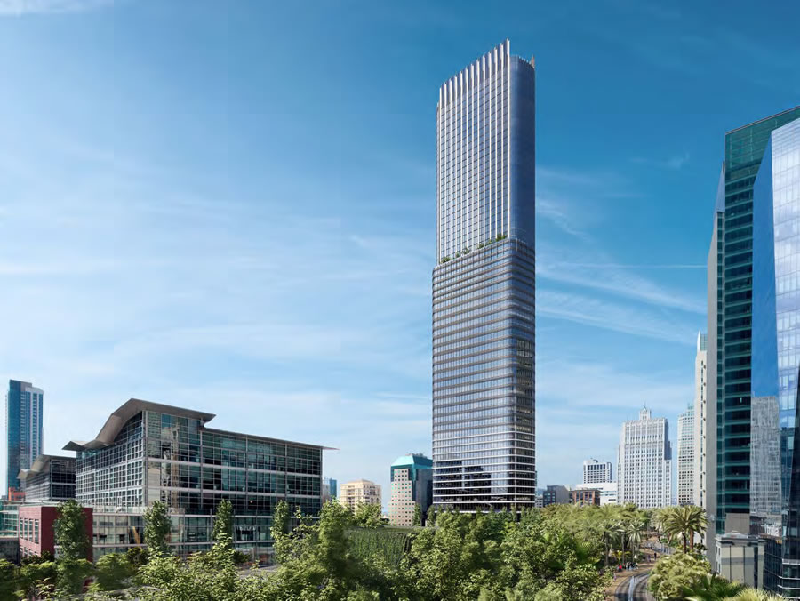
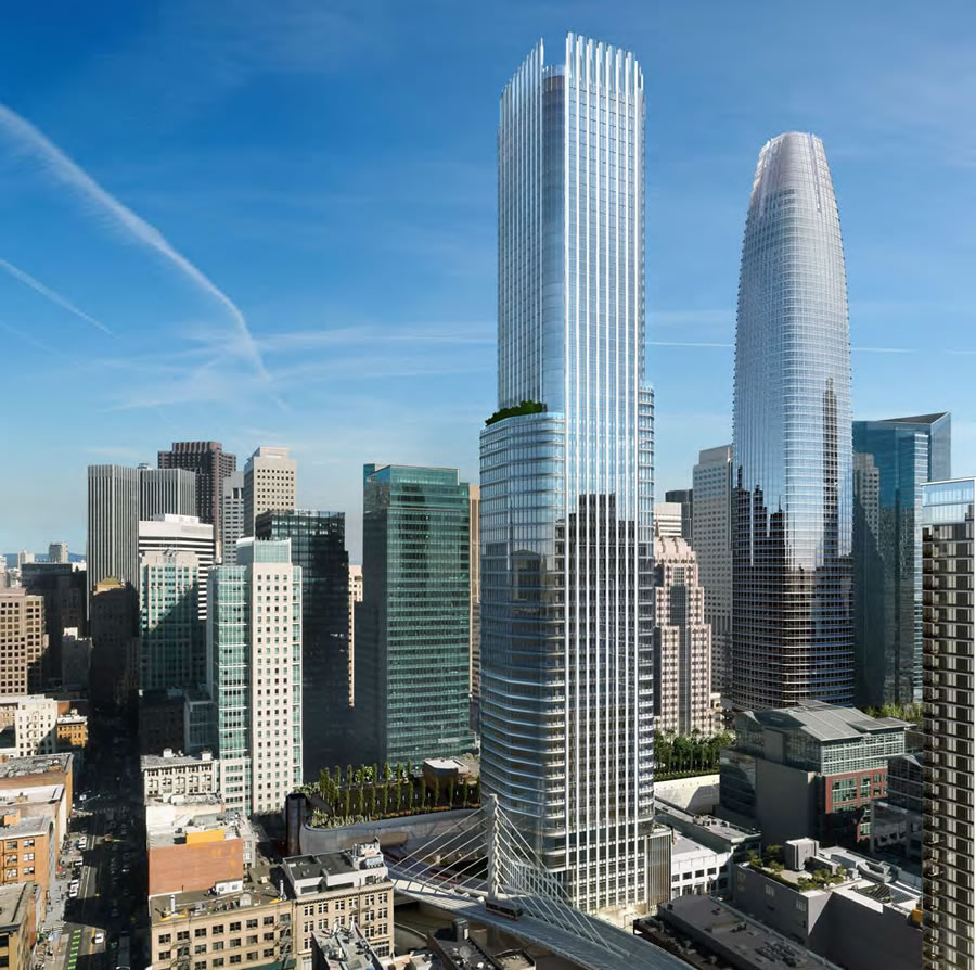
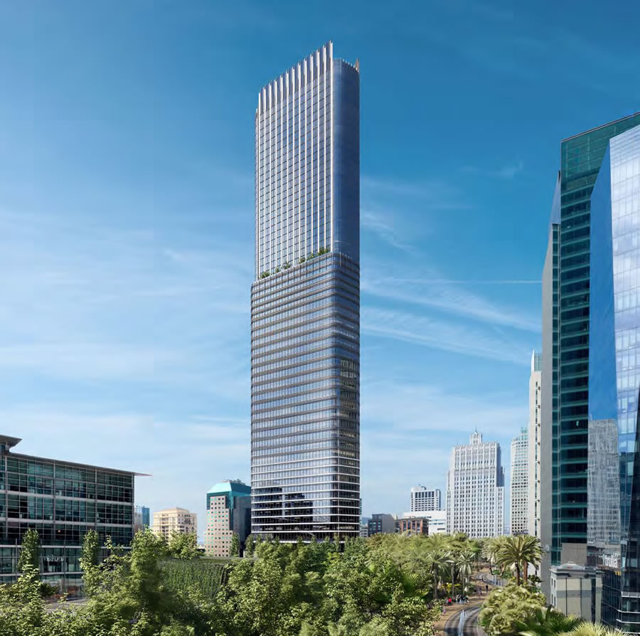
The proposed 64-story tower to rise at 550 Howard Street, on Transbay Parcel F, would reach a height of 806 feet as proposed, making it the fourth tallest tower in San Francisco, behind the Salesforce/Transbay Tower, the future Oceanwide tower at 50 First Street, and San Francisco’s iconic Transamerica Pyramid building.
As designed by Pelli Clark Pelli with HKS for the “F4” development team, 200 condos would be spread across the top 27 floors of the 550 Howard Street tower, with 16 floors (287,000 square feet) of office space and a 250-room hotel below.
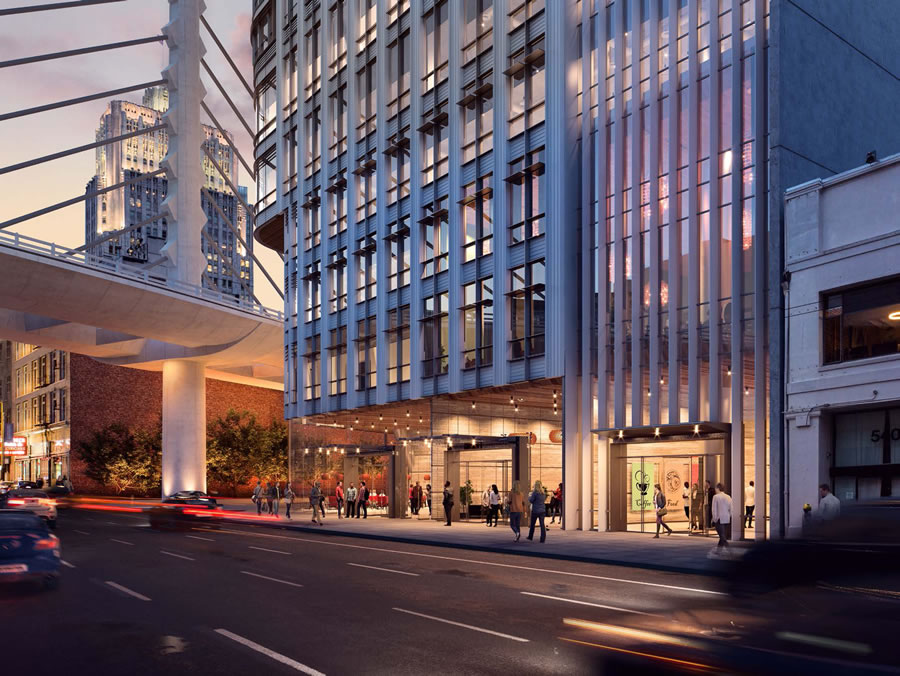
The building’s office and residential lobbies, along with a passageway and café space, would front Howard.
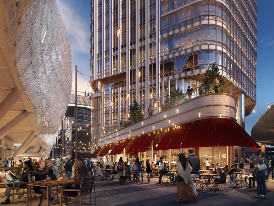
And as proposed, Natoma would be be dead-ended on either side of the new tower and turned into a pedestrian alley, with ground floor retail on either side of the street and a fifth floor pedestrian bridge between the tower and adjacent 5.4-acre City Park atop the Transbay Transit Center.
While recently refined by Pelli Clark Pelli, and San Francisco’s Planning Department is on the record as appreciating the solidity of the proposed tower design, according to Planning’s preliminary feedback to the project team: “As one of the four largest towers in the city, however, the Department recommends that the [tower’s] massing be more gently and iconically-shaped.”
And in the eyes of Planning, while the tower’s asymmetry and steps “might work as a formal strategy if repeated; as they only occur once within the most visible height of the tower, they seem episodic and less architecturally intentional.”
We’ll keep you posted and plugged-in as the design and approvals for 550 Howard progress.
Every bit as unimpressive and uninspiring as the Salesforce Tower. Two missed opportunities. I was in Jacksonville recently and a few of their newer towers show more imagination than this.
Planning is spot-on about the single asymmetrical setback and the less than iconic shape.
I like the double deck over looking the plaza.
I sorta agree it’s a bit boring, but I still say build it!
As for rankings of the new tallest towers (and old) here is my list from best to worst.
1. Transamerica – can’t beat an old original classic for its time
2. Oceanwide (aka dr claw HQ) – this tower is gonna be cool.
3. 181 Fremont. – Breaks the blandness of sf towers with some (gasp) diagonal lines and planes…wow! How creative.
4. Transbay tower (best name), I mean salesforce tower. – I like this one but man it coulda been so much better. And you can’t deny the phallic relation…
5. This tower in the article – Not too notable but kinda cool and slender in a rectangular way. Overall it kinda sux/boring though but yes they should build it!
6. Old BofA tower – An old classic but kinda bleh now, just like most of these will be in 30 years!
Why can’t cities get more bold and green, much more green, in thier designs!
I’m afraid you lost all credibility when you listed Transamerica as #1. The ONLY place Transamerica looks good is on the skyline. In all other respects, IMO, it is a terrible building. Awful at the street level. Questionable floor plates from a planning perspective, and increasingly in the wrong location.
I’m afraid I had trouble getting past boasting about Jacksonville’s skyline. Seriously, everyone, google “Jacksonville skyline” and have a gander.
Just did, and it’s as boring and unattractive (doesn’t really merit an “ugly”) as I remember it. Made me want never to go back.
‘Increasingly in the wrong location’
What does that mean?
Perhaps he is suggesting that businesses are moving in a southerly direction…Salesforce Tower, 181Fremont, Park Tower…you know, “The New Center.”
Increasingly means “more and more”.
Stated differently: More and more, the corner of Montgomery and Clay is less of a preferred business location. That is, of course, Just My Opinion.
Hope that is helpful.
Ok, but that seems a weird way of putting things. It’s not like the Transamerica Building can move. When constructed, it was in a fine location.
Yes – at the time it was built, the presumption was that the Financial District would continue to grow north – SoMa was for industry and warehouses and the like. Even the “inroad” of the Moscone Center into SoMa didn’t happen until the latter part of the 1970s and early 1980s.
Also, the Transamerica Pyramid would be *less* out of place if reasonable projects such as 8 Washington and the [forget the name – ed.?] curvy condo tower next to Redwood Park had been approved…
City: shoots self in foot, then complains that it has a limp…
[Editor’s Note: 555 Washington’s EIR Certification Reversed.]
Must definitely be among the “newer.” I was through Jacksonville in 2014 and was moved to comment it was the most unattractive American downtown skyline I had ever seen.
Now that is one good looking tower.
“massing be more gently and iconically-shaped… seem episodic and less architecturally intentional”
The Oracle speaks.
I hope planning is aware that they totally screwed up with the Transbay Tower. Why on earth did they take 3-designs, no opportunity for feedback or refinements, and pick the least provocative option.
IMO SF needs another 1100+ ft tower to take attention away from the bland, phallic Salesforce Tower.
[Editor’s Note: Hines And Pelli Clarke Pelli Bid The Most (And Get The Transbay Nod).]
agree, too bad we don’t have the ability to allow for a public option/vote/review of these monstrosities especially ones without any real defining features, bland obelisks… except the café scenes and view decks that will not work.
See most of SF which is turning into telecom store-fronts, and banks…. we are losing the urban, and becoming mall-taxed
Personally, I am loving the shape of Transbay. I can see it out my window and have been really impressed with the silhouette as it rises (as well as 181 Fremont). The cladding and crown will either seal the deal or ruin it, but so far I quite like it and am glad we went for a simpler, more elegant/refined shape.
Simple: Park. All they had to do to win the competition was throw in a park on the top of the terminal! Instant win with SF voters.
The SOM proposal was far superior.
This building looks fabulous.
agree. this is beautiful
Planning should allow another 100 ft for aesthetic effects. Maybe a nice spire or a crown that doesn’t look like a mushroom head.
The closure of Natoma and turning it into a retail area is a nice touch. The design is bold and very elegant.
Everyone I know (I’ve lived here 30 years — so I pretty much know everybody) avoids that whole area of SOMA except to swing by MOMA, a few restaurants and occasionally a show at the Yerba Buena. Its awful. Dystopian, bereft of character, lifeless and an endless traffic nightmare. Its just astonishing that we let developer money ruin what was left of the Paris of the West. Astonishing but knowing the players, not surprising.
Which is weird because I know so many people who hang around that area all the time. If no one goes there, why is it so crowded?
How exactly was the city ruined by developing this area into a modern downtown extension? To me it appears to allow the city to grow and modernize without infringing on the classic neighborhoods that contribute to our European reputation.
Good point. Most of SF is more suburban so it is nice to have some diversity with a centralized urban area. Gives people more options on how they choose to live in the city.
those neighborhoods are still being pasteurized but I’m perfectly fine with how this specific area has been treated. it’s generic and all but who cares, as long as it prevents neighborhoods from being ruined…
You must not have been to Paris in 20 or 30 years. I have some terrible news for you…
Definitely a part of the city I quite enjoy especially walking through it nearly every day for the past 20ish years. grow from a lot of parking lots over the past 20 years and a crusty old transbay center.
Of course essentially non one went to SOMA pre-Yerba Buena Ctr. b/c there was nothing there. I still don’t go there, but when I drive through there I feel like I am suddenly in downtown New York – there are actually people there on the streets – very interesting. In the past it was very low-key and why not?
I’m 35 years old and I grew up here. I don’t remember anybody going to the area pre- Yerba Buena either so what’s your point? It seems far more lively and bustling now days. It may lack the charm of Noe Valley or the character of the Haight but it certainly doesn’t strike me as lifeless as it was in the 80s, 90s.
Everyone you know avoids the area except to go to the things that are in the area? Uh, ok?
The old parking lots were breathtaking, I admit. Such a breezy space!
Well, I’ve been here longer so I just know more people and all the ones you don’t know must hang in that area. But the point I really want to make is the “Main Street” of the TransBay District is to be Folsom St. and the main components of that are to be on the ground floors of buildings now under construction along Folsom from 1st St to the Embarcadero. So it’s pretty silly to judge the area when little of it is fully built (and its retail and public-serving components not open), whether you are talking about the Salesforce Tower or TransBay Terminal or the main buildings along Howard and Folsom.
Terrific looking building!
You know, I kind of agree. It has a Deco look or perhaps reminds me of New York’s “lipstick buiding”.
So 181 Fremont at about 805′ (including the spire) will be the 5th tallest?
That is correct.
Solid indeed. Nothing in the design says Torre pendente di Pisa. Closer to Rincon Hill, further from the Bay, hopefully the tapioca pudding Soma soil is a little firmer in this location.
Nice design but it could be better. I hope this tower or one of the new ones being built add a tall spire to their roof to break up the flat skyline around it. 181 Fremont tried the spire idea but Salesfore tower makes it kind of pointless now. One WTC in NY is such a great anchor for the Manhattan skyline, SF needs a real landmark tower.
I had the same comment. Planning should allow another 100 ft for architectural enhancements like an epic spire or crown to make up for the ridiculous ‘crown’ on the salesforce tower.
The blandness could be helped some by giving the top 100 feet a different exterior color – amber for instance. In any case planning can’t up the height of the project – even if just for a spire.
You had me until the One WTC comment – there could not be a more uninspiring, blah, “designed by committee” tower than One WTC. Talk about missed opportunities!
I’m afraid the once magical NYC skyline (think Gershwin’s day) has been totally destroyed by what has been done to Lower Manhattan/Battery the last four decades or so. At least WTC II is better than the travesty which was the “Twin Towers.” The ultratalls going up all over the island might make for an eccentrically recognizable but not very aesthetic new New York. LA or even Houston provide a more inspiring skyscraper experience.
There’s still hope for SF when viewed from the isle of Alameda.
Almost as bad as the blue glassed intercontinental or the b of a tower…
The public needs to comprehend the power of critique in architectural design, and having some semblance of review of these projects beyond the SF Planning Commission… Public competition, and international open competition (anonymous) and allowing public entry of all designs and decisions… The current system is not bringing about changes in the design and creativity of the towers… we thus need to change the system…..
Quite quite boring.
The crown is at least a bit different, but in the grand scheme of things the base is so close to the style of Salesforce tower. I wish Pelli Clark Pelli would push their style outside their own box.
I hope those are LED string lights. Or else…
Let’s see how many people, other than the homeless, hang out around here like it’s depicted. Maybe they will…grab a coffee and bite to eat outside before they hop on Caltrain. Oh wait. There won’t be any Caltrain. Correction: grab a coffee and bite to eat before hopping on their bus.
I (and about 15,000 other people) live within an easy couple of block walk from this location – I’ll be here almost every day in the spring, summer and fall months. This is the heart of a quickly densifying area which sustains the largest daily migration of any place west of the Mississippi; I think you underestimate the draw.
Or they might grab a cup of coffee before work, or after work, or at lunch time, or any of the other times that people might was to grab a cup of coffee. I’d predict this place will be packed.
Love the look and feel of this. But what do I know? I’m just a citizen.
I like it. And, by the way, I don’t find anything to rave about in the Jacksonville skyline. There’s this strange boxy thing doing the splits which is where my eyes went.
Another step in the densification of the area, which is the only way to progress. A place for a few thousand people to commute to during the day (most on increasingly over-taxed public transport) and a couple hundred people to live in at night (if half are occupied) to bring a little more life to the area. Much like more recent Lower Manhattan but with better winter weather.
Everyone saying Salesforce is Phallic, what’s wrong with that? We are in SF after all 😉
I actually like it. Put something on top for the public to enjoy at that height.
UPDATE: Refined Parcel F Tower Plans Formally Submitted to Planning