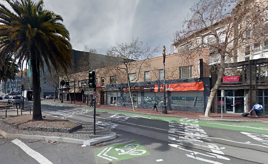
Plans to raze the two-story building at 1740-1772 Market Street which is currently leased to David Rio, Proposition Chicken and the former Rebel Bar (now 1772 Market Street) are in the works.
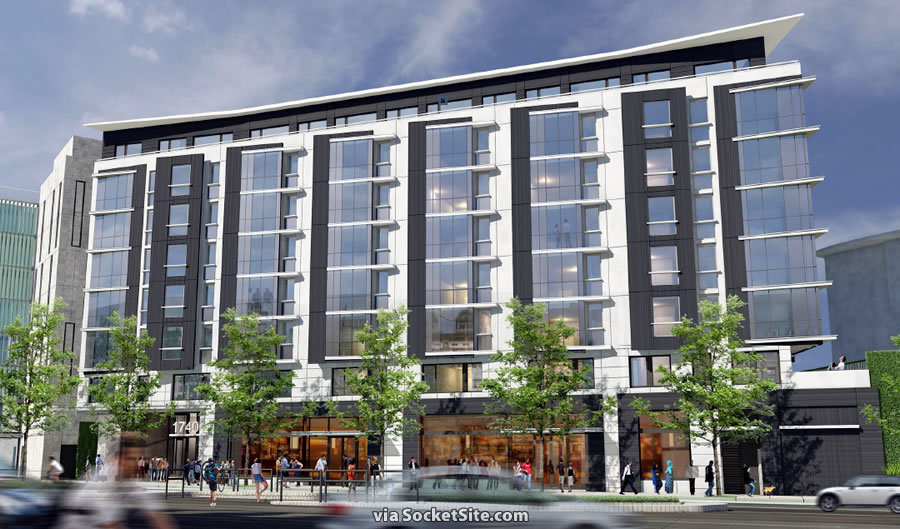
And if approved at the end of this month, a nine-story development designed by Forum Design, with 100 apartments over 4,400 square feet of ground-floor commercial space and parking for 160 bikes, could rise upon the Market Street Hub site which is adjacent to 8 Octavia and across the street from the Flax site to rise as well.


Speaking of 8 Octavia … drove by it Sunday at 9:00 a.m. while en route to the freeway – almost every set of louvers was closed, such that the building presented a 5-story green wall to the world. While I’m sure it’s nice for the interior residents to be able to block off light (and noise from Octavia), the result is horrible for the rest of the neighborhood.
We can’t let people have control over their interior environment, it’s much more important that the rest of the neighborhood feel nice about how the building looks. The people actually living in the building shouldn’t factor into the design at all.
I think his point was critical of the design resulting in the effect described.
My comment is clearly about the effect of the building on the neighborhood – there’s quite a difference in visual impact between a ‘traditional’ residential building (even with all the blinds and curtains drawn on the inside) and having all the giant exterior louvers closed on this multi-story façade.
Well, it is what it is Sierra. There is no right for a neighborhood to have any special “visual effect” unless you are referring to a designated historic district with strict architectural controls. The city generally regulates massing, height, zoning, and other general facts. We don’t live in a Soviet-style state where every aspect of life is dictated by the state.
Some buildings that get built will be pretty, most will be boring, and some might even be ugly to certain people–that is life in the big city! And, I would argue that is what makes a city interesting, even the “not best” buildings add to the mix. Let go of your need to control and just go with the flow.
I hardly think Sj’s comments on the merits of the building’s architecture demonstrate any kind of “need to control” and your insinuation is just dishonest.
I like it.
I don’t know if I would say the effect is “horrible”, but it is very monochromatic, perhaps what others would consider a brutalist effect. I would suggest a community discussion on possible color schemes to enhance it visually. I personally like rainbows, subtle geometric patterns, and perhaps a thin “skins” would allow them to be changed when faded.
The LAST thing we need is more so called “community” input on architectural details, color, etc. The Planning Commission does a poor enough job in that category to try and please everyone. It always fails.
Like Chris says (above) the true character of a city is the variety of the buildings AND architectural styles, including the best ones and the no so best.
I think it looks nice.
I think it’s a beautiful building.
Who wants to look at the freeway. This is an example of architecture that isn’t stud boxes clad in stucco dictated by planning – a gem in my opinion.
Well, that side faces Octavia, not a freeway. And who wants to face a blank 5-story wall?
I’m also getting over my initial disappointment. It’s growing on me. I just wish the remainder of the buildings proposed for that side of the boulevard would get built.
I think it’s ridiculous to actually think that residents of a building have some sort of social obligation to open their personal space to the world, to make the world feel better.
Guess what Sierrajeff? the blinds are open AND closed all the time, randomly. Why does that bother you so much?
Again, try your reading comprehension skills. At no point did I say residents have an obligation to open their interiors to the public. I MERELY NOTED THAT A 5-STORY SOLID BLANK WALL IS UGLY AND OFF-PUTTING. God this site is getting as annoying and presumptive and polarized as everything else in this insane world.
Well, I read that you “implied” that residents of a building have some sort of “obligation” to society to make their view “pretty”. Quotes are mine. Ugly and off-putting is subjective.
And it’s really NOT a solid, blank wall. It’s a glass curtain wall with automated aluminum louvers. When I walk by there, I find the façade ever changing and, in fact, quite interesting. It’s never the same light and dark; actually lots of nuanced variations. I find it refreshing.
Architect should have known they would always be closed. If you open them then it feels like you’re in a prison cell with all these bars outside your windows.
Trouble with your statement is they are NOT always closed.
GOOD – Now make it taller.
I like the soaring horizontal lines; the curved “cornice” is a nice touch. Nice modern look, with some thoughtful details. IMO: might be pleasant affect to turn the palette gray-blue/cream.
Who is David Rio and how is he popular enough to have his own brand of chai?
And it’s stumbling distance to Martuni’s!
Given the crew that regularly assembles in front of Rebel this can’t happen soon enough. Combined with the development of the Flax site across the street I could see this area becomming a decent little sub-neighborhood.
Yes, i like it very much and it comes as an unexpected and welcome replacement to what is there now.
People actually live there? I actually thought it was the new jail. No wonder they close louvers (bars)…for all they spent– views of homeless encampments and cars doesn’t seem very fair.
The ground floor commercial would surely become reflective-windowed medical offices, adding much character and charm to the neighborhood walking and shopping experience.
This should definitely be a lot taller since it’s on market. At least make it 10 stories
8 Octavia is artistic. Every time you look at it, the louvers are in different positions. It makes for a nice change to traditional windows. Furthermore, at night when a louver is slightly open, light shines across in a really cool way.
8 octavia is truly the ugliest building in SF. I have changed my route off of the freeway (adding 5 min to my commute) just to avoid it.
great, one less car on the road for my commute. Winner = me
False. The Holiday Inn on Van Ness is the ugliest building in the city.
Exactly.
Nice looking building, but a silly, short height. Should be twice as tall.
No it shouldn’t.
I must say many of the designs on market all look the same and are pretty uninspiring…this looks identical to the other 3 buildings up along Sanchez. Can we do better please? I thought the Linea building was the first step in a progressive design for our urban residential buildings.
Totally agree!
UPDATE: Big Rebel Bar Redevelopment Closer to Reality