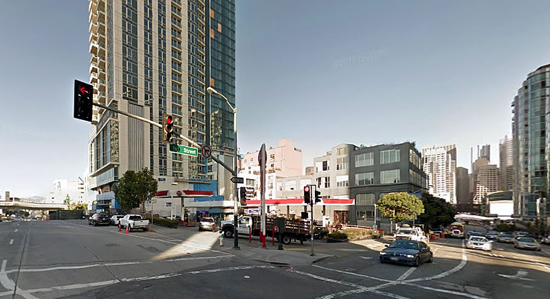
Facing pushback from the development team behind Jasper, which recently rose on the 45 Lansing Street parcel next door, as well as the 50 Lansing Street Homeowners Association (which raised a myriad of concerns, including its “design compatibility with the neighborhood”), the proposed 14-story development to rise on the northwest corner of First and Harrison, a prominent Rincon Hill parcel currently occupied by a Union 76 gas station, has been redesigned:
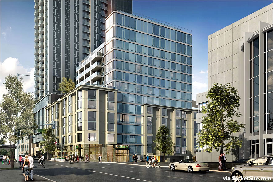
The proposed tower’s window wall has been extended to the ground to frame the building’s main entrance; the brick base is gone, changed to a light colored precast concrete material “in recognition of the Sailor’s Union of the Pacific building” across 1st Street; a reinforced cornice line has been added to the top of the building’s podium; and the corner café space has been increased from 348 to 610 square feet.
In addition, the development now includes a 30-foot long passenger loading zone along 1st Street, “to accommodate taxi or ridesharing pickup/drop-offs and small deliveries” and “minimize potential traffic impacts related to the location of the [92-car] garage entrance/exit” on First.
And with San Francisco’s Planning Department (once again) recommending the 180-unit development dubbed “Modera” be approved, the City’s Planning Commission, which actually formed its own working group to participate in the project’s redesign, could approve the redevelopment of 390 1st Street next week.
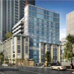

I wish that is what they would build at mission and s.van ness. Love the look and scale.
I think this looks terrible. Is there some reason we can’t have a decent looking building on Rincon hill? It is ALL garbage, every single one.
Bill, agreed. Who are these people who our Planning Department lets come in with their computer generated buildings. It might as well be 1970 all over again. There needs to be a major rethinking in this city about our collective sense of pride of place and civic aesthetics. Though I fear it may be too late.
Your know-nothing parochialism is an embarrassment to San Franciscans.
Every. Single. One.
Looks good. One less gas station in the City though.
Not only a gas station, the mechanic there is fantastic.
Don’t you read the comments section? Everyone in SF will ditch their cars pretty soon. Because we’re so transit friendly! No need for gas stations, parking, etc.
Demand for gas stations falls predictably with increasing density. This is just one of the interesting results that have come from studies of complexity, especially at Los Alamos. Look up some of Geoffrey West’s presentations on YouTube for good summaries of what is going there.
Irrelevant. If demand for gas stations has fallen then we’d see them closing up. The gas stations are doing great, it’s just that the profit in condos is much higher.
they are closing up, in fact. at the namelink:
“By 2017, the Bay Area will have 40% fewer gasoline stations than in 2007, KGO-TV reports. During the past six years, 23 gas stations have closed or will close in San Francisco.
In the greater Bay Area, hundreds of gasoline stations have stopped selling fuel since the turn of the 21st century. Jeff Lenard, vice president of strategic industry initiatives at NACS, told the station that the number of gasoline stations across the United States has been declining…”
The Jasper developers should be banned from any criticism based upon the “people who live in glass houses shouldn’t throw stones” rule.
There are a lot of things they should be banned from after that building…
From bland to vanilla. Needs more work to bore the NIMBY’s away.
I can’t wait until the governor’s as-right plan goes through. No more NIMBYism scaring off interesting design!
Except this project, like the majority of proposed developments in San Francisco, is seeking a couple of minor modifications/variances to San Francisco’s Planning Code (in this case, for obstructions over streets and alleys (Planning Code Section 136) and dwelling unit exposures (Planning Code Section 140)).
And as such, it (likely) wouldn’t qualify for “as of right” development per the Governor’s bill, which isn’t the panacea that others might have led you to believe.
Does the “as of right” bill preclude any design review? That makes no sense. This modified design is a step backwards but if there is no design review developers will take the cheapest path and build boring square blocky mid and his-rise buildings.
Yes and no. The city could not deny a project’s approval based on the subjective quality of its design, but it could require a hearing and request changes based on objective design standards.
That is troublesome. request design changes? But not be able to enforce them? Not good. Developers will have a field day.
I guess the only way around that is to tighten the codes. Actually prohibit square buildings, require setbacks at upper floors, require roof decks/greenery. Its not good to go into such detail in the code but if the Brown bill is basically anything goes, then the City needs to really tighten the building code.
It seems to me that the way around this would change the existing zoning to be a “recommendation” and the actual zoning to be zero feet high, so anything exceeding zero feet still has to go through the same review as before. Then things that meet the “recommendation” would be more likely to be “exempted.”
Great idea RobBob. Much simpler than trying to create 50 specific design guidelines. How about a blanket 50% downzoning in heights throughout SOMA/downtown and the Van Ness area. if the developers want to build to the previous heights it would require Planning approval and a grand design to do so. Win/win for the City.
Seriously, the Supervisors will find a way around this as they should and it will backfire on developers in the long run.
I’ve always loved the Sailors Union of the Pacific building.
I would love to see that building used as pedestal for a high rise residential tower of modern Moderne design though I suppose that stupid rule of the Rincon Hill Plan regarding the spacing of buildings would present a problem.
Ugh. I much preferred the mix of brick and glass as a kind of homage to old and modern. Now this just looks like a suburban outlet mall and prefab office building had a mutant baby.
Yes – the brick was at least compatible with Soma’s warehouse and industrial history – the “light colored precast” just looks like more jarring modern design, which will appear dated in about 15 years.
I have no idea what “jarring modern design” really means. Is all modern design jarring? and how and why does precast become dated?
In reality, the constant tweaking and adjusting and design by committee in this city is meaningless: because every single design will be scrutinized into being something “better” and “different”, and yet that will in turn be scrutinized. Ridiculous.
No single design, or detail component, or massing, or color, or fenestration or height or decoration will EVER satisfy everyone, and it doesn’t have to.
Older design was much better. The earth tone/brick lower floors gave the project a warm feeling. The new base is unremarkable and adds nothing to the street level experience of the building. IMO.
The brick version was more compatible with some adjacent buildings without being cartoonish.
That’s a pity. It actually looked just fine before. Why on earth would anyone oppose the first design and be okay with the revision? It almost seems like they are just trying to stall them to delay construction and not for any other valid reason.
That rendering makes that corner look like Mayberry – look at the pleasant street with fews cars and happy pedestrians and bikers. In fact, it’s a traffic sewer.
Still, an improvement but I’d never live there.
Really the rendering is absurd. It’s not even rendered as a hill, which it is. Nobody has ever cycled down this street because it would be suicide and a pointless climb. If you ever see three bicycles at once on this corner take a photo and I’ll give you five dollars.
I really like this the way this feels.
Love the two strips of apartments on the top floor. Apartments, as in not condos? I don’t like the apartment trend.
On the few occasions I’ve had to summit first to get on the bridge or go south on harrison from 4 blocks away and mission street, I was cursing the entire 35 minutes. I am so glad I am not needing to commute out of the City in this direction for the upcoming year.
So SF is just basically just one big HOA? Lame.
I agree with the Pro-Brick comments here. warmer, an homage to the brick industrial buildings of SOMA’s past.
Does it come with HEPA air filters?
Why is this not a Highrise? More housing?
Exactly, Matt. It should be 20 stories taller.
The brick was great, too. A break from the ordinary. Why does it’s exterior have to match the Sailor’s Union, anyway.
More design by committee.