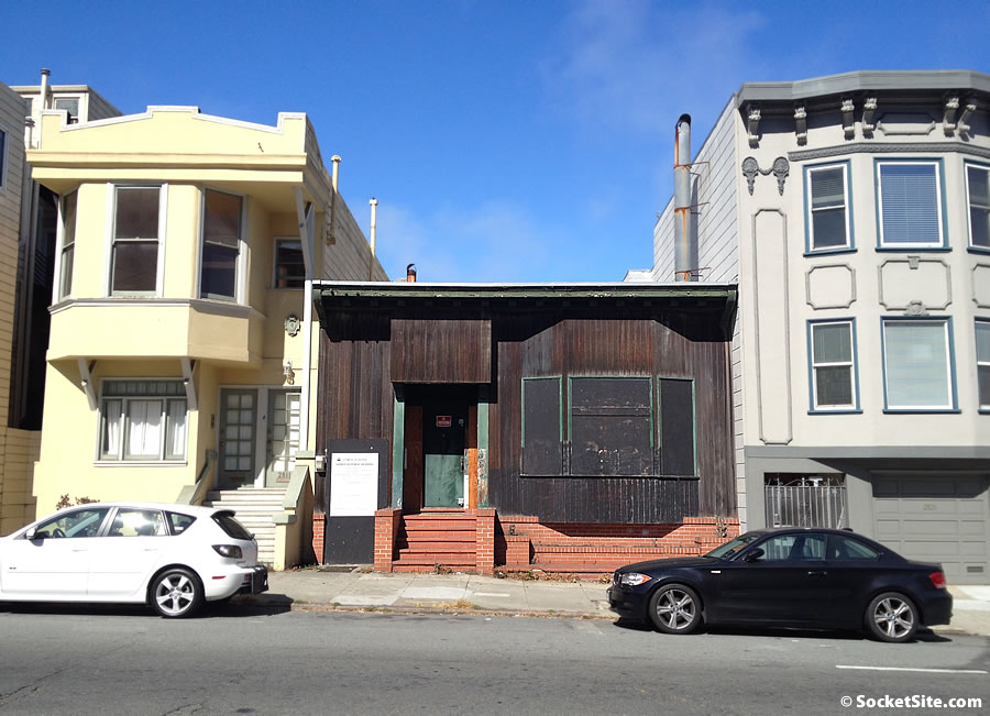
Built in 1914, the little single-family home at 2815 Polk Street has been boarded up for years, having been owned by an out of towner and long a target for vagrants and vandals.
A local finally managed to buy the building for $820,000 at the end of 2013. And within a year, plans to raze the existing home and build three-units over a four-car basement garage had been drafted.
While over 50-years old, the age at which a Historic Resource Evaluation is automatically triggered for buildings in San Francisco, the existing structure, which was actually remodeled in 1959, “making it difficult to discern the original style of the house,” has been found not to have been associated with any historic events nor an architectural historic resource in its own right.
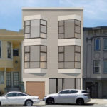
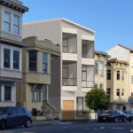
And as such, San Francisco’s Planning Commission is poised to approve the redevelopment of the 2815 Polk Street site next week, as designed and newly rendered by Taylor Lombardo Architects below:


Triangular bay windows? Ugh these people that design McMansions Neo classical/ Spanish colonial mansions in the burbs should resist the urge of doing contemporary urban infill.
driveway = loss of another parking spot on the street, but it’s such a stellar piece of architecture that blends in so well with the rest of the neighborhood that I’ll allow it.
My, just 3 short years to entitle … that’s what, holding costs of about $30,000 in property taxes alone? $10,000 per unit, just for the property taxes for the entitlement period … and we wonder why housing costs are so high?
as opposed to 3 more cars on the street everyday?
it’s a net gain of parking, if you actually live around there.
ever think about constructing a 3-unit building with no parking?
Depends on how many cars the residents of the 3-units end up owning. If you get three households like mine in the building it would be 12 cars added to the neighborhood, 8 of which would be on the street.
Why can’t this be 4 stories? There are several examples of 4 story structures in the immediate context on the block.
Wow, big improvement. Nice catch for the buyer.
A building that stands out in the block for the wrong reasons. I’m not a fan of sharp angels.
Glad to see parking in the building. It seems like a religion with some people that everyone should be miserable & ride the marvelous MUNI.
this looks like a low budget project which is surprising since the firm has done some expensive looking work. Maybe it is just bad rendering. The bay windows are hard to swallow.
Typical. Early 21st century, bland, generic SF multi-unit building.
Some think – “ooh modern”, but 50 years later people may think “such a simple box – how boring”. Modern-day architecture seems to have limited style. I would hope we can find a better style for the modern day. That project will no-doubt be profitable though, so kudos to the project exec.
50 years? Try a decade. Styles change much faster than that and unfortunately we’ve devolved into accepting soulless boxes as normal.
The new thing is pretty close to a Richmond Special, but considering what it’s replacing…
I’d consider it the off-spring of the Richmond Special. Problem is we’ll be stuck with it for probably the next 100 years.
The Windows should be angled in the other direction, they might actually catch a small view of the bay if switched.
Regular bay windows extend the living space with a nook for a couch or a table. This triangular space just creates an awkward layout for the rooms.
The Pacific, on Webster and Sacramento, appears to have similar windows.
Something is wrong with the pic?