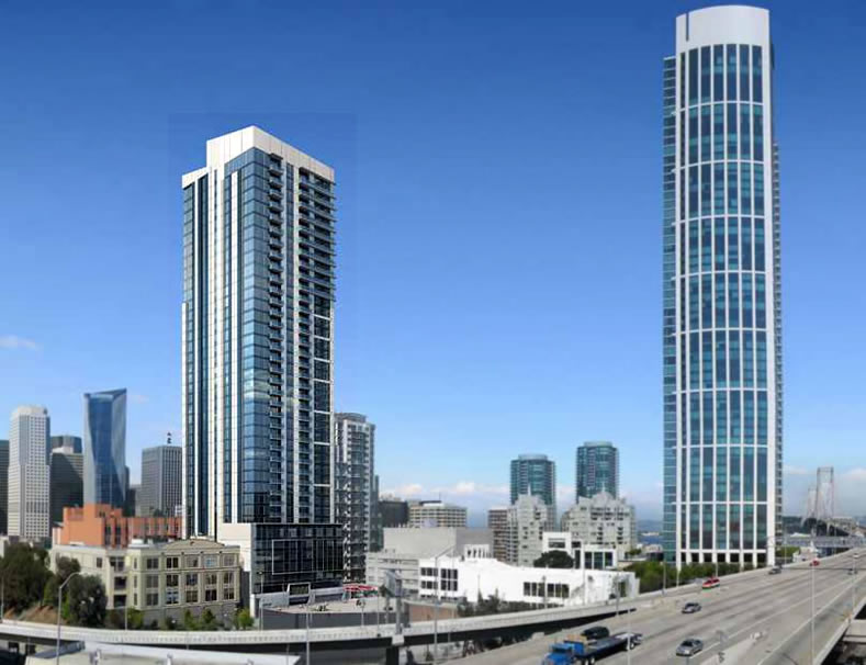
The 400-foot tower rising at 45 Lansing has been dubbed “Jasper.”
Originally intended to be developed as a 227-unit uberluxury condo building by Turnberry Associates, the project was redesigned by Crescent Heights, the developers of NEMA, to consist of 320 rental units, including nearly one hundred studios (up from 3 as originally designed).
The leasing office for Jasper is slated to open this spring.
And as plugged-in people know, plans to raze the adjacent Union 76 Station on the northwest corner of First and Harrison are in the works, with designs for an 185-unit building to rise.

Maybe change the name of the street to de Chirico and the number to 73. (Namelink clue in the likely chance that you don’t get this obscure reference)
What an incredibly bland building.
I like it. And at least its white, instead of brown or black. I hate dark buidlings’ effect on the skyline, when seen from afar.
Agreed. Bland, undistinguished, generic. Appropriate for rentals I suppose but NEMA is so much better.
respectfully disagree. The effect of NEMA on the skyline is just a jagged dark shard (and not an artistic one). And like so many buidlings with uneven parapets, from many angles the window-washing and other roof equipment is readily visible, ruining whatever effect the architect thought he was creating.
Eh… it doesn’t look like a tower fan.
The actual tower doesn’t look like that- the west side is almost entirely white, like a big blank wall. Planning fail.
Jesus is this already built? Seems like yesterday it was a parking lot
I agree. The west side does look very white.
Notwithstanding that no one knows where Lansing is (yet), 45 Lansing is a great building name, um address). Jasper is a marketing moniker and better as a name for a dog. How is it this picture doesn’t show all the cranes of the other buildings going up on Folsom as well as on Fremont?
agreed.
My first thought was “Casper the friendly ghost”.
It’s too bad Turnberry didn’t develop this site.
invented, the image is a photo composite from several years ago. Note, there is no tower 2 of One Rincon, nor any of the cranes you are missing.
I’m disappointed that it’s not condos.
Me too. More rental competition does not benefit me.
Unforch it looks like many of the towers being built now will be rentals. I was told that insurance money is behind many and they want the rental income. Turning them into sales condos will not be easy. Hope all this doesn’t flood the rental market in 2015-16.
Why not call it the Lan Sing? Then, open a branch of Yank Sing on the ground floor.
The east (money shot) side of the building is OK.
But, what is disgusting: the west-facing-side which is the freakin’ core of the building. i am not against the height, but a planning department which is either corrupt or stupid for letting the greedy developer design the bland, crappy, slip-form construction core and face it at all of us in the city. i think it is time to find some less “beholden” people in the planning department.
Coincidentally, this is from the developer of the NEMA. Again, another questionably approved tower with poorly designed crown that does not even disguise the equipment at the top of the building.
It’s sad that such a prominent position in The City is taken up by such a bland mediocre building, talk about an opportunity lost. Agreed the Westside of the building is way to white & when viewed along with Rincon 2 looking East the result is a visual concrete wall. The Architectural firm responsible for allowing this design to move forward should send their principals back to school & the San Francisco planning department should be chastised for allowing such visual blight to be erected. BTW would love to know the reason why someone thought the hideous crown on top of Nema would be a good idea.