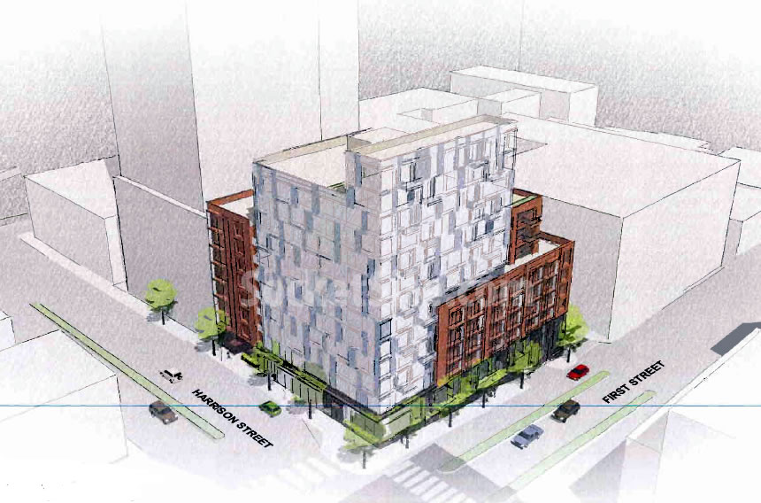
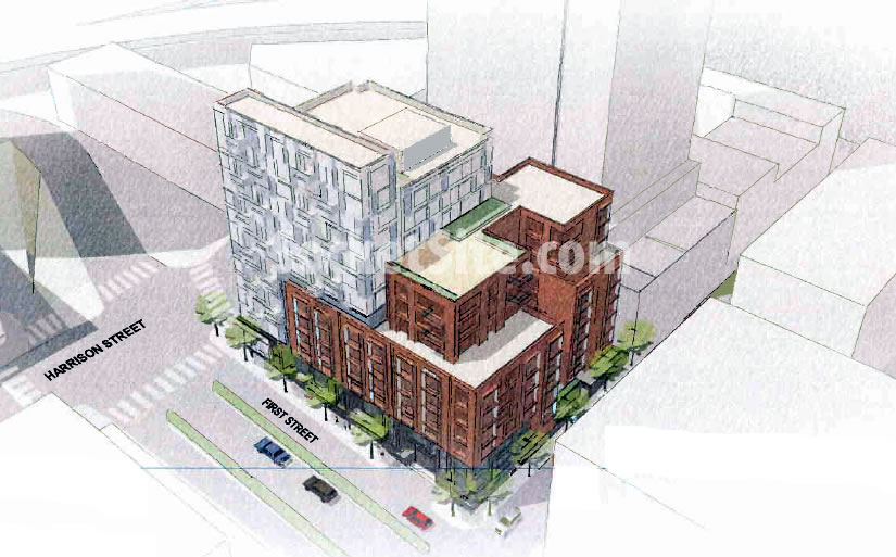
As we first reported two weeks ago, plans to demolish the Union 76 Station on the northwest corner of First and Harrison have been submitted to Planning. And on the corner, a 185-unit residential building has been proposed to rise up to 13-stories with 165,000 square feet of residential space, an underground garage with its entrance on First, and no retail or commercial space on the ground floor.
With the bay windows, balconies and exterior materials still “under study and subject to change,” we now have the early illustrative design and proposed massings for the 390 First Street project which would rise to a height of 130 feet along Harrison and First Streets and step down along Lansing.
From the project sponsors:
Most of the Project faces the wider, prominent First and Harrison Streets, a zone allowing taller height. In contrast, the third street frontage faces quieter Lansing Street, a narrow pedestrian “shared street,” with a smaller-scale residential focus. The building embraces and expresses these two zones with a light glassy 13-story tower element at First and Harrison, and a stepped 5 to 7 story “base,” fronting Lansing and First Streets. The base element employs projecting bay windows, balconies, and private stoops to further scale the building in line with traditional San Francisco residential architecture.
As always, we’ll keep you posted and plugged-in.


Is this a sketch ontop of a sketchup background that was run through a generic photoshop filter? What is this, 2nd year college work?
Do you read? It said “early design, under study and subject to change.”
Why does everybody on here need to be so hostile, condescending and rude to one another on here. What ever happened to manners?
i agree. we’re talking real estate, not world politics. why all the attitude?
Not to mention, I actually like where this is headed – I’d take an interesting infill like this, even if “only” 13 stories, over a taller but bland glass box.
This is the best and MOST appropriate way for serious design professionals to begin concept ideas for a project. It’s done this way all the time; from small firm to large firm.
Quick massing study, a general idea of the form and shape, some loose color values and a suggestion of fenestration and setbacks.
This is how it’s done and it makes sense. Now let the architects do their work.
nice! much more attractive than the current gas station.
I LIKE the current gas station – best mechanic for miles around. But it could be prettier.
I like that gas station, too. Where will one get gas in that neighborhood?
Strange that there’s no ground level commercial.
This is intended to be a residential block. Every block in the city can’t support ground-floor retail. The concept of the neighborhood is a lively retail corridor along Folsom at the intersection of the Rincon Hill and Transbay neighborhoods. It’s only one block to walk down to Folsom and distributing retail throughout the neighborhood in every building would dilute the intended effect of the “Folsom Boulevard” neighborhood retail district.
“It’s only one block to walk down to Folsom and distributing retail throughout the neighborhood in every building would dilute the intended effect of the “Folsom Boulevard” neighborhood retail district.”
I think that’s the way Planning is thinking about it and it probably makes sense. Keep it focused on one corridor, especially in the early stages, to help it take root. Years from now, retail can spread up the hill as demand dictates.
It’s odd that the only idea we have for good pedestrian streetscape is retail. Obviously, every street can’t have this. But where is there a good pedestrian experience in SF recent construction that strictly residential? I’d love to have some examples pointed out to me because, off-hand, I’m having trouble thinking of any.
Great question!
Dear “Presentation Police” you are part of the problem, not part of the solution. It is because of people like you who make random flip remarks that projects of perfect merit get delayed costing everyone time and money. Look at the concept, its pretty remarkable, wedding cake, tiered design that gives interest and dimension instead of the same old bland boring square. If you are incapable of reading and imagining what the structure will look like based on a “concept” drawing, then you have no business remarking on it. I suppose you hated the “Wall on the Waterfront” too…hmmmm, maybe you are the same [person] who came up with that idea…no progress, no matter what. Enjoy that architecturally interesting gas station, meanwhile why don’t you go back to the streets and protest a Google bus or something that makes you feel more relevant.
I also very much like where this project appears to be going, but your handle certainly speaks for itself.
I understand that by limiting the building height the construction will not require the use of steel girders , but with a height limit option of 400 ft , I wish that the developer would have bitten the bullet and taken this closer to its max approved height
How did you “understand” that? Steel can be used in talls, supertalls and small buildings. Same with poured in place reinforced concrete for structural integrity.
HELLO MR LETS BITCH PEOPLE OUT !
“The building embraces and expresses these two zones”?
Uh, if you say so. I did not know a building could embrace a zone.
The real question is does the building embrace the zone with love? Or are we faced with more of a one-night-stand situation?
Awesome proposal; developing nicely in the urban juices. Stay tuned for further developments.
UPDATE: Plans To Raze Prominent Rincon Hill Gas Station Progress