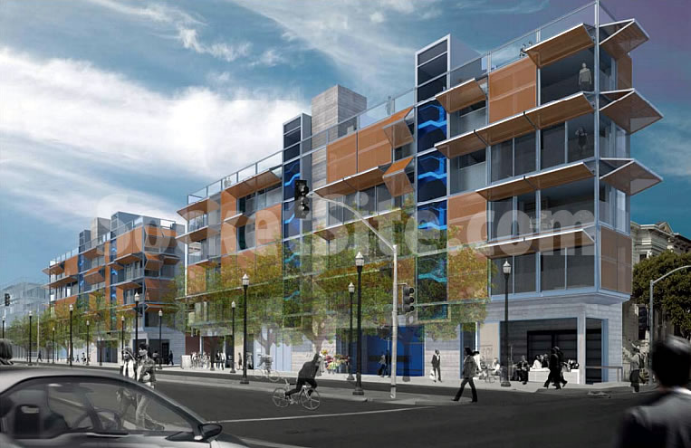
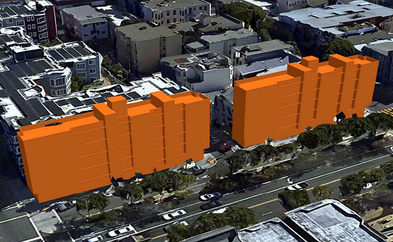
Speaking of former Central Freeway parcels and future Hayes Valley developments, the plans for a pair of modern five-story buildings to rise on Central Freeway Parcels M (350 Octavia) and N (300 Octavia), two undeveloped parcels which are just over 18-feet wide, have been refined and are working their way through Planning.
As designed Envelope A+D and proposed by Bay Area Urban Development, the two identical buildings would measure 11,761 square feet apiece, including 943 square feet of ground-floor commercial space, with a total of four two-bedroom and eight studio condos in each building.
And while the mass of the two 55-foot buildings, which would extend along the east side of Octavia Boulevard between Fell and Oak, bisected by Hickory, would cast some shadows on the cater-corner Patricia’s Green, San Francisco’s Parks Department is recommending that the project’s 244,000 net new square-foot-hours of annual shadow, a 0.37 percent decrease in potential sunlight on the park, be deemed “insignificant” with respect to the City’s Sunlight Ordinance, as it is recommending for the development at 455 Fell.
The proposed designs for Parcels M and N aren’t to be confused with the plans for 56 apartments, including 34 micro-units and 8 micro retail spaces, to rise on the adjacent Central Freeway Parcels R and S, between Oak and Page.


those outdoor blinds look cheap and ridiculous…SF wind storm will thankfully blow them off.
I thought they were the pigeon roosts.
If they are the product I think they are, they are power operated and originally designed as airplane hangar doors and are not cheap. Ridiculous is in the eye of the beholder though.
No what’s cheap, ridiculous and a terrible waste of energy (re-radiating heat from insolation inside a space, for the HVAC system to then cool) is interior blinds. Happy to see use of exterior blinds in this country.
Kinda Cute. Mid modernist Paul Rudolph built a similar single-family house / Walker Guest House / in Florida in ’52. His place had spherical iron weights to counterbalance the flaps. I hope this doesn’t mean Trump’s gaining power.
At least it’s different and has some personality. There’s a lot of monotonous/not exactly gorgeous stuff being built that probably won’t age well either. At least this one’s somewhat interesting.
That’s horrifically ugly. It takes “brutalist” all the way to “pugilist”. And creates an incredibly unwelcoming, off-putting wall along the boulevard in the process…
Brutalist? Using some concrete in a design does not automatically categorize a design as brutalist.
Whatever, I was trying to be punny – but regardless, raw concrete is raw concrete is ugly.
Tell that to the Pantheon.
Are you saying we have to wait 2000 years for it to become pretty?
I’d say that vertical shaft midbuilding qualifies as brutalism.
so…8% brutalist
I don’t think those words mean what you think they do. It’s a funky unexpected design. Let people experiment! That’s how all of the interesting things in life get created.
I would love to see floor plans, I’m assuming it’s just a stack of shotgun units with windows along one side.
The paving over of SF continues apace.
Talk about a wall on the waterfront – that is exactly the image the rendering conjures up.
18 feet wide?
Why could not this parcel be left as a greenbelt along Octavia? Enhancing the boulevard?
The building looks terrible and sadly will obstruct a view of the more engaging building on the parcel in the background.
Is this a serious comment or are you being sarcastic?
Unusually, I happen to agree with Dave 100% – see my comment above – this converts a [narrow] green space into a looming presence. Between the buildings on one side and the continuous bumper-to-bumper traffic on the other, it’s going to be an incredibly unfriendly pedestrian environment.
Octavia, south of Patricia’s Green, already is an unpleasant place to be a pedestrian. At least the addition of more housing to Hayes Valley (many if not most of which will be built without 1:1 parking) will bring many new Muni riders to the neighborhood. And this will help contribute to increased demand for more frequent and reliable service. With better Muni service, there is more incentive for motorists to get out of their cars and get onto Muni… Such a modal shift can help to improve the pedestrian environment.
where’s the water?
I think he’s referring to the stream of hobo piss that runs down this sidewalk.
I completely agree. There is such a complete absence of common sense (because its been paved over by greed and suburban-style “new urbanist” group-think) that in a city with a long sordid history of great Victorian architecture being ruined and cast in shadow by ugly momentary slapped up buildings… this happens and no one on these pages barely bats an eye. It should be green space and it shouldn’t throw the buildings next to it under a bus of shade.
ITA. Look what became of 19th Avenue after they removed the wide sidewalks for more traffic lanes. This runs the risk of being as oppressive a stretch.
This was an opportunity to make a nice though short boulevard. An engaging place but – not in SF. We know the drill here when it comes to development.
Thanks for clearing this up. Usually the nimby-preservationism view is more couched these days, so it gives me the tingles when it’s stated so plainly. You didn’t even open with “I’m not opposed to more housing but…” I admire your candor.
Are we in a housing crisis? Only one that our politicians (police-ticians?) have contrived for us. Nonetheless a disinterested third party will recognize that the cost of housing in our fair city is high. If there can be any short term areas of compromises, one has to that we should construct housing within the urban grid on vacant plots that do not support alternative uses and are zoned accordingly.
This should remain green so that we have something nicer to look at on our way off the highway? Green space to blow car exhaust? These are silly ideas in my opinion.
“sadly will obstruct a view of the more engaging building on the parcel in the background” Do you really mean the dilapidated lap siding of the adjacent Victorian? Again, I doubt the sincerity of your comments when I read that statement.
We must preserve the rat-infested ivy strips at all costs!
Those old houses at Oak and Octavia are sh*tholes.
I put on my value engineering goggles and all the blinds went away. I see rectangular boxes with varied siding, some horizontal wood elements, varied plastered cement. Some metal.
Looks like more housing for the city, will ultimately fly.
How much was paid by the developers for these parcels?
We have reached exactly the same conclusion on the blinds. Too bad, they are my favorite feature of this design. I’ve always enjoyed buildings with operable blinds/awnings that make the individual resident’s preferences visible from afar.
But those things are going to be expensive and the first thing to get slashed when improving the bottom line.
The external blinds, if built, would be a great touch.
I would expect some would always remain closed on these otherwise everything-on-display, completely fishbowl units.
The good thing, sunlight to every square feet of the interior. The bad thing, the 300 Octavia building a quite a bit taller than the 3 story Victorian next door. Perhaps one 5 and one 4 stories will be more appropriate and also vary it bit.
Don’t fret too much folks about the fantasy design. The image presented will very likely not look like the final product. I have seen it time & again in San Francisco. When built then you might have some real complaints!
I like it. No so much that monstrosity planned for Fell and Laguna.
Not bad for an occupied sound barrier. Wonder if the wide horizontal blinds are a reference to the narrow verticals on the saitowitz by Market. Too bad these narrow lots won’t be left green with some air pollution absorbing plants, but for the right money….
Regarding the Saitowitz project near Market, does anyone actually live there? Each time I go by most all of the blind are closed down in the repel the Zombies setting.
8 octavia is the ugliest building put up in SF in past 20 yrs. Ive starte taking a different exit off 101 just because i cant stand to see it on my drive home everyday
I loved the initial concept and renderings, but was then disappointed in the execution. However, it’s begun to grow on me.
I agree, my first thought was that these buildings would make a good sound barrier for the streets off Octavia. Also they would catch some of the particulate pollution from all the cars going by. I wouldn’t want to live there myself, but I’m sure someone will.
The ground floors look extremely cold and unwelcoming. Funny how the retail space is populated with dining/café space along a narrow sidewalk that’s buffered by contact traffic jam. I guess something has to be built her but is this it? Very complicated space to build
Some bioswales on the ground floor sidewalk area, and a donation towards transit improvements done deal.
Looks like a great infill project, with urban scale/character and a great flexible system on the exeterior that will make a positive impact in the area architectural design wise.
I wish the City would reconsider the options in this area. The Green is already overwhelmed with users.
Love it! hope they keep the blinds actually – they look really cool to me. Amazing something so nice could fit in such a small space
nice. is that 943 square feet of ground floor commercial space in each building or across the two sites. hopefully, it’s the latter: they’ll never get top dollar and some interesting little shops could pop up there.
My lot is 17-feet wide, and my (1908-era) building tapers down at one point to 6 ft wide. These units would feel roomy.
It’s a blank wall, but it’s a *Victorian* blank wall! With a cornice!
Very handsome design. The shutters will keep out the western sun, eliminate the need for curtains, and animate the facade. The last thing this neighborhood needs is undefendable, unprogramable open space for the shopping cart set. Take a look at the nearby new McCoppin Plaza disaster. In addition to Patricia’ s Green, Jefferson Square, Lang Field, Hayward Playground, Civic Center Park, Alamo Square, Koshland Park, Hayes Valley Playground, and Duboce Park are all in walking distance.
Civic Center Park
They don’t actually have the nerve to call that space a park, do they?
Let’s be real, folks. This is not a greenbelt, it is currently a FENCED OFF VACANT LOT covered in overgrown ivy!
I think the rendering looks cool, and I often like the look of raw concrete on some buildings. I don’t get why every rendering seems to have orange accents (I really hope the planning department doesn’t ask for this as “referencing local context” but I suspect that might be the reason). I also like the Victorian next door. Not everyone will agree on the aesthetics here. Big deal!
Hasten to say a word on this hotbed of contention, haven’t read through all the comments, but I feel the building could work aesthetically (if a tad severe), but maybe a few of those “green walls” and another color on the shades would help a lot.
I just don’t dig some of the “retro sixties” colors I see splashed around: yellow, orange, brown, look silly in a major city. I’d suggest caramel, khaki, light beige, light taupe, or maybe a light gray cool color (soot will darken whatever overnight).
The city is reserving those colors for its Vision Zero asphalt painting pallette.
“… caramel, khaki, light beige, light taupe, or maybe a light gray…”
Unfortunately I associate those first four colors as “slumlord brown”, i.e. the free paint made available by mixing remnants and returned paint.
One of the most dreary street scenes is a row of previously nice Vics all painted the same single shade of slumlord brown.
then maybe you don’t know what you’re talking about, and just proved it.
It doesn’t matter if you don’t “dig” (how retro of you to say that) some of the colors being applied to new buildings today. You don’t have a say in it.
Only the architects and the client do. and that’s what matters. Don’t you know that?
Jesus Effing Christ Futurist, where did he write that he demanded “a say in it”? He was offering an opinion, like everyone else does here.
Calm down. It’s all opinions here.
And to be clear, I didn’t say he couldn’t have an opinion. But basically said that “opinions” on color/design generated from the public simply do not matter to architects/developers. What really matters (honestly) is what the client says to the architect.
“Calm down”? Really? Coming from you, that’s rich. I don’t think there’s anyone on this site who continues to talk down to people the way you do and acts as if their opinion has been handed down from god.
Well ok. I think you confuse the “talking down” component (your words, not mine) with having someone in a particular profession, mine being architecture, offering opinions that are far far beyond the standard “it’s fugly”, ” I hate it”, etc, etc. That’s simply not how I choose to talk.
I certainly can’t pretend not to be an architect, and I also don’t need to apologize for it. My opinions are formed from my 30 + years exp in that field and those experiences and projects define how I think and view urban architecture and design.
It’s the same way people get defensive the way a doctor or lawyer may talk when offering an opinion on a subject that they are well informed about. I’m sorry you don’t like how I comment, but it’s the way it is.
And no, “god” didn’t hand it down to me. I did.
Remodeling kitchens is quite a bit different from what you’re discussing here.
Actually I have an architecture degree with a concentration in urban design so I feel I’m entitled to an opinion, and to state it, and I feel it’s important to do so because the local status quo is only so good.
Additionally, inspiration can come from anywhere; I recall a visiting architect in college stating that the only person in their office that could solve certain design issues was the secretary. And Frank Lloyd Wright, for example, deferred to a sculptor when he needed sculptures.
Learning’s a lifetime process. It’s not like anyone knows everything. And besides, whatever architects and clients come up with has to make it through the planning process, and the general public can contact local officials and put in their two cents, and it may not make much difference, but one never knows.
Far worse than any Wall on the Waterfront.
Five storeys next to two storeys and ugly to boot. Should be no more than four storeys and then they would be less of an eyesore.
Very Mad Max. Dystopian prison I say.
It doesn’t look like a prison at all to me. A distinguishing feature of modern prisons is that their cell windows are narrow slits.
In a city with so many restraints on building heights, it seems the apex of hypocrisy if this new urbanist wall of buildings goes up as proposed next to the lower Victorian buildings next door. The lack of consideration in this proposal for the nearby historic buildings is stunning. SF height limits are strictly applied against taller buildings in SOMA where there is no such valuable historic context and yet out-of-context heights allowed to rampage here? This planning system is so worthless and corrupt, it should be scuttled altogether.
This is only proposed to be 5 stories tall. On the same block at the corner of Oak/Gough is an existing 5 story building from 1926. Kinda funny to be stunned about “lack of consideration” when the “historic context” of what was “next door” to those “Victorian buildings” was an elevated freeway since the 1950s.
Don’t know where you got the idea that height limits are strictly applied in SoMa. Developers have been negotiating to go taller for decades. Even the now dwarfed GAP HQ went higher than allowed by negotiating a variance back in the 1990s. SoMa is among the easiest areas in SF to negotiate away “strict limits” for height and bulk.
UPDATE: Pair of Skinny Hayes Valley Buildings Slated for Approval