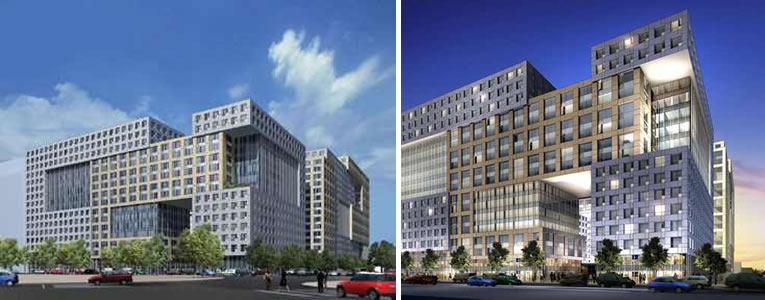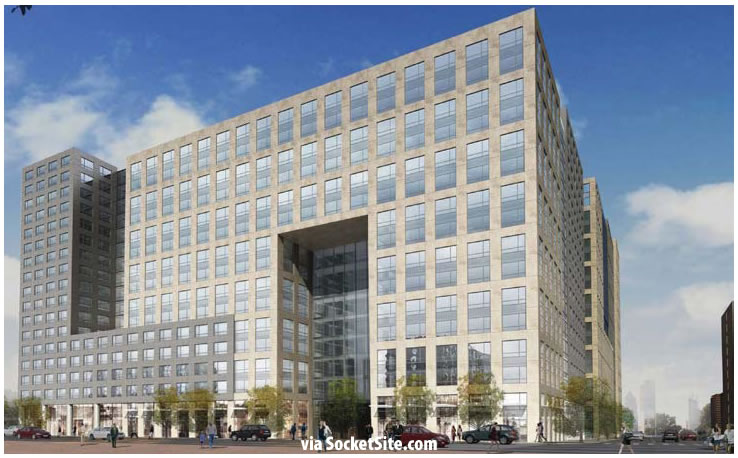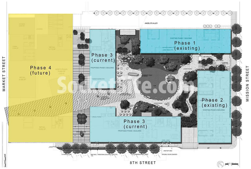
As originally designed, rendered and approved, the 1,900-unit Trinity Place development, which will front Mission, Eighth, and Market Streets, included two big “holes” in the building’s façade along 8th and a massive open archway along Market Street as well.
The holes along Eighth Street, however, were “value engineered” away, along with the glass curtain wall which was to grace the first few floors of the building at the corner of Mission, leading many to wonder whether the open archway along Market would survive.
And while the outline of the archway along Market Street remains in Arquitectonica’s plans for the final phase of the Trinity Place development, we regret to break the news that it’s no longer an open eight stories, although it will open to the development’s art-filled plaza at the ground floor.

The timing for the Market Street building, which will be the fourth and final phase of the Trinity Place development, has yet to be announced.

This is so wrong. How can the City allow the design to be altered so much?
I echo your comment. Here is the original design which was quite nice.
the original design had such promise! i don’t think it’s fair to blame the architects. obviously this has all been VE’d to death.
It’s not the architect’s fault. You can see how the design was much better in Phase 1 before the cuts started. It’s Sangiacomo who pulled a bait and switch and the City staff who allowed it.
Value Engineered? No need, even if the changes save money. Between the time this building was approved years ago and now, rents and values in mid-market have gone through the roof. If the expensive design penciled back then, there is no possible way it doesn’t work now. Just greed, incompetence and corruption that allowed this to happen. This is the first time I have ever missed Chris Daly – he would be on top of this.
More lipstick for one of the ugliest pigs in the city…
Perhaps the powers-that-be could also find some large eyelashes to slap on it? *however it will still be a pig.
A missed opportunity, yes, but it’s still a massive improvement over what was there before.
The whole thing looks like a hospital.
“Value Engineered” means they want more square footage? How is that even possible?
Bait and switch.
It’s simple, the planning commission should rescind the buildings construction permit. The developer won approvals on a unique design at an important location close to the SF Civic Center and along Market St. and then “value engineered” the place down to the boring block of buildings now built. The developer needs to be held accountable. Look up the developments that Trinity manages on Yelp to get an idea of Angelo Sangiacomo’s business ethics. Trinity Properties policies are what caused rent control in SF.
This kind of “bait and switch” is very common in grand proposals, and it would serve us all well to be highly skeptical of plans that look expensive to build, and, more importantly, expensive to maintain; and to temper our enthusiasm when such plans are proposed.
morpheus: “Value Engineered” does not mean they want more square footage, just that they want to lower the construction cost (as usual in this town, and most of the development world)…
I’m drowning in all of your precious tears.
Lying, evil m_____ f______. Why doesn’t the Planning Dept. “Just say no?” Now we will have what can only be described as a “Commie block” dominating Market Street for decades.
I usually don’t post my architectural opinions, but this looks like a Tetris brick ate a building at Mission Bay.
Surely this was a move to increase square footage. Wouldn’t that require a larger office allocation? If the developer wanted more square footage, the city should have allowed them more height rather than permit this monstrosity.
I agree with those above who argue the main objective of the redesign was probably lower construction costs rather than square footage although they will marginally increase that as well by filling in the “hole” (though seemingly not by simply replacing the glass and aluminum curtain walls). But this is not office so Prop. M and the office building limitations are not relevant.
Thanks, I missed that.
It is not an office building. It is an all residential development with some limited retail space. So, there is no “office allocation” involved. The city did give the developer a variance for a substantial density bonus for the residential units.
Did the same VE’ing happen on Phase I & II? I think those buildings turned out just fine.
[Editor’s Note: As linked and reported above: Trinity Place Phase Two: Timing And Reality Check.]
Phase 1 seems to have been built mostly as approved but phases 2 and 3 were “value engineered” and you should compare the original designs with the result of phase 2, which is also completed, before making a judgement. IMHO the change made the building substantially heavier looking and blander.
I’m more ticked and confused as to why they are building this out so slowly; one building every 2-3 years. The city is desperate for housing; these 4 buildings should have all gone up at once; instead, we have a giant construction site in a major part of the city for a decade
Because Sangiacomo is building it with his own funds–no construction loans which were hard to obtain when he started. Therefore, he probably needs the cash flow from each phase before moving on to the next.
Incidentally, the good news here is that since he doesn’t need bank loans to keep building, phase 4 of this project will probably get built as planned (in his head–we aren’t yet privy to the info) even if the current boom cycle in development ends before its time has come.
Honestly, it’s not like the CC has beautiful architecture popping up so, sadly, it fits right in.
I actually see the new design as an improvement…big apartment blocks like this usually come down to the quality of facade materials anyway. All this effort to ‘break up the massing’ usually just looks confused and scrambled to me. Just my 2c
Before it said Cri, now it says Ln.
the new design is embarrassing
I’d be fine with ugly housing if it was built fast and cheaply, build out 15 soviet style buildings, or recreate Queensbridge here, we need it and I’m ok with it. But don’t present something fancy, then make it less fancy while knowing full well they’ll rent for the same.
I’d agree with you if it weren’t on Market St. Market should have the city’s best architecture.
It’s an FU to becoming Market Street. In anything-goes, look-away San Francisco. It’s winking @ Linea up the street.
Not sure I understand the comment, Linea looks exactly like what was approved by the Planning Commission.
The hole was the most interesting aspect of the design. Removing it is ripping the city off on what was originally agreed.
It is so disappointing. The new design looks nothing like the original.
It’s a bit like the arranged marriages of European royalty of centuries ago. Folks go around showing everyone a beautiful portrait, they hook a buyer, months later the real deal arrives. Too late…
In the end it wasn’t much of an upgrade over the previous trinity apt’s that were at the location. Sad and 50 years old is now sad and brand new. Looking forward to seeing it get demolished and replaced in 50 years.
This is a ludicrous comment
@Zig thats my opinion. I used to live in the neighborhood and would walk past the old trinity apt and thought they were terrible. Then I started walking past phase 1|2 and guess what…its still terrible.Terribly bland and uninspiring. I understand not all architecture or designs have to be amazing but it’s sad that these buildings were outdated before they were even built.
Sorry, but your opinion is just wrong. The former buildings were disgusting. The new ones may not be exciting, but at least they’re serving the purpose of bringing much-needed housing to a neighborhood well-served by public transit.
There are a lot of new rental developments in the area which will, in turn, reduce the asking rents and create more competition. This probably factors into the latest value engineering. Just like there are many more rent controlled units available on the market because folks have either move away, bought homes, or moved to the new developments. However, the asking rents on rent control units still remain high.
Few people who have lived a while in a rent contolled unit and are not leaving the city are willing to give up their bargain rent for what can be many times as much. That said, the only rent cpntrolled building of any size in this immediate vicinity was probably the old Trinity Place and residents of that building were moved into Phase 1 of Trinity Plaza, nearly filling it at the old controlled rent.
And recall that vacant units can be rerented at market rates.
Not sure why people are so upset with the changes. Looks better than just about anything else in the area. The Chase Bank looks squat and out of place. The Burger King is plain ugly. Even the Orpheum Theater is a pretty ugly building. 1155 is a bit plain. The Holiday Inn across the street is dated and has one of the uglier podiums in the city. This is at least housing right on top of BART, where it should be. With a nice park in the middle of the entire complex. At the very least it is an improvement over what used to be there – a parking lot and an even uglier building.
But not an improvement over what was promised and therefore SHOULD be built.
I don’t know..that holiday inn is starting to look better and better when compared to these monsters.
I know a guy who bought a condo next to Trinity Place I. He was assured that he had a view, but after he bought his condo Trinity Place I had permission to add height so the guy lost a lot of value in his condo & his view. I see this happen often, floors added after the development is no longer in the public eye. The architecture pared down.
I think he’s telling you a tale. I’ve followed this development pretty closely and I’m pretty sure what was built as Phase 1 was what the Planning Commission approved. Height may have been added from a
preIiminary design but not what was presented to Planning.
BTin SF – It MAY be a tale. I only quote from the good friend who bought the condo at the SOMA Grand, I do know for a fact that the building at the corner of Polk/Fell, the Argenta, had floors added after the plans were submitted. I may be misinformed but I do not tell tales.
Ah, an ugly building was demolished to be replaced by another. Thanks developers and the Planning Comm..
In reality, those “holes” tend to be awful dark windy useless places — see any university campus which has a brutalist building with this motif.
The loss of the overall shape and texture is much worse, the result is simply San Jose generic.
Sickening, another big ugly brown Fox Plaza. The Planning Commission needs some people with taste on it. Frankly the old Trinity Plaza would have been an improvement on this sickening mess.
I like that the conceptual drawings always leave out the homeless, who will be sleeping on the sidewalk in front.
How is it the developer is allowed to arbitrarily change its design like this? Is this legal for them to do on their own or was an exception granted within the planning department? What power do we in the community have to pressure the planning department, our elected officials, or the developer to make good on its original designs? I cannot sit here and allow this eyesore to be built in my backyard without doing my part to force the developer to honor its obligations.
just my two cents but the social justice aspects of development are all that matter in this city. In this case it was about preserving rent controlled apartments and neighborhood stabilization and affordable housing funds. It was also about the “progressives” fight against a conservative old school landlord. Nobody cares about the design once the deal is done and the fight is over.
Someone is playing Tetris poorly.
There needs to be a moratorium put on Arquitectonica from desiging anymore housing in The City. Everything they design looks like a an office building or a civic building. I work in an office–I certainly wouldn’t want to go home to one. Imagine a friend trying to find your “place” –they’d drive right past confusing your home for the communist party headquarters. I am certain Kim Jong Ung would have high praise for this design!
This was heard at the Planning Commission on Thursday 3/19/15. You can review the video at SFGTV. No one was there to make public comment. The commissioners fell all over themselves to congratulate Sangiacomo for a great project. Other than on Socketsite I have not seen any other coverage of the change in project design.
Why all this BS. Here is a man who is trying to do some good for the people of San Francisco! We should respect and honor Angelo Sangiacomo. I certainly do!