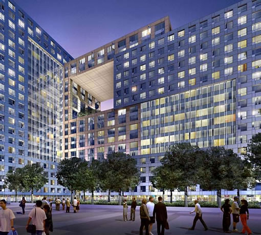
San Francisco’s Trinity Plaza project has been approved by the Board of Supervisors. And now it’s in the hands of our Mayor Newsom to add his signature and final approval (he has until April 28th to either approve or veto the project).
According to BeyondChron, and as a tipster notes, upon final approval of the project, Trinity Properties “will have 15 months to commence construction, and 42 months after that the first tower must be certified for occupancy.” But according to a Trinity Properties employee, the “application for site permits have already been submitted…plans will be submitted to various City departments at the same time rather than in staggered succession…[and they’re targeting] the start of construction after this coming winter with a completion 24 months later.”
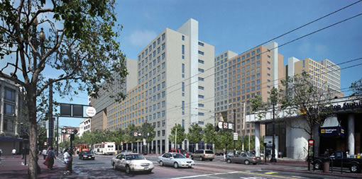
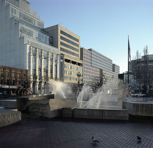
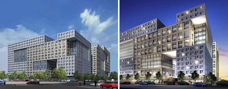
UPDATE (4/23): A plugged-in reader uncovers a couple of more contextual (but perhaps less glamorous) renderings of the proposed Trinity Plaza on the SkyscraperPage Forum.
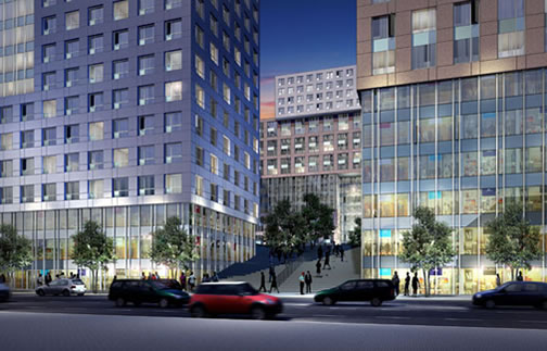
Finally…a victory for the tenants, the landlord, Daly, the City, and for reason, all in one project.
Although what currently exists is horrible, is this really THAT much better? Somehow, the design of this project reminds me of an up to date version of East Berlin housing blocks. And before anyone writes the bashings, I am not in love with Victorians, DO want change and growth in San Francisco, and just wish we could get better design built in this city. I will say that Mr. Sangiacomo’s house in Pebble Beach is a modern masterpiece, why not try using that much creative effort for such a prominant project in S.F.?
The Mayor should veto it. Nothing good can ever come of anything that has Daly’s fingerprints on it. East Berlin, indeed!
I really don’t care what it looks like as long as it is more friendly to the street than Fox Plaza, and can add nearly 2000 units to the city’s rental stock. Build it three years ago.
“Somehow, the design of this project reminds me of an up to date version of East Berlin housing blocks.”
I don’t believe that Arquitectonica, the architect of the new Trinity Plaza, did any work behind the Iron Curtain.
If you scroll down on this page:
http://forum.skyscraperpage.com/showthread.php?p=2776268
you’ll pics of the proposed Market St. building alongside existing Market St buildings– the height is about the same. On the Mission St side, the complex neighbors the Soma Grand and the new Federal Building, which are of similar height as the Mission St. side of the complex.
It is not the height that I think the complaints were about, but the overall design itself. Arcquitectonica did at least insert their “signature” hole into the building. They have been doing this trick since the early 80’s in Miami. Someone else posted that this is the “Downtown version of Park Merced”, and I could not have said it better, for if Park Merced is great design, then this city better stop calling itself “world class”.
morgan curious do all developments need to be world class? This needed cheap rental housing, that is only being built because of unique circumstances, gives people a place to live. That matters too
Design isn’t everything. This project is nothing like Park Merced because of its location. And what exactly is wrong with Park Merced other than location?
The city can’t have everything: great design on every building, fee exactions for neighborhood stabilization, inclusionary housing, life time rent control and expect it all from the private sector
For what it is, I don’t see the problem with the design. It’s not going to look like Sangiacomo’s single family home in Pebble Beach, because it houses 1,899 more households than that house.
I’m interested to see what the complex looks like in terms of street level retail. If there are shops and cafes that create pedestrian interest at the corner of 8th and Market, that will be a great addition to the neighborhood.
The residents of the 1900 apartments will greatly improve street life in the neighborhood– providing customers for the UN Plaza farmer’s market, for the Harvest Market at 8th and Howard, and for shops and cafes that will arrive after the opening of the complex.
I think the design is great. Its unusual and unique to the neighborhood. It also succesfully accomplishes its goal which is to house 1900 households.
I think that East Berlin is a major exxageration. So, this isn’t the #1 design in the world, but I don’t think its bad either, especially compared to what is currently in existence.
I would say that if you were to look at one of the newer developments around Mission Bay and add a little extra flare, this is what we will see here. On a stand-alone basis, I don’t think those developments are terrible. I actually think they look sort of cool. However, its the fact that you see one after another exactly the same that makes it look worse.
Sure, this development won’t win design awards like The Infinity, but then again, it should be a nice addition to the neighborhood. In 10-15 years, when other developments have filled in the area, I don’t think it will look bad at all.
Take away the trees and dramatic evening lighting and what do we have? An ordinary highrise of no distinction with a hole puched in it. There seems to be some confusion about whether this is better than what exists on this property currently. OF COURSE this would be better, but, take a look at the actual elevations of this project instead of the slick image that is posted and explain to me what makes this so “great”? I think S.F. should develope a “Chicago Standard” when it comes to new high-rise design in that it should be attractive, original and contextural.
It’s definitely going to be a huge presence on mid-Market. I really like it, but then again, I want SF to “Manhattenize”. As for design awards, I believe the same firm designed the Infinity and Trinity…and the new Fed building was designed by a Pritzker prize winner Thom Mayne, but still some people hate it.
“I think S.F. should develope a “Chicago Standard” when it comes to new high-rise design in that it should be attractive, original and contextural.”
In an ideal world, everything built would be beautiful. However, this type of “not good enough” mentality is exactly what our beloved supervisors have done to stall the development of this and other sites. I look at it as baby steps being necessary to attain the end goal.
“An ordinary highrise of no distinction with a hole puched in it.”
It’s not a Calatrava, but I think it is of some architectural interest.
From the drawings, at least, I think the design is more interesting than most of what is being built in Mission Bay and Rincon Hill.
The hole in the building is just one element of a “building blocks” effect that breaks up the massive scale.
It is unique for SF, in fitting so many small, relatively affordable rental units into a compact space, with mid-rise buildings of similar height to its neighbors.
AS previously stated, though, I’ll reserve my final judgment for the design until I see the building built.
Ouch!
Given the sublime views of the courtyard, I am underwhelmed w/the Market St frontage which is — let’s face it — unacceptable. Blocky, heavy, and without setbacks on Market – creates a daunting, oppressive canyon effect. Give me air, give me light.
What should be an engaging & an open transition from the evolving Civic Center to the becoming north SOMA area is instead a pointless agressive fortress.
I’m otherwise jazzed by the bldg, and hoping I’m just completely misreading the new Mkt St. renderings.
hmm, even just a small setback of the light grey horizontal cube on the Market Street facade would help.
It sorta goes with the new Federal Building … glad the Federal Building is environmentally sound (though I wouldn’t like to wear sunglasses at work due to too much natural light).
Thanks to Socketsite for including the views of this project along Market Street. Unlike what is claimed above, I do not expect “every” project to be an award winning design, but I do hope that we could get something better than this. Just because this is better than what currently exists is not a good enough justification when we can demand better urban design which is taking place in many other cities throughout the world. Please remember that just because some are unhappy with the designs of SomaGrand or Trinity Plaza does not mean that we are anti-growth or anti-modern but instead just wanting to see the type of better new buildings one can experience when visiting other cities.
It would be good to remember that this project has been YEARS in development. Our Board of Supervisors has raked this guy over the coals for quite some time, so if the design is not quite as moderne as some of its neighbors, that’s because the concept was born about 10 years ago. As said above, the density will do wonders for the neighborhood – lively market, draw in some cafes, all the sorts of things that follow in populated areas. I for one am thrilled to see this corner get built.