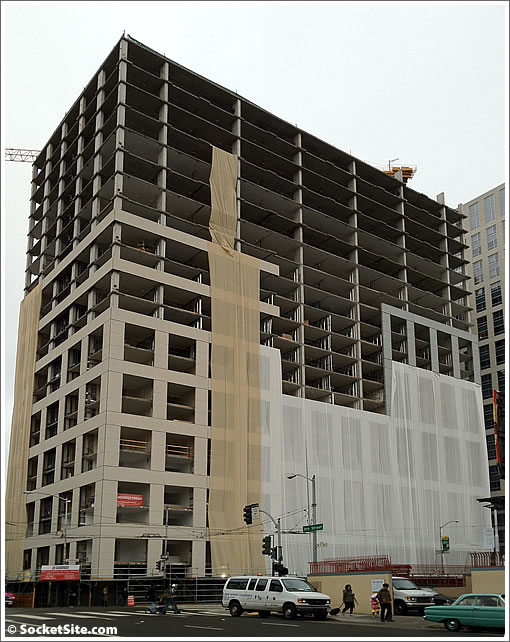
As originally designed, approved, and rendered, the 22-story second phase of Trinity Place rising at 1190 Mission Street was to feature a glass and aluminum curtain wall wrapping around its base on the corner of 8th Street with a precast concrete exterior above.
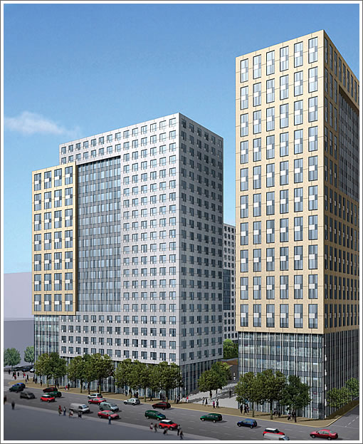
As a number of plugged-in readers have noticed, however, the design was quietly revised and the glass and aluminum curtain wall that was to grace the corner of 8th Street and the first few floors of the building appears to have been “value engineered” away.
The revised rendering for Phase Two of Trinity Place that we uncovered but hasn’t been published by either Arquitectonica or the developer:
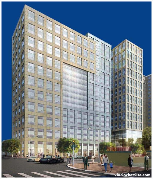
While the revised corner finish might seem like a minor detail, it calls into question whether or not the two “holes” along 8th Street have been value engineered away as well.
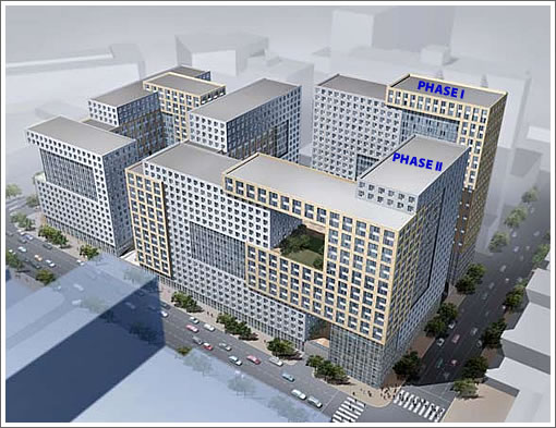
The construction along 8th doesn’t appear to support Arquitectonica’s holey design.
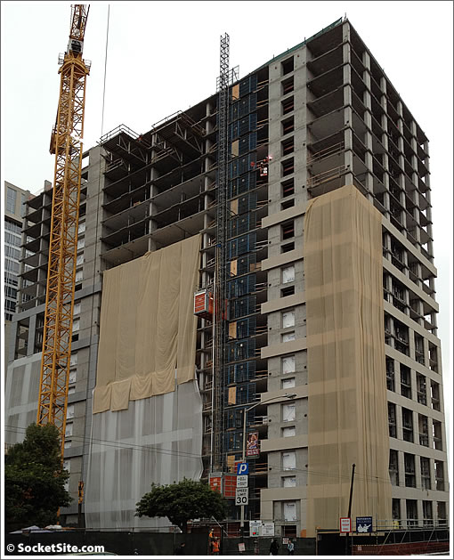
Regardless, the 418 residential units in Phase Two of Trinity Place, mostly one-bedrooms, are currently scheduled to be completed and ready for occupancy in the summer of 2013.
As always, we’ll keep you posted and plugged-in.
Such a shame that the City allowed that. What about the rest of the development?
I hereby name you Tetri-nity Place.
For all those who think we should go higher and higher and denser and denser throughout the city, this is what the end result is. Enjoy!
It’s way better than what was there before.
Fits in with the horrific Fox Plaza building. Great job, San Francisco.
Bummer. It was those textural differences that really made this design work. And when I saw those original renderings it thought “Wow, what a nice way to use inexpensive construction methods to produce something interesting.”
… looks like they found a way to make it even cheaper.
“It’s way better than what was there before.”
One ugly mistake does not justify another. And no, just because it is bigger, does not make it “better”. We should expect more.
…dull is the new boring.
A great example to keep in mind next time some “starchitecture” firm presents a model or a computer rending at a pc or neighborhood meeting for the attendees to ooh and ahh over. There’s no guarantee, unless the architecture firm is also doing the construction management, that the sleek and cutting-edge designs presented at the initial stages of a project will ever get built.
I think it’s ugly no matter what happens. The borgs have invaded. Must assimilate.
While the original design of the complex has been botched, you guys need to grow up a bit in regards to this “DIS IZ WUT U GIT WEN U ASQUE 4 TA11 BUILDINGZ” rhetoric.
The complex as it seems to be getting built is not going to win any architectural awards, no, but it is far from hideous. And while architectural form is an undeniable facet of what must be considered in projects such at this one, the end goal of the complex is not building a new architectural masterpiece – rather, it’s to increase the number and density of inhabitants along this incredibly transit-rich and urban-living oriented corridor.
Not every project is going to be a knock-out, but it’s steps like these that will bring more people to living in the area that will make it more of a desirable residential space that will attract more architecturally compelling (and expensive to construct) projects to the neighborhood in the future.
For all those who think we should go higher and higher and denser and denser throughout the city, this is what the end result is. Enjoy!
I’m baffled at this reasoning. We see small buildings on this site every day that look crappy to begin with or are value-engineered down to looking crappy. Are you saying that it’s more common with large buildings? Certainly doesn’t seem that way to me…
Although, I’m sure you’d be happy for a couple more layers of bureaucracy at planning, along with another 2-3 years of approval time needed for each project…
Building looks fine to me – nothing special, but most buildings aren’t. It loads up the area with another thousand sets of eyes, which is desperately needed here. Only wish it could have been 10-15 stories higher to add some more folks – its neighbor already looks pretty stubby.
The building being built now is not all that prominent in location. I hope the city won’t let them remove details from the Market Street side of the building.
What the heck is it with the influx of NIMBY commenters on this site?
Well, I guess they don’t have the money for Phase III.
Very disappointing bait-and-switch by greedy developers.
dan, there is no market st side of this building
bg – I think Dan is referring to the future phase which does front Market.
While I am not a huge fan of the appearance of the building, this project has always been all about getting people LIVING and working near mid-Market so that that stretch of what should be San Francisco’s premier street can be lifted out of awfulness. It is big and dense. OK. But that means more people . . . regular middle class people to displace the derelicts and bums that have taken over Market between 5th and Van Ness virtually unopposed.
Along with all the other new projects in the area (Crescent Heights, Avalon Bay, Twitter, Square, MarketPlace and others), Mid-Market now has a real shot at rebirth because of Trinity Place, no matter what it looks like.
[Editor’s Note: Don’t forget Dolby or CityPlace.]
Take it from a 30 year vet in the construction business. Value engineered means. Cutting corners to save money.
The City should enforce the original design which was supposedly approved to enhance the City.
Sorry, but I’m not sure I like “no matter what it looks like” as a planning policy. Sangiacomo will build this. He’s not a regular developer at this point – he sees Trinity Place as his legacy and he doesn’t have a lot of time left to see it to fruition. He’s said it himself in a recent interview. He’ll still make money even if he’s held to his original commitment – just a little less. The City should push back a bit.
Sad to see the building will feel less “open” in more ways than one. Then again, this is a glorified econo-box made for maximized ROI, what did you guys expect?
I’m happy they opted to try and make it at least a bit interesting.
It does not look bad – the original design had more texture but the final version is good enough. It will immediately be one of the nicest buildings within 3 blocks in either direction on Mission. And per the earlier commenter – putting people right downtown near jobs and transit is (correctly) the idea. If you want more elbow room drive 25 minutes out of the city in any direction and you will get as much as you want.
The hole and relationship between those 8th & Mission corner buildings is obviously a huge loss for the design, but it’s a shame that even the windows on the “silver section” of this building won’t match phase one’s.
There are too many people who are unable to afford housing. We *need* more econoboxes. How can folks complain about too much luxury development *and* complain about too bland low-cost development?
(Oh, that’s right, people will just complain about *any* development. Never mind me.)
All of Trinity’s properties are blighted or just plain ugly. The Sangiacomo family’s influence has always been like a cancer in the SF community–only taking and never returning anything of lasting value is what they’re all about….What a legacy.
“Call it a California moment. Angelo Sangiacomo is having a little trouble operating the electronic security gate outside his residence on the 18th fairway of the Pebble Beach ”
I think the family inluence is bad on only SOME design they may be involved with. I have always admired their home at Pebble Beach overlooking the ocean as being well designed. It is part of the “experience” of golfing the 18th at Pebble and is a great reminder of how different the rich really are about their choices when it comes to their own home. Hope the link is not too far o.t.
http://www.architecturaldigest.com/decor/2007-10/bararchitects_article
Every time you pay your Recology Bill he has another drink of his 1000 dollar a bottle wine.
Cheers
What did everyone expect? Class A luxury designs for ‘FOR RENT’ apartments?? I’d take this well over some of the other rental properties (especially affordable) that have blighted this city. That block of Mission Street isn’t really the new Paris either…..
“Every time you pay your Recology Bill he has another drink of his 1000 dollar a bottle wine.”
They are not the same people.
What a cheap city. Real cities like New York and Chicago wouldn’t allow this.
^Yeah! We should totally have more laws to prevent development!
Real cities dont extort money from Developers (which is then passed on to the consumer) nearly at the rate that SF does.
I would venture that the soft costs of development in SF were multiples of the similar costs of other “real cities”
They are not the same people.
Real cities dont extort money from Developers
Every extra person in the City costs money in infrastructure, sewage, safety, education, etc…
The regular upkeep of these services is done through regular taxation and/or usage fees. But building, improving, scaling up these services have to be paid somehow. The City has every right to request an upfront fee.
After all, long term inhabitants have been paying to build the core of the infrastructure year after year. Newcomers have to chip in so that they do not free-load on others who paid their dues.
Let’s change scale and look at a new tract development in Anywhere, America. Most of the time the addition of dozens or 100s of new homes will require an upgrade in power lines, water, sewage, roads, probably an extension of the local school. Cities will acknowledge the extra income they’ll take from new residents but will more often than not ask for a significant participation on the “upfront” expense the new people are causing. Sometimes they’ll waive that in order to attract fresh blood, but not all the time, especially if the town is desirable.
That’s not extortion. That’s the real world.
#1)Finally, this building will show those capatalist dogs what are economic system can really do!
#2) Uhh, Sir…that building is in San Francisco.
#1) Oh…victory is ours!
#2)Uhh, not guite…the wall came down.
lol – I gather that most folks here aren’t talking about all impact fees being extortion, but simply the scale of the impact fees (and other things like affordable housing allowances, keeping several hundred units rent-controlled at this location, etc) compared to other places.
Yesterday was the 500th anniversary of the service to mark the completion of the Sistine Chapel. I understand this is better than what was there before, I support development and agree the numbers need to add up etc. But the lack of ambition makes me sad; and for what my friend, for what?
This just in…. a new study reveals that pedestrians don’t actually enjoy sun light…
anon,
I agree that the affordable housing fees/mandatory affordable units issue can be debated.
But if you look at how much adding new sewage pipes, improving roads, expanding schools cost, you’ll appreciate the economies of scale the City is offering. Anyone who has hired a contractor to replace a sewage line on private property knows this is not close to cheap… and yet we’re talking about a few 1000s per unit for the right to piggyback on what’s already there.
sfpuc is getting a check a when you get a permit as well.
http://www.sfwater.org/modules/showdocument.aspx?documentid=200
Lol, those would be fine arguments except that “long term owners” are made far more than whole vs newcomers via Prop 13.
Shza,
That’s true, but it’s a perversion of the system imho. Prop 13 should never have been voted.
Apart from this big basic flaw, the system does what it’s supposed to do. If anything the deficits prove that not enough taxes are collected or that expenses should be lowered to meet funding (depending on your personal political opinion).
Yesterday was the 500th anniversary of the service to mark the completion of the Sistine Chapel. I understand this is better than what was there before, I support development and agree the numbers need to add up etc. But the lack of ambition makes me sad; and for what my friend, for what?
In order to have places for people to live? In order to make the neighborhood a nicer place to walk around in? In order to increase the city’s tax base?
We don’t build buildings just to look at – they have, you know, functions.
The city can absorb two of these, but the entire block extruded in kind feels like Soviet/ Paris-peripherique/ Shenzen joylesssness. That’s not an indictment of density and high-rises, just banal design.
Perhaps it’s a business decision. Poison the well for those that come after. Not only do you realize the savings from the “value engineering”, but you hamper future attempts at tall buildings, limiting competition to your apartments.
When your purpose is rental return, your primary goals are optimizing 3 elements: market segment targeting, cost and practicality. For rental, a few % of savings + extra units have multiples on ROI.
I think everybody wins here. More units for tenants, higher quality than what was there, the existing tenants have their leases grand-fathered, and all of this is happening right on public transit. And the dense urban SF proceeds its inevitable expansion west.
My concern is–what else that is less visible may have been value-engineered away? Is the roof going to leak a few years in? Is the insulation crap? I’ve been in new-built construction, all allegedly built to code, of widely varying quality.
jenofla,
This building is not targeted at resale, but rental. A landlord who builds new construction will most probably not skimp on things that would cost him more money.
The “cosmetically interesting” and “good to have” elements can be gone, but I can bet you they really worried about making this building low maintenance and durable. Well, I do hope the landlord did his homework, but I am not too worried…
If they were condos, I’m be much more cautious. Some developers will risk-analyze savings vs legal/repair costs in case of lawsuits, but a landlord will live with his building for many decades.
It is a pitty,
the new design does not engage the pedestrian flow as much as the older one.
See what happened with Bloomingales few blocks away on Mission Street. The developer promised see-thru storefronts along Mission Street to create an interesting place for pedestrians and instead they created a monster glass wall.
These mistakes should not repeat.
Total haters all of you. Historically Civic Center has been a pit with a stratospheric crime rate over the last 30 years. Trinity Plaza was the old Del Webb Townhouse Hotel where the Yankees stayed for the ’62 World Series. It looked like a bulked up Motel 6. The end result here will be magnificent. There’s no more land people. Where will everyone live in the future? Have a little vision for God’s sake.
Cheers.