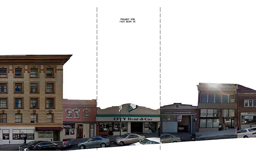
Speaking of developments which have been redesigned, the plans for the proposed 47-unit building to rise upon the City Rent-A-Car site at 1433 Bush Street, between Polk and Van Ness, have been refined anew in response to the Planning Commission’s request “to redesign the project to address concerns primarily related to the size and quality of the ground floor retail spaces and the dimensions and location of the [project’s] interior courtyard.”
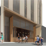
But in addition to refining the development’s ground floor plan, which now includes two ground floor commercial spaces totaling approximately 2,000 square feet, with a restaurant space fronting Bush and a café fronting Fern, the overall design has been refined, and possibly value engineered, by the Dahlin Group for JS Sullivan Development as well, moving from modern to a bit more contemporary.
Originally approved for development back in 2014, “but with 32 condos, 26 parking spaces (versus 8 as now proposed) and a replacement ground floor space for the rental car company, the re-revised plans for the site are slated to be approved by San Francisco’s Planning Commission this week and the paperwork for the demolition and building permits has already been filed.
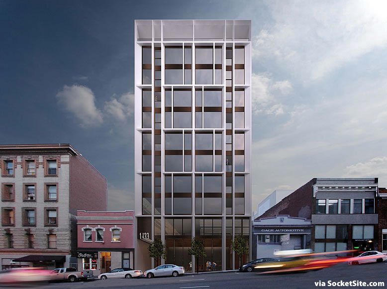


Lesson hon how to make a relatively short/small building look tall, imposing and generally ugly.
I’m still always amazed that the developers never really try to do fire rated glazing (at least a little) at the adjacent property lines rather than just the giant stucco wall with a little lousy articulation. I know fireglass is expensive, but money seems to be no object to the folks paying cash for new luxury condos.
There is more to it than that.
The permits are also really burdensome, and at the end of the day someone might just put a building right in front of the windows, anyway.
1. Your so called “lousy articulation? has nothing to do with fire rated glass or stucco or any other material.
2. Fire rated glazing isn’t just installed to make a property line façade more interesting. it’s installed when there are functional reasons INSIDE the units or floor plan layouts.
3. Additionally, assuming that the two much smaller adjacent buildings could also be built up, the current developer realizes they could lose their property line glazing in the future.
These are an example of real reasons why property line glazing is used or not.
Further, by putting in windows that you know will ultimately get covered by future development, you are just inviting a fight for sometime in the future (can’t take away my light & air…) and you are passing that potential fight onto the new condo owner. This would not be a responsible thing to do. I know so many on this site think that all developers are bad people, but that is not true. There are good reasons for some of what goes on, often created by well-intended, but ill-informed public policy.
If I were a buyer and I was offered an EXTRA window, knowing that it might one day disappear — two years from now or two decades from now — I’d say YES.
Yes, until the time came to take away your window, agreement or not and then (maybe not you) someone will hang up the developer for months and fight. Right after the buyer of your unit sues you for not appropriately disclosing that the window might go away even though it is obvious. Please, in this City, there are months long fights over a whole lot less than a window.
I really don’t think you would, when it came to reality. And in fact, that so called extra window would also raise the initial price of your condo.
Still going to say yes?
I understand your assumption that there will never be another building next to this one, but thats not the world of today. Something will butt up against that and then the glazing will be expensive and useless.
JS Sullivan appears to be bullish on the 8 unit projects.
“moving from modern to a bit more contemporary”
Though I know what the author meant – I think – this could have benefitted from some ” ” around “modern” (or is it just a wry comment on architectural faddism?? If so, then “Bravo!” )
IDK, it looks far more refined and contextually appropriate to me. The previous version was confused and a little too “trying” for me.
Is the building shorter in the back than in the front, or is that just the drawing making it look that way?
In th era of on-line shopping, this city probably has more ground floor retail spaces than it needs now. I am all for as much such retail as we can handle but I’m afraid what we may end up with is block after block of empty storefronts and that is worse than no storefronts.
BTinSF – agree. Every new building does not have to have a business on the ground floor. A street like Polk is enough to satisfy the neighborhood. At this moment the Mid-Market is saturated with restaurants & 2 have or are failing.
Compared to what is being churned out right now, this looks great. I’m sure some uber contemporary architects would argue with me on that, but I like it.
UPDATE: The Planning Commission hearing for the 1433 Bush Street project is now slated for June 1, with the unit count down to 40 units and two ground floor retail spaces totaling 1,546 square feet and 16 stacked parking spaces.
UPDATE: Downsized Development Slated for Approval