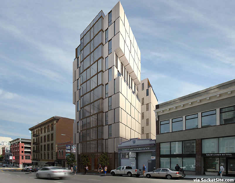
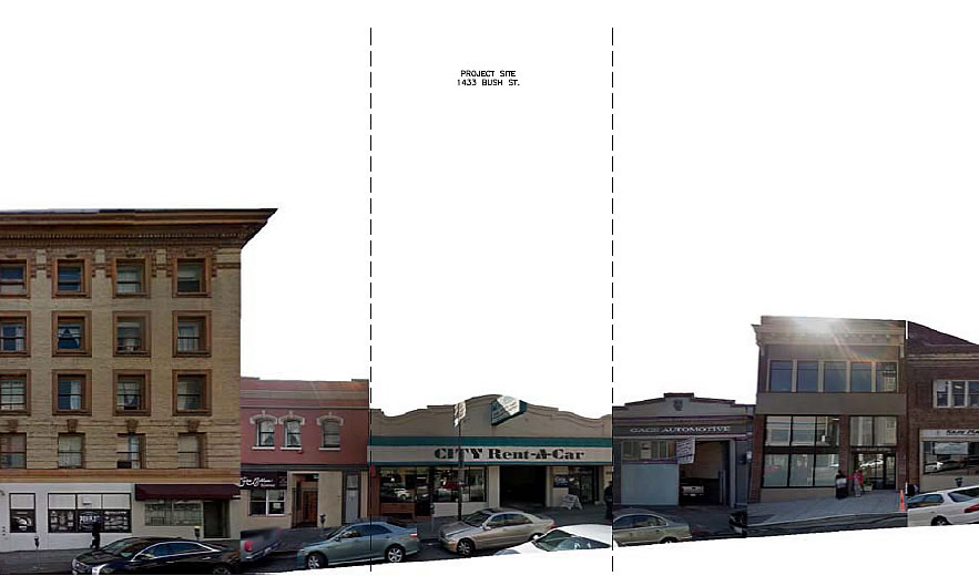
Plans to raze the City Rent-A-Car building at 1433 Bush Street, between Van Ness and Polk, and construct a 10-story building dubbed “Casa D’Ambrosio,” with 32 condos, 26 parking spaces and a replacement ground floor space for the rental car company, were approved back in 2014.
But as we first reported last month, the development has since been redesign by JS Sullivan and the new plans call for a decidedly more modern building to rise up to 116 feet in height on the site, with 47 condos over two retail spaces (a restaurant fronting Bush and café fronting Fern) and a garage for 5 cars.
The paperwork for the demolition and building permits has since been filed.
And if the revised plans are approved by San Francisco’s Planning Commission this week, on Thursday, June 9, the modern Polk Gulch development at 1433 Bush Street could soon break ground.


This is a disruptive design for this block – IMO. The original proposal was a better fit in terms of complimenting the surrounding buildings.
Its not the height that is the issue either – the 430 Eddy project is 8 stories and taller than the surrounding buildings but complements them and makes for a visually cohesive block. Its a very handsome building to boot.
Modern design is fine and as such this type of modern building belongs, IMO, in an area of all new modern design such as Mission Bay. The one thing I don’t get though is this penchant for designing buildings that look like they could topple over in a very strong wind.
15 extra units, 21 less parking spaces and ground floor retail instead of a no-name rental car company — putting your aesthetics aside wouldn’t you say that’s a stronger project?
Stronger because they get to save the money it would have cost to dig a deeper hole to park the cars owned by the residents?
When developers are compelled to build a parking deck or to dig an underground parking garage, those costs–anywhere from $20,000 per underground space to $40,000 per space translate into higher rents or fewer affordable housing units.
Parking spaces for most condos sell for between $50 and $100,000 depending on the neighborhood, so they can more than afford to build the needed parking spaces and make a good profit. This is an eyesore to the neighborhood and our city as a 4th generation San Franciscan.
Considering the parking spaces concerned were largely above-ground, I think even at $100,000 (which seems quite unlikely), they would lose out against using that space for commercial or residential.
Can we please stop using ‘disrupt’? It’s like nails on a chalkboard to free-thinking people.
I disagree, I think a modern bold design amonst the old adds a cool contrast….
Forcing your antiquated taste on everyone else is the definition of infringing on other people’s right, just like Family Research Council or other hate groups who can’t stand minorities or gays who have different lifestyle than their own.
You guys are really reaching now when you are comparing a strong opinion about design and context to infringing on the developer’s civil rights? Jeesh. BTW I like the new design.
it is ok to have strong opinions. It is another thing to enact laws & lawsuits to infringe on other people’s rights.
But then half the commentariate here complains that Mission Bay is too monolithic, too sterile, too modern.
Reminds me of something you’d see in Oslo’s Barcode district. Pretty cool!
That’s a pretty cool looking building.
Vaguely reminiscent of the condo building going up at Franklin and Pine. It’s a nice look IMO
This looks amazing relative to the buildings around it. A very hodgepodge mix of different styles shapes and sizes. Stuff like this is very much what makes a city interesting, IMHO. I dont actually think the particular building is that great, its more how it mixes in with everything else that enhances the street.
You don’t understand! every building must have the exact same architectural style (the one i like), and must be the exact same height (same as my house), or else SF’s unique ~CHARACTER~ will be destroyed forever!!!!!
Looks like the brutalist design of the California Pacific Medical Center on Sacramento and Buchanan. A regrettable aesthetic to say the least. Hopefully, it won’t be approved.
Not even close though I certainly share your disdain for that very regrettable building. BTW, what are the plans for that site once CPMC opens its Geary/Van Ness campus? Another do-over ala “The Pacific?”
As plugged-in people should know, CPMC’s Pacific Campus will be renovated, expanded and the existing hospital building will become an ambulatory-care center.
SIX years ago! I didn’t even know SS 6 years ago.
UGH! I was hoping that building would disappear from the neighborhood or, at least, get a makeover like the former dental college.
Originally inclined to dislike the design due to the immediate context of the surrounding buildings. But on this bock alone there are at least six buildings that have potential for future development, the two on each side of the proposal, 1465, 1475, 1428, and 1430 Bush. The approval of this project may steer future designs and morph the current context. 47 condo and 5 parking spaces are a bit confusing but may be a concession to appease planning.
Yes! As I commented in the earlier item on this revised proposal, don’t look to the past or the street, but to the future of this increasingly aerial residential enclave.
And who is the architect of this very handsome building?
[Editor’s Note: See More Density and Modern Design for Polk Gulch Project Proposed as linked above.]
Dahlin Group – of Blackhawk Danville fame
Design by Alan Tse
Architect of Record – Dahlin Group
Is NO ONE else bothered by the idiotic name Casa D’Ambrosio!?
UPDATE: Polk Gulch Development Take Three