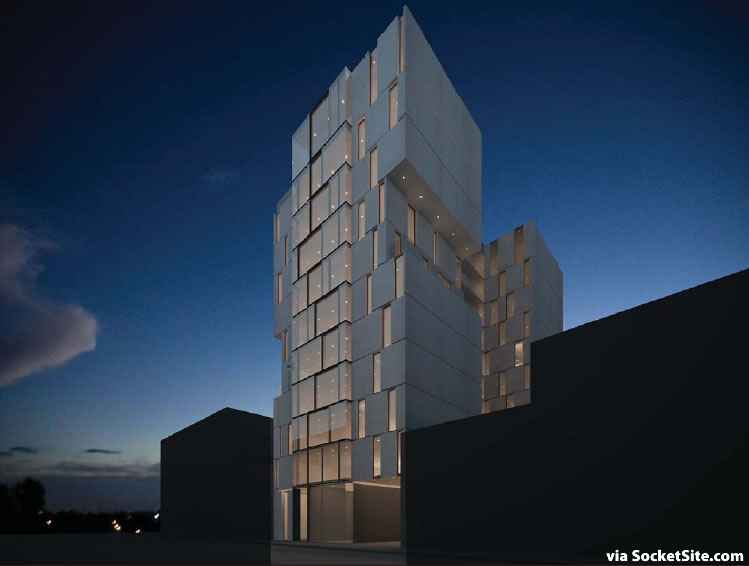
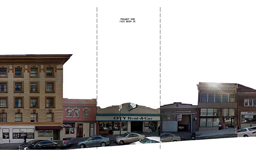
As originally proposed in 2013, and approved the next year, the one-story City Rent-A-Car building at 1433 Bush Street, between Polk and Van Ness, was to be razed, and in its place a 10-story building dubbed “Casa D’Ambrosio,” with 32 condos, 26 residential parking spaces and a replacement ground floor space for the rental car company was to rise on the Polk Gulch site.
Since redesign by “Made in Filmo” for JS Sullivan Development, new plans for the site now call for a decidedly more modern building to rise up to 116 feet in height, with 47 condos over two retail spaces (a restaurant fronting Bush and café fronting Fern) and an underground garage for 5 cars.
The revised plans will require a modification to the entitlements for the project, the hearing for which has been scheduled for June 9.


Cool!
This design is jarring and disrespects the surrounding buildings. No effort to blend in/complement the street architecture. The original 2013 design was far better.
> No effort to blend in/complement the street architecture.
You mean no effort to stay boring. Interesting cities aren’t uniform.
A building can’t be disrespected. It doesn’t have a theory of mind.
“The original 2013 design was far better.”
Seriously? With opinions like this in the Planning Department this is why we get the endless parade of faux-bay windows that do absolutely NOTHING to show a diversity of design that San Francisco deserves.
And we wonder why nothing interesting ever gets built in this city.
I agree. Far more of an interesting and articulated façade; balconies enliven the street scene. The current design, while I acknowledge is merely a quick digital rendering, lacks any detailing, scale references, complexities and even a bit of “soul”. It’s a pretty dead façade, but to many will be appealing because they crave “newness” without really knowing what that means.
I like modern and contemporary as much as the next person, but in this instance and this location on Bush Street, I think that some respect to existing context is warranted. The new proposal does none of that.
Exactly. The roof overhangs in the original design capture that of the nearby adjacent building. There is a transition in design at the lower floors setting apart/emphasizing the street and picking up on the adjacent buildings.
Modern can be fine but, as you say, not in this location.
yep. And its a lot easier and cheaper to make a rendering look good than it is to make an actual building look good.
Half agree with you, need to see a little more work done. The renderings don’t even make it look like it exists within a city (especially the night shot).
Don’t agree on the previous design, I fell asleep looking at that, but there has to be some kind of adventurous middle ground. A lot of people complain about SF architecture failing to be world class, at least the current proposal is taking a step in that direction with a long way to go.
You must love the Pei pyramid in front of the Louvre. Context is code in this case for “more of the same.”
How come SF celebrates diversity in its people but not in its buildings?
LOL, San Francisco is the most closed-minded, homogeneous, UN-diverse cities in the world.
roughly 800,000 suffering from the most pathetic case of Leftist groupthink imaginable. Anyone who dares to advance a slightly more conservative/conventional viewpoint is essentially run out of town.
He’s obviously talking about racial/ethnic diversity (which is what people usually mean when they mention “diversity”), not political viewpoints.
As anyone who’s read reddit or nextdoor knows, the city, despite its liberal reputation, is full of right-wingers. Maybe it’s only 20% rather than the national 40%, but there’s plenty.
I’m coming down on the side of the newer design.
First, it’s much more interesting than the quite pedestrian though comforting original.
More to the point, when considering contextual relationship to the neighborhood, it’s important to consider when and which neighborhood.
In this instance, the building will stand tall for its vicinity just 1 block south of the tower now rising mid-block on Pine which will be next to the building to replace Grubstake. They, in turn, will be just a block east of the twin towers nearing completion across the street and Van Ness which are about the same distance from similarly proportioned residences south on Franklin. No doubt, they, all modern designs, will be joined by others in this burgeoning neighborhood where density of homes is being added to the urbane amenities of mid-Polk.
I think it just makes more sense to not look to the old street level neighborhood but to the aerial collection of homes of the future when judging its relevance. In that context, the refined version is a bold addition.
I see only one worthy of respect (the one on the corner of Polk).
Here’s a crazy idea. How about we respect private property rights and stop imposing the personal aesthetic opinions of un-elected bureaucrats and the general rabble, and ditch entirely that “design review” is about anything else than letting a NIMBY sensibility make everything more expensive than it needs to be.
Reducing all complaints to your constant use of the word NIMBY seems simplistic to me, and an easy way out to blame. There are many complex factors to making housing expensive here in SF including cost of land, cost of labor, insurance, materials, difficult site access and loading/unloading, permitting process, inclusion of neighborhood input. All are important factors and should not be thrown into the tired label of NIMBY.
Calling a label tired doesnt make it not apply.
Your comments might hold more weight if you didn’t devolve to the old “…just because we default to stereotypical name calling doesn’t mean it’s not true….” argument.
Because this “owner” wants to improve his property in our city.
Scary looking. Not concerned about modernism v contextual, just whether this is executed well or looks like a crude dry-vit box w bad windows when complete. seems on the edge of that already.Very tough to do this “aesthetic” well. Can borrow from Porzemparc and Taniguchi here and there and still end up with a dogs breakfast. Anyway, good luck Sullivan. The Market will pay for quality.
Why don’t they go back to using Saitowitz?
The previous scheme was junk and this one looks like an undergrad arch school project, gone wrong.
Interesting. Let architects be architects. Enough “discretionary” bla bla bla.
“Casa d’Ambrosio – elegant living right around the corner from the Boulevard de Teenaged Hookers.”
Love it. Build it.
New design = more condos with less parking; let’s do it!
I live in the neighborhood and love this. Go! Build it!
Yes, let’s let the “professionals” decide, ie,those well represented on this site, decide instead of the little people. They know best. What a horrible-looking building.
I love this design. Being safe is fine, but it’s much better to be interesting.
Right – please build a 120 foot version of 1907 era wood/stucco Edwardian buildings
Screw modern and all of the building techniques invented since then….
sigh
LOVE IT – BUILD IT
You know, they were also building 120 foot buildings in the 1907 era. It’s probably those that people want to emulate.
While apparently a more conceptual design, I like it, although I agree it could use a base, and the base could display a more human, “neighborhood” scale (could be something as simple as well-proportioned, well-placed, expansion joints,etc.
It reminds me of the 60’s era late modern, wherein (mostly) residential architecture in all white, became a pleasant, sculptural display of solid and void: shade and shadow. While perhaps cocky and aloof, the whole notion of condos upstairs from the dry cleaner’s (or whatever) in a borderline neighborhood is cocky and aloof. At least it’s honest: pure.
UPDATE: Modern Polk Gulch Development Could Soon Break Ground