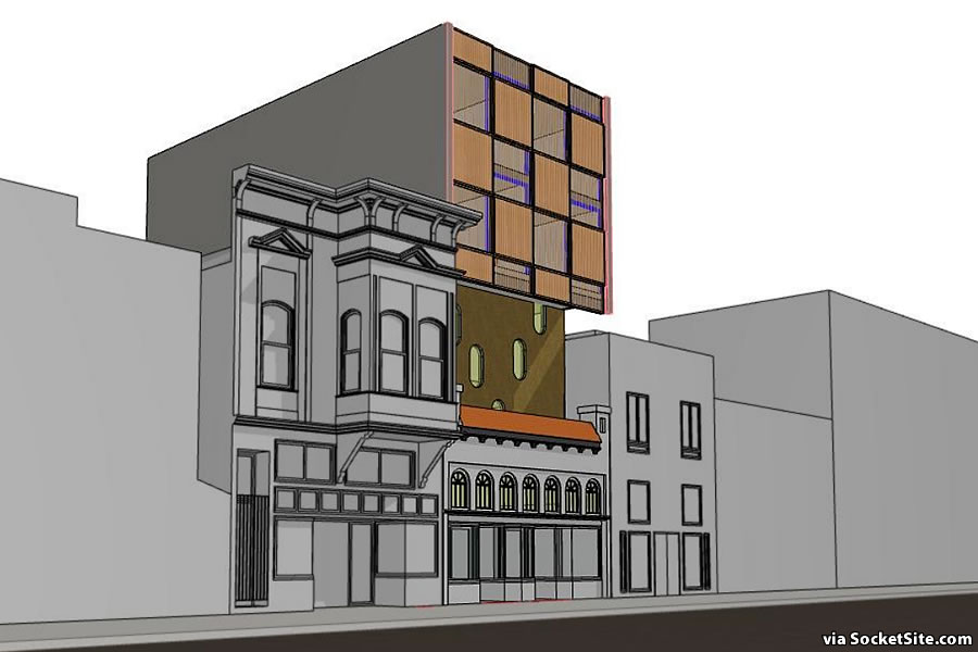
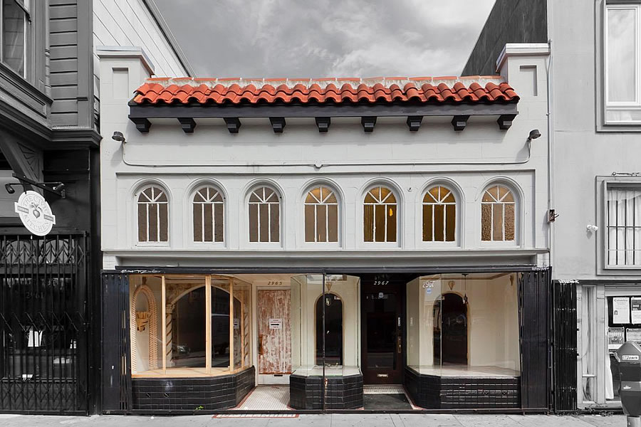
While plans for a modern addition to rise atop the historic commercial building at 2965-2967 Mission Street had been drawn, said plans were panned by Planning, as we outlined last year.
And the 3,400-square-foot Mission District building, which was purchased by Endgames Improv for $2 million back in March of 2018 and positioned as the culmination of a 10-year vision, “to put San Francisco on the map as a nationally renowned destination for the highest level of comedic performance and training,” is now back on the market with a $2.25 million price tag and slated to be delivered vacant.
We’ll keep you posted and plugged-in.


As envisioned last year, the design of the addition still is so jarring to me.
The intention is to create a clear contrast between the original building and the contemporary addition, so each element stands on its own, but it can still be read as a single building. The designers did not want to engage in historical pastiche a la Disney World (or Las Vegas), nor did they want to erect the typical off-beige box that passes for architecture in SF.
I get it. My comment isn’t meant to indicate that I think any of the new work should be emulating the old work. You could take that horrid box off of the older building and the horrid box would still be jarring. The massing, proportions, reflectivity, colors….. all of it is shite.
It’s pointless to set up a straw man (“Disney blah blah blah”) just to knock it down. Nobody involved in these decisions wants anything like Disney World or Las Vegas, although it’s probably comforting for some architects to assume otherwise. The tired old gimmick of bashing San Francisco architecture to justify a generic suburban modern design is an even weaker argument.
Might make sense if the original structure needs a seismic retrofit anyway, so is one way to offset the costs.
So a $14k a month mortgage equals about $4+ a square foot minimum rent?
Not much of an upside at that price without a major redevelopment of the site.
Great location!
It’s in the same stretch of Mission (just down and across the street) from the Bob Tillman’s “Historic Laundromat” project.
We know how smoothly that planning entitlement went!
I live right behind this building. As an architect in SF, I think this very assuming, proposed modern monstrosity addition is an abomination. The top part addition should be stepped back from the façade at minimum, which would afford some balcony space facing the street and better blend in to the surroundings.
Just because you can cram the most square floor space into a building envelope to make the numbers pay out for your investment doesn’t mean you should. And I think if it was stepped back as a balcony space 6 or 8 ft deep, you could still claim that floor space as usable space and still respect the fabric of the neighboring buildings.
I’m not sure of the height limit, but if they added a proposal for an additional height / small half-floor plate set aside for affordable housing it might actually pass and look like there is some compassion.