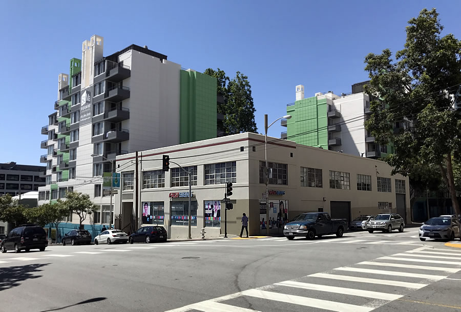
As we first reported back in 2017, plans to raze the two-story Fast Signs Building on the northwest corner of Harrison and Hawthorne Streets and develop a 130-foot-tall residential building on the site, with 118 residential units over a garage for 26 cars, were in the works.
While the site was only zoned for development up to 85 feet in height, the project team was banking on the adoption of San Francisco’s contentious Central SoMa plan which has since added the extra 45 feet as envisioned and rendered last year.
And while San Francisco’s Central SoMa Plan has been challenged, the team behind the proposed entitlement of the 650 Harrison Street site (Realtex) isn’t backing down.
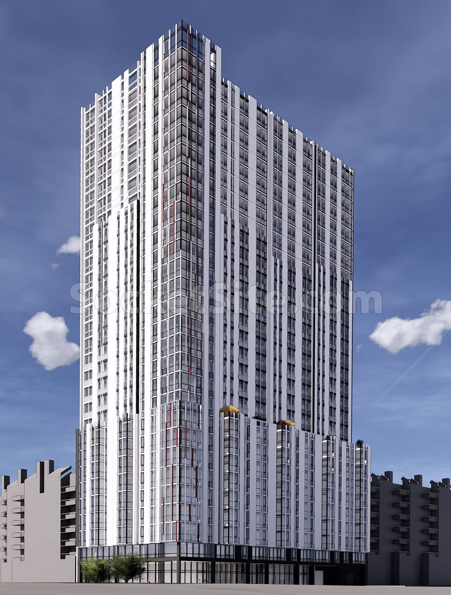
In fact, density bonus plans for the up-zoned site have since been drawn by Ankrom Moisan Architects. And if approved as newly proposed, a 294-foot-tall, 29-story building could rise on the corner site, with 245 residential units over a 928-square-foot retail space and an underground garage for 42 cars, as newly rendered below:
We’ll keep you posted and plugged-in.


Hope they don’t lease out that entire 928 square feet of retail space all at once…
seriously, why so little retail? that’s like 3 or 4 square feet of retail per unit. I know, you don’t have to have any retail, but it seems that if you want to cut down on traffic, put retail in close proximity to where people live.
Indeed. With so little retail, what’s behind all those glass windows on the ground floor? Apartments? Is it just a very narrow hallway wrapping around a garage?
“With so little retail, what’s behind all those glass windows on the ground floor?”
The building’s lobby, a community room and an amenity space for residents (along with the retail space on the corner).
About the size of a Starbucks.
Amazon. Deliveries. “Retail” is so 1987. Especially since the staff supporting the retail can’t even afford Antioch or Tracy anymore.
It’s amusing that the metro at least partially responsible for the damage to the retail segment also demands “lively streets” and unique neighborhoods….while the same people buy everything at Costco and online.
Plus…the U.S. has 3-10 times the retail square footage per capita as other western countries. We already have vastly too much.
Get with the program! The official word (or incantation) isn’t “lively”; it’s “vibrant”!
It’s across the street from the 24,000 square foot “market hall.”
That is a real dog of a design. Hope it’s just a bad rendering.
Is it? I like it more than a lot of what’s posted here.
Me too. There is a nice art deco cast to the building.
Happily, unless Maurice is a MAJOR VENTURE CAPITALIST, his opinion is probably of little interest to the developer or the architect.
Same – at least it has something of a unique style – not just glass and even lines.
Is that really how the building will meet the sky? Real thoughtful….ugh.
Good point. The two architecturally key factors in designing a structure such as this are how it engages the street and how it meets the sky. This building gets a fail on both. Don’t know which is worse – this design or the 5M tower.
If they paint the building black, tan and green you won’t even notice how ugly this thing is…
please approve
Hopefully they use the opportunity to widen the sidewalk on Hawthorne.
How many inclusionary units? Doesn’t adding extra BMR units give them a height bonus (but not 45 feet)?
UPDATE: Height of Proposed Tower(s) Likely to Be Reduced