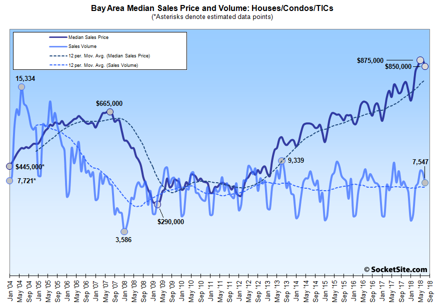
The number of single-family homes and condos that traded hands across the greater Bay Area totaled 7,547 in July, slipping 0.3 percent on a year-over-year basis to a 7-year seasonal low, according to recorded sales data from CoreLogic.
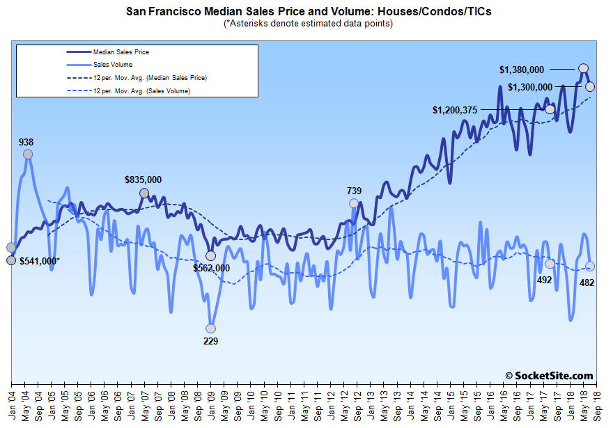
In San Francisco, recorded sales totaled 482 in July, down an above-average 18.9 percent from June and 2.0 percent lower on a year-over-year basis for the lowest July sales volume since totaling 444 in July of 2011.
At the same time, inventory levels have actually been ticking up in San Francisco.
Across the bay, homes sales totaled 1,634 in Alameda County, up 2.4 percent on a year-over-year basis, sales in Contra Costa County totaled 1,579 (up 3.3 percent), and sales in Solano County totaled 621, up 6.9 percent versus the same time last year.
Home sales in Santa Clara County (1,633) were down 7.1 percent on a year-over-year basis in July while sales in San Mateo (589) were 0.9 percent higher.
And up north, home sales in Napa (129) were 1.6 percent higher versus the same time last year and sales in Sonoma (589) were 6.9 percent higher while sales in Marin (291), a higher priced county, were down 14.4 percent.
The median price paid for those aforementioned 482 homes in San Francisco was $1,300,000 in July, down 5.8 percent from a record $1,380,000 in May but 8.3 percent above its mark at the same time last year.
The median sale price in Alameda County slipped 1.6 percent to $855,000 in July but remains 12.1 percent higher on a year-over-year basis; the median sale price in Contra Costa County slipped 0.5 percent to $632,750 but is now running 11.5 percent higher, year-over-year; and the median sale price in Solano County slipped 0.7 percent to $432,000, which is still 6.7 percent higher versus the same time last year.
The median sale price in Santa Clara County dropped 3.3 percent in July to $1,112,000 but remains 17.1 percent above its mark at the same time last year, while the median sale price in San Mateo County ticked up 2.3 percent to a record $1,360,000, which is 13.3 percent higher, year-over-year. San Mateo was the only Bay Area county to record a month-over-month increase in its median sale price.
And up in Marin, the median sale price dropped 5.3 percent to $1,100,000 but remains 14.9 percent above its mark in July of 2017. The median in Napa was unchanged at $669,500, which is 9.3 percent above its mark at the same time last year, and the median price in Sonoma slipped 3.4 percent to $599,000, which is 4.2 percent above its mark at the same time last year.
As such, the median home sale price across the greater Bay Area slipped 2.9 percent from June to $850,000 but remains 11.4 percent above its mark at the same time last year (versus 12.9 percent higher on a year-over-year basis in June).
Keep in mind that while movements in the median sale price are a great measure of what’s selling, they’re not necessarily a great measure of appreciation or changes in value and are susceptible to changes in mix, as opposed to movements in the Case-Shiller Index.
Same story for about 6 years now. Low supply and high demand leading to higher prices. The price lines in these two charts pretty much provide the result (unless one wants to try to argue that the mix has been skewing toward higher and higher end sales for 6 straight years and only 4000 sf homes are selling now). I suspect, and hope, we’ll see some flattening for a while.
Not quite: it looks like there was a period of “flattening” of about two year’s duration (Jan’16-Sep’17…so maybe 1-3/4ths years) with an uptick after that…again.
Fair point. 4 years up, a little more than a year flat, then another year up. But those who have been calling the SF housing market “top” have been wrong for about three years running.
For those hanging their hats on changes in the Median Sale Price being equal to changes in property values, that would suggest that values in San Francisco have increased 16 percent, on average, since the fourth quarter of 2015.
At the same time, pricing for new condos in the city somehow peaked at the end of 2015. Rents peaked right about the same time. And a rapidly expanding collection of recent apples-to-apples sales paints the picture of a rather different reality.
And then there’s that pesky little trend in sales (you know, actual demand), which continues to decline despite average inventory levels having bottomed around…2015 as well.
“pesky little trend in sales (you know, actual demand)”
You’re just going to stick with that gross error, huh? As the chart indicates, in nearly all periods when sales have been trending down, prices have risen, often sharply (exception being late 2007 to late 2009). I guess economists have just had it all wrong for generations. Again, number of sales does not indicate “demand.” That is just completely wrong.
Bender, it’s not at all clear to me that real estate economists have, for generations, conflated changes in median sale price with actual demand level. Can you point me at a relevant paper in a peer-reviewed journal?
What’s your preferred metric for demand level? Change in days on market?
A peer reviewed journal article about economists conflating changes in median sale price with actual demand level? I’m afraid I can’t figure out what you’re asking.
As for a metric for demand level? Well, there’s really no such thing. Demand is a curve based on price. So there is no single “demand level.” This is one of socketsite’s fundamental errors. There are proxies for gauging demand in a local real estate market, such as broad selling price indices, days on market data, and months of supply data. None are perfect. Number of closed sales absolutely does not equal, or even correlate to, “demand.” We’re this so, as the chart above indicates, lower “demand” would correlate pretty closely with rising prices – clearly wrong.
Inventory up, Sales Down is textbook low demand. Demand is a willing and able buyer at the current price level. If the inventory showed up but there was no transaction, then there was no willing and able buyer. And if the demand drop is concentrated on the low end, the drop in sales below the median pushes up the median level. Even if prices, i.e. Apples to Apples, drop.
Not quite. Pretty easy to illustrate. Year 1 you have 5 places for sale and 20 willing and able buyers. All 5 sell. Year 2 you have 4 places for sale and 25 willing and able buyers. All 4 sell. 5 sales declining to 4 sales does not indicate less “demand” by any stretch. That is simply wrong. In this scenario, you likely would see rising prices, exactly as we’ve seen in SF. And you have an awful lot of “ifs” in your post.
Of course, if you were to keep demand constant but add supply, you would also have a higher inventory and lower prices.
ifs? “At a more granular level, the number of single-family homes currently listed for sale in the city (205) is now running 40 percent higher versus the same time last year”
Your example has inventory dropping. That’s not what has been going on here. And median is a population statistic, it does not represent what happens to the price of individual homes. Apples-To-Apples is the same home now selling at a lower price. If there was pent up demand at the previous higher price the seller would have gotten that higher price. Inventory up, Sales Down, Apples-to_Apples prices down.
I have no idea what you’re talking about.
I’m saying that if you keep demand constant but increase supply, inventory goes up and prices drop. That’s basic economics.
Was responding to bender. But what you are both missing is that inventory is up sharply, apples to apples prices down, and still sales hit a 7 year low. Buyers have more homes to chose from, at better prices, but they are not buying. That is a demand drop.
Again, a lot of errors there. First, I was just pointing out the obvious error socketsite keeps making in saying that number of sales equals demand. I think that debate is now over. But your new point also has it wrong. Just flip the scenario I gave: Year 1 you have 4 places for sale and 25 willing and able buyers. Year 2 you have 5 places for sale and 20 willing and able buyers. You have a 25% increase in supply. Up sharply! But demand still far outstrips the supply, and you’ll have upward price pressure (not as much upward pressure as previously, but still upward). Lo and behold, all broad measures show prices rising. Yeah, this site hunts high and low for the rare resale that is below the last sale price, but it ignores the far more “apple” resales that go the other way (and even deletes comments that point those out). I wouldn’t even rule out that there may have been a “demand drop” but with continuing low supply, the demand curve is still meeting the supply curve at a higher and higher level for 6 straight years (with a brief plateau about two years ago), with new record highs just recently announced on this very web site.
Counterfactual hypotheticals, which willfully ignore the actual data and trends at hand, are always cute. But once again, when supply (listings) is greater than demand (sales), inventory levels increase (as has been the actual, versus hypothetical, case). When sales outpace new listings, inventory levels decrease.
Unlike some, we’ve never gone searching for apples with a specific outcome or to fit a narrative. And in fact, other than in rare cases, we have no idea what the outcome will be when our apples are picked. But yes, we have removed off-topic apples or those which have misrepresented the transactions at hand.
But at the very least it appears that you’re starting to learn the difference between what’s demanded and the demand curve! And yes, a shift in said curve could also be characterized, at least when you’re trying to simply things for some, as a change in…desirability.
Now back to actual data and trends at hand, as well as our previous note: “For those hanging their hats on changes in the Median Sale Price being equal to changes in property values, that would suggest that values in San Francisco have increased 16 percent, on average, since the fourth quarter of 2015.”
Well, back to the data observed in your chart at the top of this post – prices have increased significantly, since 2012 and in the last year. That happens when demand is greater than supply, but not when supply is greater than demand. Pretty much open and shut on this one. Unless you resort to a lot of hemming and hawing and weak attempts to pretend that rising prices really means declining prices. In late 2016, you at least had a non-frivolous argument along those lines. That turned out to be wrong. But it’s obviously wrong when SF resales and case shiller both show 10% increases year to year.
We simply can’t help those who won’t help themselves and continue to conflate the change in Median Sale Price with a change in values and the greater Bay Area market/index with San Francisco proper.
“You have a 25% increase in supply. Up sharply! But demand still far outstrips the supply, ” If that were true, then the increased supply would turn into sales. But what we are actually seeing is an increase in supply met with a drop in sales. In your example, if you had 4 sales in year 1 with supply of 4, but 3 sales in year 2 with supply of 5, you’d have to conclude that demand dropped.
Ah, those apples, all those apples back in 2009 that showed housing prices going down, down, down, never to recover. But then as median prices soared relentlessly, there were many frantic reminders that medians aren’t real, ignore those medians, it’s really just mix.
There is a very simple reason why prices will stop rising. Average Google engineer makes $140k. 30% of that is $42k – the rough amount they will pay in housing costs per year. That’s $3,500/mo. An $850,000 housing unit will equate to around $4k/mo housing cost, all-in with a 20% down payment. Rents won’t go much above that either.
They Bay Area has decided that we don’t care about increasing supply – compared to other metros, new housing permitted per capita is simply laughable. But ultimately, prices can only rise if people can pay. We’ve reached that limit.
That is a very strong argument.
So, by that token, the only way prices rise is if the rank and file backbone of tech salaries also rise. Can that happen?
What’s really laughable is the assumption that San Francisco housing demand is driven by salaries.
True. The salaries are the demand part, but the other factor is supply. It’s looking like our future increases in supply are very limited.
Over time, I believe it is. Liquidity events could cause short term gyrations, but over time it seems there must be a cap on pricing based on salary comp? If that’s not the case, anyone who does live on a salary will be priced out of SF, and no company with a workforce (let alone a startup) will be able to exist here… and there won’t be any more liquidity events.
SF will come back down to earth.
There is nothing close to price cap based on salary here. CAR affordability index for SF is 14!
Minimum qualifying salary is $350k, and then there’s the down payment.
Unprecedented central bank madness has flooded the world with cheap money, and no alternative for those with wealth other than to pile into assets like real estate and equities. If you are super rich, you’re losing literally millions of dollars per year with cash in the bank. Sure there are people buying on salary in the dwindling sub $1M market, but much above that you are probably looking at some funny money from overseas, tech stock options, family, crypto, etc. The lower to mid level employees in the local workforce most likely bought at lower prices, are milking rent control, bunked up with roommates, commuting from Antioch, or living in their cargo van in the parking lot.
I’m not sure where this ‘minimum qualifying salary’ of $350k is coming from, but there are plenty of couples around here who clear that pretty easily on their salaries alone (not including their equity).
The 1M and under market, which is the backbone of the current marketplace, is largely driven by salaries in my opinion. And here’s the other thing. The affordability is now so far south geographically, the 1M and under market is practically at Daly City and South City lines. So SF is almost close to complete gentrification in affordability terms, and affordability to highly compensated workers, at that. I think it’s going to happen before the next downturn, actually. A million, for like under the overpass at Mission and San Jose. And that will be sort of interesting. It’s not something America has seen before, really. Not on this scale other than Manhattan, which has its own market idiosyncrasies.
Roughly 30 percent of all property sales in San Francisco over the past six months closed at under a million dollars, including 14 percent of the single-family home transactions.
And while there’s certainly a dividing line for sub-million dollar single-family homes around Lincoln Way, recent sales include 120 Augusta Street which just sold for $900K, 1241 Shafter Avenue ($818K) and 1418 Underwood ($800K), none of which were “fixers” and all of which included room to further expand and upgrade.
So, you gave three examples that are practically at the very southern borders of town. And that was what I wrote.
There are other examples further north, if you bother to look, we simply errored on the side of recency. And in terms of being practically at the very southern borders of town, or “practically at Daly City and South City lines,” as you actually wrote, you seem to be ignoring a few neighborhoods in-between (such as Portola, Visitacion Valley, Little Hollywood and Crocker Amazon).
I look at this sort of thing quite often. If you want to parse back from my musing, hypothetical, somewhat hyperbolic take, then fine. But maybe a third of those will have some sort of tenancy hurdle to surmount. And then there will be another half or more that are generally going to be a fixer or else quite small and therefore a development play themselves.
We have no interest in parsing one’s words or comments. We do, however, have an interest in people being analytically accurate with respect to the market and trends.
but shouldn’t you double those estimates for dual income households (assuming similar jobs). It’s not all single tech bros living in $850k units.
Good point. Maybe, but many 2 income households will also be thinking about kids, which will change costs. Maybe the price cap is slightly higher but not much.
Spot on. There is a price limit even for tech bros. And it is being seen – when you have tech buyers purchasing in less desirable neighborhoods as they can’t afford Noe of Bernal or Portrero Hill. Pushing prices in, as an example, the Mt. Davidson area to ridiculous levels. 1.3 million for a small fixer upper near me. Techie couple with one kid and they were barely able to afford it and are indefinitely putting off fixes as they are strapped.
Prices can’t appreciate too much beyond where techies can afford to purchase. There is a ceiling and short of major salary increases price appreciation will slow significantly.
Glassdoor data is extremely stale and a erages data from today back through when they first started collecting it. Avg google engineer earns far greater than $140K all in. In fact, new college grad engineers at FANG (Facebook, Apple, Netflix, Google) companies frequently earn $200K all in.
actually decent article from The Economist reports median income at FB across all roles in $240k. Not sure where their data come from but probably more reliable than Glassdoor.
The Economist screwed up. The average salary at FB is NOT $240K. The $240K figure is total compensation, includes health care, stock options, bonuses and FB’s cost of providing its other employee perks.
but you can only look at cash, unless the equity portion is liquid (which it usually isn’t for the 22 year old starting). one other factor is that many of these engineers live in group housing situations – similar to the dual income situation banano is describing.
the cap might be slightly higher, but I do believe there is a cap on SF prices that equates roughly to what people can pay. i’d be very nervous about projecting past increases in value too far in the future… once housing is simply too expensive for tech workers, the dynamics of the market will change drastically. it feels like we are close.
Today, new grads at FANG companies are definitely getting 140k+ in cash. The median income must be at least a few decades hire.
These companies are public, which means their equity compensation *is* liquid, it typically comes in the form of restricted stock units (RSUs) which are sellable on the open market upon vesting.
If you’re leaning on average techie comp as a metric, I would strongly consider looking more towards 180-200k.
In addition to what Sabbie wrote, you might want to consider that “new housing permitted per capita” is laughable compared to other metros because population is increasing, largely due to immigration, faster than other metros. The Bay Area might “care about increasing supply”, but the amount of the new housing increase is lower than the amount of population growth.
There was a very modest increase in housing units built in the last five or ten years, but that seems to have ended. Maybe the London Breed can pry open the spigot again. It seems as if at least she genuinely cares.