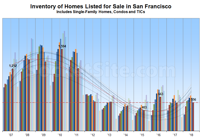
While the number of homes listed for sale in San Francisco has ticked down 16 percent since the middle of July with typical seasonality in play, there are 3 percent more homes on the market right now (555) than there were at the same time last year (540) and 39 percent more than in the middle of August back in 2015 (400).
And once again, it’s actually an increase in the standing inventory of single-family homes (210) versus condos (345) which is driving the overall rise, with 18 percent more single-family homes on the market today versus the same time last year and 5 percent fewer condos, totals which don’t include the vast majority of new construction condos for sale across the city (the inventory of which has been hovering around 550 with the recent opening of the sales office for The Avery).
We’ll note that the average list price per square foot of all the San Francisco homes that are currently in contract has just dropped below $900 for the first time this year versus an average of closed to $930 per listed square foot in the first half of 2018. And if typical seasonality patterns hold, expect new listings and inventory levels to jump in September.

It would be great if @SocketSite could provide data going back to a few more years (’02/’03/’04 etc.) so that readers could see what the run-up to the big ’08/’09/’10/’11 numbers looked like previously. Additionally, some info about the trend-lines (some sort of weighted rolling average I assume?) would be helpful. The trend-lines show a sharp inflection that it doesn’t seem like ’17/’18 are carrying out.
inventory similar to 2012 and lower than 2016. remember what happened 2012 to 2016. are we on the next leg up?
Curious to hear what people think about single-family homes driving the overall rise. Why? What can this be telling us? Or is leaving out new development condo counts causing the diff?
Our counts are apples-to-apples. But a pullback in new condo pricing and values has hurt the market for attempted flips and extended the required hold for units purchased over the past couple of years to exit without a loss.
So then are you claiming the market top is in and the lack of condo inventory is due to frothy flippers finding themselves underwater? Condos tend to leas the market South.
What are your smoothed lines supposed to show? How come they are spiking higher than the bar charts of inventory? In, securities markets, one would expect to see moving averages based on trailing market data. But in this case, the smoothed lines are moving up faster than the bar charts of what I assumed were the category-specific inventory. So what are the smoothed lines showing?
It appears to be a trigonometric smoothing…a sine of the times, as it were.
It appears to be devoid of meaning, like that symbol that was Prince’s name for a while.
A sign of these times.
“bar charts of what I assumed were the category-specific inventory”
12 bars, 12 months?
8 dark, 4 light, August is month 8? Dark=Year to Date, Light=Future months???
Smoothing some sort of YoY/Adjustment for typical inventory that month of the year???
What is the orange dotted line?
It looks like we’re about a year away from the beginning of the next glut. It looks like the trend lines are very steep upward at the moment. Are prices going to flatten? Drop?