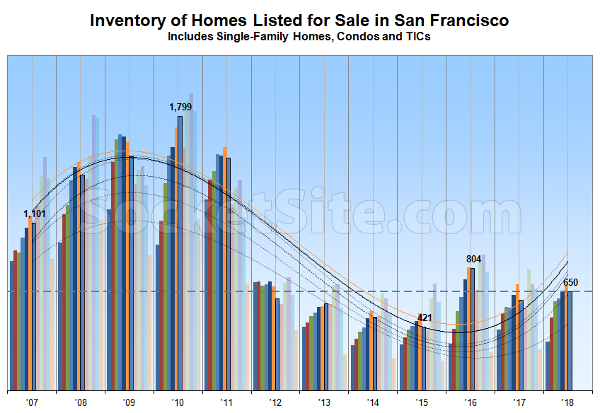
While having slipped 6 percent over the past month with typical seasonality in play, the number of single-family homes and condos actively listed for sale in San Francisco has ticked up 9 percent over the past two weeks to 650, which is 3 percent higher on a year-over-year basis and 54 percent above its mark at the same time in 2015, which remains an inflection point for the current cycle.
At a more granular level, the number of single-family homes currently listed for sale in the city (225) is now running 15 percent higher versus the same time last year while the number of listed condominiums (425) is running 2 percent lower, a total which doesn’t include the vast majority of new construction condos for sale across the city, the inventory of which is currently hovering around 500.
In terms of pricing and expectations, 18 percent of the active listings in San Francisco have undergone at least one price reduction, up from 16 percent in the middle of June but versus 21 percent at the same time last year, while 34 percent of the homes on the market are currently listed for under a million dollars, up from 32 percent in the middle of June but versus 35 percent at the same time last year.
With respect to sales activity, the number of homes currently under contract in the city, the inventory of which isn’t included in the totals above, is currently running around 450 having averaged closer to 470 over the past month.
And once again, Inventory levels in San Francisco typically decline during the summer months before climbing again in September, as tracked and trended above on a monthly basis since 2007.

Would be cool to see a few more years added to the left side of this chart. How does the 2015 inflection point look versus the 2005(?) inflection point? How far back does this data set go? What patterns do we see?
Am I being dense, or doesn’t that graph basically look flat since 2012? 2016 looks like it outlier year to me.