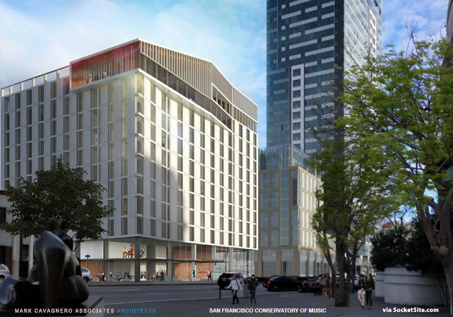
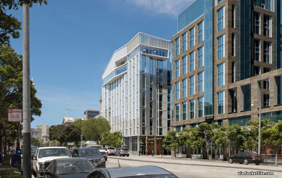
The refined designs for the San Francisco Conservatory of Music’s proposed twelve-story building to rise at 200 Van Ness Avenue, between Hayes Street and Dr. Tom Waddell Place, will be presented to San Francisco’s Planning Commission next week with the project positioning for approvals in February.
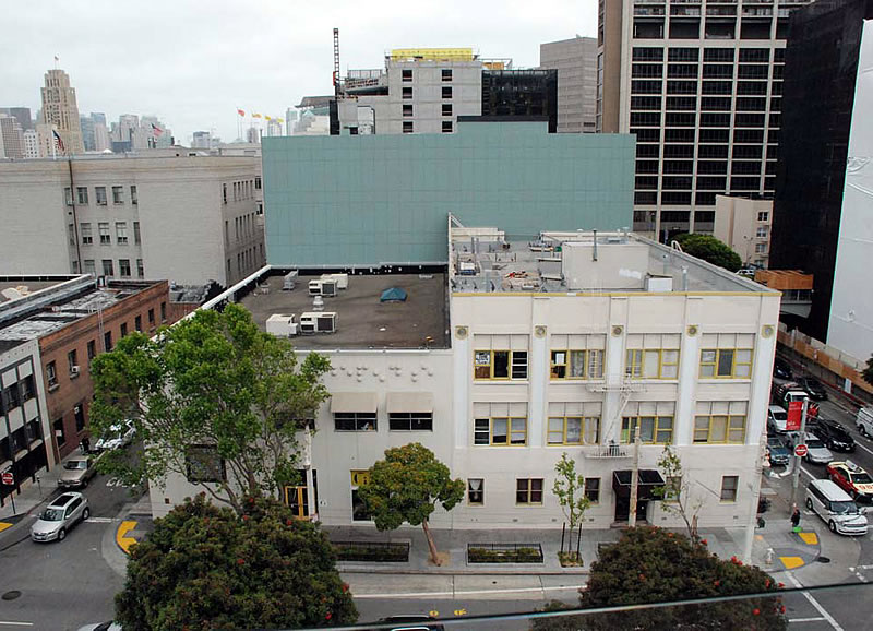
As designed by Mark Cavagnero Associates, the project plans now include 113 units of group housing outfitted with 420 beds for students of the Conservatory, three apartments for Conservatory faculty, and 27 apartments to replace those which would be razed in order to make way for the development.
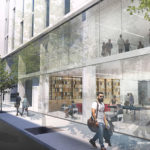
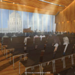
In addition to a ground floor restaurant, recital hall and student center, the development features a double-height performance hall on its top floor, with floor to ceiling windows framing views of City Hall and Davies Symphony Hall across the street.
And while the proposed building has already been cut down to size by 20 feet by integrating the performance hall into the building’s envelope rather than stacking it atop, the current height limit for the site will still need to be increased from 96 feet to 120 feet in order for the project to proceed, an up-zoning which the Planning Department supports.
We’ll keep you posted and plugged-in.
Looks really nice, though I wish at the very least artistic institutions would be commissioning some more aesthetically ambitious architecture. Either way, looks good!
Notice how the plans show storeys squished in relation to their neighbors so the full height of this monstrosity is not apparent.
This ugly building should not be allowed to “frame views of City Hall”. Instead, for this location near an iconic building a smaller, less intrusive development is called for.
So what exactly is so bad about this proposal? It’s a block away from City Hall….what’s your suggested buffer zone? And what makes it “intrusive”
It’s the same height as its neighbor 150 Van Ness, and much shorter than 100 Van Ness. This comment is silly.
squished stories? what plans? don’t know what you’re even saying. project is perfectly scaled. this area needs way more density.
If you’re talking about the brown building to the south, those windows are *double*-story windows – covering 2 floors – in an effort to make the building look less tall. (And, apparently, lead to misinformed commentariat.)
Limp monotone design looks like dormitory meets utility shed/parking structure. Junk for this important location. Looks like lack of design confidence and vision; result is a despiring, derivative mess. Love the Consevatory and attend concerts there.
Nice design for an office building. What’s that? It’s a music conservatory? Then why is it so dull?
Not super ambitious, but tasteful and appropriate for the area. As with most designs, the finish and material selections will be the deal maker/breaker.
One thing that could help break up the elevation and add a tiny bit more visual interest would be (yea its an overused trick nowadays) to stagger the vertical window alignment or even carry down some of those extrusions from the top floors. Either way, looking forward to Van Ness’s continued evolution and relative growth.
I walked by yesterday & noticed the notices posted on the buildings.
A bit bulky & squat for my taste. Some design detail could have broken it up a bit. I will be interesting to see if this is agreeable with the Planning Commission.
The proposed building looks great. They are going to do more work to get the streetside landscape right though.
The picture at the top of the article showing the existing conditions has the silliest collection of mismatched spindly street trees since Dr. Suess published the Lorax.
Integrating the performance space into the building envelope actually improved the overall building. The side facing Van Ness appears more modulated in this render than the original. I agree that materials will make or break the design. I would love to see lots of rich wood tones, either setting the performance space apart from the rest of the building or giving the whole structure a sense of acoustically-minded design.
There are tenants in the apartment building in that block. Did they get bought out or was the builder entitled to have them vacate the premises? If we don’t know the answer, what is the likely way it was handled?
Did you notice the bit about 27 new apartments to replace the existing ones? The existing tenants will almost certainly be allowed to move back in if they choose to and if their rent is currently controlled, like the controlled rents will continue. The article doesn’t say if their rent between demolition and completion of the new building will be subsidized, but I’m betting on it.
It’s like one of those paintings you know you’re supposed to like but you really don’t like it.
I wince at the representation of the cafe. “It’s all sterile boring modern” is a ubiquitous critique of new urban building, but please. This place? For music, made by people? The California Academy of Science has similar “robot space” with raw concrete and steel – at least you can argue for cold rationality in our understanding of the natural world. But here? In a place for music? That scene (a fairly good representation of what many public cultural venues built in the past 20 years looks like) seems as devoid of emotional interest as a saltine cracker. The utility of a parking garage is not an ideal in this context.
Sleek, modern, impersonality form has a place – Apple Stores. It’s like if you build a place where there are no germs or colors, and then staff it with a bunch of teenagers with spread earlobe bulbs, meager facial hair, and pre-diabetes flesh spilling out of tight jeans, you’ve made the place engaging. For me, not so much.
Jesus H. Christ! Everybody’s an aestheticistic architectural design critic. The Conservatory isn’t a money-grubbing for-profit corporate behemoth but rather a civic asset trying to better its lot by partnering with a private developer who’s willing to accommodate them instead of going for “luxury” housing or “Class A” office space on a supposedly prime Civic Center location. Let’s cut them a little slack and trust them to come up with what their resource constrained budget will allow. Or would you rather the current structure sit there in perpetuity?
Well said.
Excellent point.
If you look closely at the renderings, especially the second one, this is not a big block. There is articulation on both facades that makes the building very interesting. Materials and detailing, which are hard to depict in a small rendering, will also make a big difference. Mark is a very talented architect who has done some very nice, understated work (including the SF Jazz Center). I have confidence that this will be a very nice addition to the Civic Center (and can’t wait to see the existing building on the site go away).
Ignore the kvetching on Socketsite, City Planners, and let’s get this civic asset built (and the dump it will replace, replaced).
I agree completely. The arm-chair critics seem to be in full force today, offering nothing but complaining.
And BTW @ Kyle S: it’s rendering, not “render”.
And BTW @ pal: what exactly is “ambitiously aesthetic”? Seriously?
I blame city planning for all the boring architecture in this city. I am sure architects want to building amazing buildings but city planning would only kibosh it. Sad.
UPDATE: Conservatory of Music Project Approved to Rise 120 Feet in Height