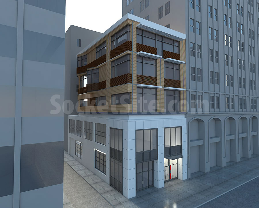
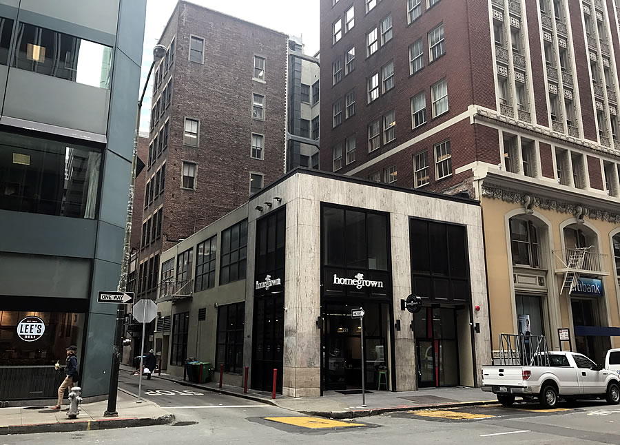
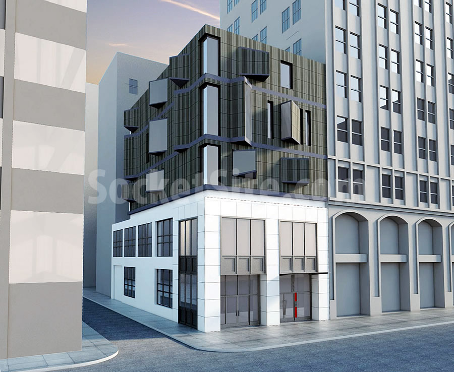
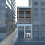
While the plans to add two urban townhomes atop the recently remodeled Financial District building at 220 Battery Street are pushing forward, as we reported last week, the project team is not moving forward with the modern addition as rendered below.
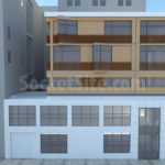
Instead, a more traditional design by Winder Gibson Architects is being pursued, the plans for which would still yield two side-by-side townhomes measuring roughly 2,500 square feet apiece, not including their private roof decks.
And once again, in the works since late 2015, the formal application for the addition has been filed with Planning and the building permits for the project are in the works.
Ok, I take back every compliment I gave the project. Yawn.
That siding (rainscreen?) is going to look awful next to the existing stone. At least the previous design had a strong contrast.
Sorry but this is so much less interesting (an unkind person might say “uglier”). Looks like something a bad architect would have come up with in the 1960s . . . or is that the look they want (retro)?
Old design was much more interesting.
I think the new design is too modern. Can we have a brutalist concrete pillbox?
Phew! That was a close call… this almost looked interesting. Such a relief to know blandness has been restored.
Hear hear. That design almost had a pulse.
Do you guys realized the reason we have these boring design in the city is because of those so-call architects/designers who fail to become architects/designer in the private sector and end up working for the planning department UDAT, RDT design team, to which they purposely pulling all kind of string to F-UP a perfectly good design to something square and uninspiring.
That’s certainly one perspective. But as we originally reported nearly a decade ago: Damn That Planning Department To Hell! Oh, Wait A Minute…
Who asked the project sponsor to redesign if not our planning commission?
Do we know for certain this was in response to Planning? (I assume it was, but might also have been price)
I dont know that I have ever seen a project sponsor come back with a dumbed down proposal without us asking them to dumb it down. Would love to understand this.
Trinity Place was “value engineered” far beyond Planning’s requests or approvals.
Ah yes, what happened at Trinity was pretty disappointing. good point.
Indeed the planning department don’t design because they are completely incapable. Although their “recommendation” put a heavier hand to dictate the design in 2017 than a decade ago. As planning department treat every project case by case, and in this particular design, I could hear the echo from the UDAT design team comment for this 220 Battery Street project: “UDAT recommend the proposed windows at the upper floor to line up with the existing building. UDAT recommend a stronger and solid corner instead of the window corner. UDAT does not support the angle bays at the front facade as they don’t match with the adjacent buildings. UDAT recommend stronger vertical column. UDAT recommend earth-tone color….. ”
I can tell the designer who design the first rendering had already gave up after reading these vapid UDAT SF planning department’s comments. As you see, the first rendering time is sunrise, and the second rendering time is sunset.
FYI, scroll all the way down to see a list of people who dictate the design for every single project in the city.
Coherence in window alignment is not a bad recommendation. Nor, in the case of a tall building, is strengthening a “vertical element”
You all blame only the planning department, but there is plenty of value engineering, plenty of bad design, plenty of blandness without heavy handed planning department review.
@Not John Rahaim: Having been on the receiving end of UDAT’s review and comments, I see you clearly have been there, too. It’s exactly right in tone, cadence and vapidness.
What explains the yellow brick (at least that’s what it looks like in the rendering)? The last time I saw that was a 1960s era school building.
The Alchemy development at Laguna & Haight is covered in yellow brick. And it’s not pretty.
Neither rendering gives an accurate reflection of the actual bldg next door nor the one below. The rendering currently looks like a 60’s office structure, instead of the brick-n-terra cota clad elements that’s actually there, while the below-rendering appears more granular than its existing boxy aluminum-marble contrast belies.
The “modern” submission would look cheap and small next to the taller, more stately structure.
The more traditional redesign at least uses complimentary material (brick cladding). (Hopefully thats not “wood”, as even stucco or polished concrete would be an improvement, to harmonize with the both older elements beside and the newer elements below.)
So, San Francisco will continue to be an architectural backwater. Why I, as a residential architect, wonder why I continue to try to work here. Thanks, UDAT!
A shadowy project on Bumspee Lane!
Interestingly ugly building now boringly ugly
The latest rendering couldn’t be more hideous.
UPDATE: From a Modern to Contemporary to Compatible Addition Downtown