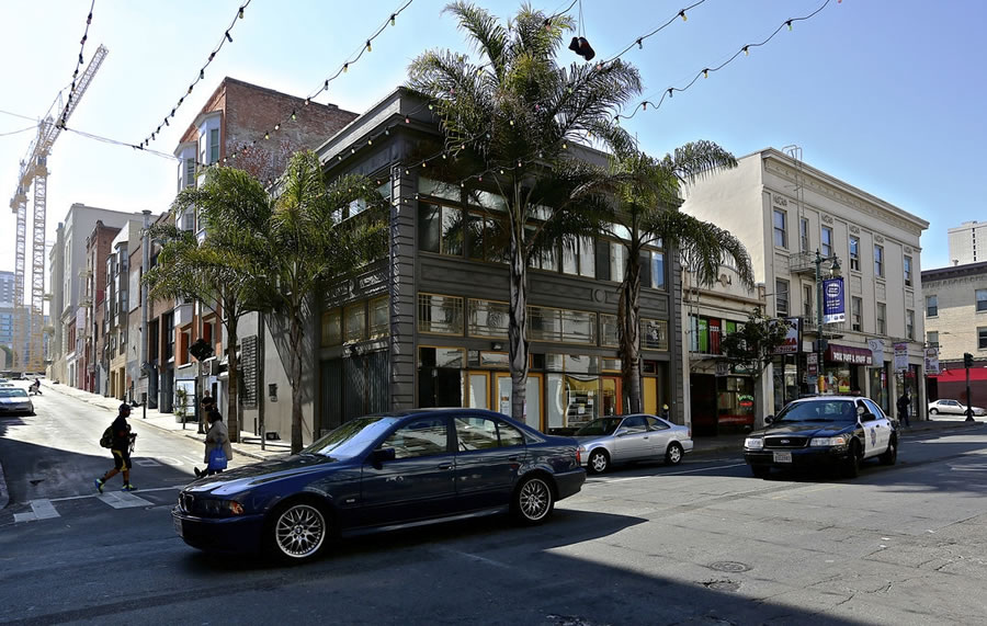
Plans to construct a modern six-story addition atop the historic two-story building at 1033 Polk Street were first floated back in 2014, as we originally reported at the time.
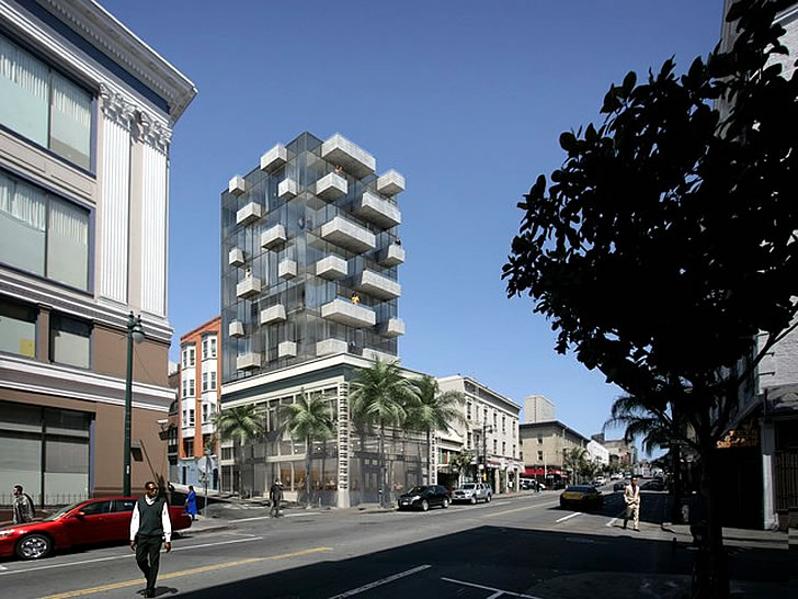
As designed by Natoma Architects, the front quarter of the existing building was to be renovated and restored while the addition would rise to a height of 85 feet on the rear three-quarters of the site, with nine condos over 1,875 square feet of office space on the second floor and 1,300 square feet of retail space on the first.
The formal application for the aforementioned project has since been submitted to Planning. And while the plans have yet to be approved, the 1033 Polk Street parcel is now in play, touting the potential for 19 units over 605 square feet of retail space and asking $4.2 million for the property and plans.
The 1033 Polk Street site is technically zoned for development up to 130 feet in height.
As I read it, this project is not yet entitled. 2017 will be telling in terms of how many entitled projects, or about to be entitled, are put up for sale. That will be one gauge of expected price appreciation for the next 3/4 years.
New condo prices are down and, though they may fall more, I doubt any further decline will be major. My guess is that condo prices could remain flat for an extended period making some of these projects less viable. Perhaps that is why this project is being put on the market.
With 19 units designed, I thought this project might be available because of the new BMR requirements. I didn’t realize that there has been no change in developments under 25 units (12%). With that said, I think your observation is doubly true. This will be an interesting gauge on the situation. I still think it’ll get snapped up because all the larger proposals are on hold.
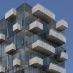
Those balconies are godawful. The glass addition looks fine on its own, but the balconies remind me of those mid-90s Playdoh “Haircut” toys they ran commercials for. Looks like a Brutalist building seeping through the pores of a contemporary glass box.
Actually, to my eye the balconies are the most interesting part of this project and keep it from looking like a generic glass box.
Check out Saitowitz’ website for more pictures showing a close up of the balconies. They are unfinished concrete and exude a Brutalist flare. Not to mention they will look grimy once weathered.
Why is the concrete “unfinished”? Is the glass “unfinished”? Should we cover everything with succo to “finish” it?
Definition of Brutalist: “employing raw, unfinished concrete set in bold, geometric forms”
Covering those balconies in stucco would actually mitigate the Soviet-era block apartment look.
I think the balconies add a lot to an otherwise wholly uninteresting project.
What we do not need in this city: more high end living spaces in glass-only buildings without any way to escape midcentury throwback curtainwalls with barely operable greenwashing afterthoughts.
this building was on the market for 2.25m back in 2013. The first floor was nice but the entire second floor was in a very weird arrangement- A 2500 square foot 1 bedroom apartment which had me pass on it- Another thing twisting the knife was the RC4 zoning which required all sorts of things this building did not have for any additions- Parking, Open space, yard, etc..
interesting design. For Miami
Mix it up a bit. We have enough bay windows in SF
Like architectural cordyceps. That said, it’s always interesting to see how people can expand upon existing buildings.
Change is good and I like it. I would like another developer to step in and build it to the full height of 130 feet. This cooridor is quite busy and being away from the new developments in SOM will allow prices that are above the norm.
I’d much rather these renovation-plus-addition projects were intentionally designed with juxtaposition in mind. Attempting to marry or mimic the original facade in the new structure almost never turns out well. Granted, most examples that I’ve seen this work really nicely are overseas where architects seem to be given a much more generous palette to work from.
Who wouldn’t want to live right next to a 24 homeless shelter / drug treatment center with 330+ beds and homeless people all over the streets. Also don’t forget you have ambulances which show up multiple times a day.
The one interesting thing about the shelter building is the Packard Arrow written on the marque of the building from when this was an automobile showroom.
Meant to say 24 hour a day homeless shelter which is located at 1001 Polk St. Plus the area is full of SROs and plenty of street characters.
If you want to see what the neighborhood really looks like do a Google Street view of site and you will see multiple SFPD cars with officers, an SFFD vehicle, and homeless encampments.
You mean Pierce Arrow
You are correct that the shelter at 1001 Polk run by Episcopal Community Services next door to 1033 Polk building would be a deterrent to living there. It’s not the shelter that’s the problem. It’s the rough group that congregates during the day along the front of 1001 Polk and up Cedar Street that would drive renters or buyers away.
Episcopal Community Services either can’t or won’t disperse the [people] who block the sidewalk. Lots of drug dealing going on. I avoid that block when I’m on foot, and renters who see the situation would turn around and seek an apartment elsewhere.
Ugh. I thought the full glass wall treatment was just a passing trend. Lose the balconies. No one uses them. Lose the rendering with people on their balconies.
The balconies are nice in theory, but if the point is to open a window and step out, why not make actual overhangs to provide shading to the glass box, then nicely sized operable windows to provide fresh air?
(Person on Balcony in rendering) “I see an OD! Oh, wait. It was a knifing. (Sigh) Just another knifing.”
UPDATE: New Plans for Redevelopment of this Historic Polk Street Site
To be honest, What is being done is the construction of The Saigon Center, which is a massive complex in its self, designed by KP&H Associates, and is due to commence construction very soon. Once Episcopal Community Service is booted out of San Francisco, they will began tearing down building, for reallocation for high-rises. once complete, It will be fully encase in glass, making it look like one large building.