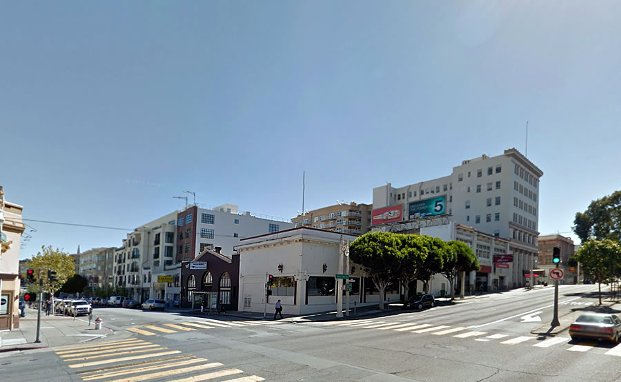
Plans to raze the Pacific Heights Auto Body shop at 1675 Pacific Avenue and the perennially cursed restaurant space at 2050 Van Ness Avenue, on the southeast corner of Pacific, across from the blessed Steakhouse of Harris, have been in the works for two years.
Yesterday, the formal application for an eight-story building to rise up to 80 feet in height on the Nob Hill/Van Ness Corridor site was accepted by Planning.
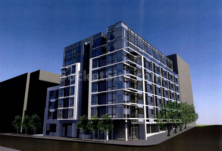
And as newly designed by Ian Birchall & Associates, the proposed ‘1683 Pacific’ project includes 53 residential units over two ground floor retail spaces, storage for 60 bikes and a garage for 27 cars:
Built in 1913, the current auto body shop and restaurant space on the site are actually a single structure with two separate facades and addresses. And while originally identified as a potential historic resource for San Francisco’s Historic Auto Row, the structure was deemed ineligible for landmark status back in 2010.


god is that ugly
Depends on how those finishes look in real life. Renderings don’t always do design justice.
Would love to see the Jiffy Lube facade saved. At least keep a bit of history.
I could think of a number of other corner intersection lots I’d prefer to see demolished and redeveloped. These (apparently this) building(s) is/are far more worthy of retaining. I never have understood why the corner location has been so “cursed.” I’m sure bad operations have been a factor, but not all have been losers on their merits. I recall very much enjoying one (but not its specifics) about 30 years ago. It was the one before a New Orleans/Caribbean “inspired” disaster.
Your timeframe would suggest “Grison’s Chicken House” (and the [un]inspired one Cafe Royale?) But the next try looks like it lasted a decade, so ownership more than siting.
Thanks for the great link. NOT the “Chicken House.”
It was definitely “Tutte Bene” which I fondly recall. Either the source has flipped their order or one of its successors morphed into what began the spiral of losing ventures.
Amazing – well, actually NOT amazing – thoroughly expected but disgusting nonetheless – that the interesting looking building on the left was built just a few short years ago, and since then we’ve regressed to the pig slop offered up here (and I say that with apologies to makers of hog-chow everywhere)
Unfortunately it seems to be a blind link as to why 1675 wasn’t listed, although it’s perhaps to be expected since it’s an “Historic” Buildings Survey, not an “Attractive Older Buildings That Ought To Be Preserved Anyway” Survey.
Developers know they can get away with design mediocrity in SF – case in point the just featured Market/Grove project. Its the cheaper way to go so, as the city does not expect more, one can’t totally blame the developers for these banal designs. Often tweaks are suggested to the design, but mostly they amount to little if anything – in terms of really improving the design. There is a saying about a pig and lipstick IIRC
LA is doing a lot of building and, though there are some poorly designed projects there, as a whole LA is getting better building designs than SF.
Maybe if Developers did not have to spend so much on the entitlement process and lawyers, they could put that extra cash towards design????
The Dolly Parton defense: it costs a lot to look this cheap?
Yeah, it’s pretty bad. There is a lot of garbage going up with both bad design and cheap materials. But, there is always a market. Someone will pay top dollar to live in a place with little to no redeeming qualities.
80 feet? Easily could take 120.
Except it’s only zoned for 80 feet in height.
And even then, anything over 50 feet requires Planning’s approval of a Conditional Use Application (which the aforementioned neighbors to the east are likely fight).
And so is the NE corner of Mission and South Van Ness, the MO plan approved zoning is 320′ and the project proponent wants 400’+. Yet everyone on this board is calling for higher heights in soma, yet will not support it along Van Ness.
Talk about a sideswipe post.
could it go to 120 ny increasing affordable housing. ? if so, i wish they would . it is wide and squat and a taller building would look great there. Since we are building the wasteful BRT, seems like Van Ness could be upzoned with the new beautiful upgrade
Hey! I’m currently in CDMX and BRT is the Bomb!
I see the spell hasn’t been broken.
How’s the market for whitebox condos with a big pole right in the middle of the corner room? Seems to be repeating the mistake of The Infinity?
More ground floor retail space that will sit empty for years. Examples of this abound throughout the city’s newer developments. Can we try something new that actually enlivens the sidewalk a bit? How about residential space with porches or stoops?
UPDATE: Revised Plans for Cursed Van Ness Corridor Corner Approved, But…