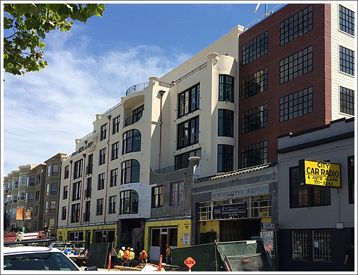
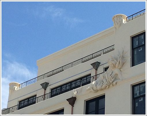
The top floors of the six-story, mixed-use development rising at 1645 Pacific Avenue have been unwrapped, unveiling a bit of unexpected detail work, as captured by a tipster:
San Francisco real estate tips, trends and the local scoop: "Plug In" to SocketSite™


The top floors of the six-story, mixed-use development rising at 1645 Pacific Avenue have been unwrapped, unveiling a bit of unexpected detail work, as captured by a tipster:

I forgot what a new building looked like that doesn’t have all right angles
Nice.
Don’t tell me that stupid looking automotive repair facade was saved and is a part of this project.
[Editor’s Note: We will, and it was. Try clicking on the link above for the details.]
nice to see something finally looking different than all the other stuff being built in SF. I agree with Zig, i forgot what a building looks like that isn’t all right angles and simple pushout square windows from floor to ceiling. I like this new apt building.
Fantastic
Agree with zig and Ben. I haven’t seen a new development that isn’t a box in a while. This is relatively refreshing, if not the best looking property in the world.
It’s lovely.
You can learn more about the process of designing this building from this video on the sales site.
what kind of price points should we expect to see?
I agree with the consensus here: it’s a beautiful building; it’s refreshing to see work which honors the existing aesthetic.
when you have a project sponsor that is a development company that has been around for 350 years (yes, that’s right), you get a sponsor committed to quality and a eye to long-term value.
Wow – looks great. Nice to see someone who actually has good taste compared to 90% of the retro-moderne crap being built in Mission Bay.
Massive respect to anyone who spends a little extra $$ on architecture. Well done !
Big fan of Art Deco. I think it is a great design.
This is MUCH better than the 80s’ bad deco-ish tacky style which I call Faux Art Deco, or F-Art Deco for short.
It’s a great-looking building. And all of it thanks to Nick Podell, the developer who led the project, lives in SF and knows what will work in this neighborhood. Nick has good taste in public art and architecture and it shows in this building.
LOVE LOVE LOVE. not too retro or “faux traditional”. contemporary and classy! love the details. so glad to see a building go up that’s NOT all curtainwall or all faux wood rainscreen. this will stand the test of time as a beautiful building.
Nice to see and reminds of some of the buildings on nob hill. The floorplans look livable, not too cramped.
I used to have my car maintained at that shop back in the 1990s. Mario always had some vintage mbz in for repair.
Hope they don’t decide to save all the old auto shop facades along Bryant and Harrison when they finally get torn down.
To the gentleman or gentlewoman that asked about pricing: I have it on good authority that that the Jr. One bedrooms run $700-$800K and while 2 Beds. start from $1.2M – $2M. Presumably the cheaper ones will face south.
I see a lot of pro comments. That’s fine.
I don’t like this one. It’s not really art-deco, or art anything. A few curves, corner planters and applied statuary do not make for very original architecture of today. It’s basically a stucco clad concrete/steel box with some applied ornamentation.
Robert Venturi could have REALLY done something with this, but as it stands it’s weak, not sophisticated and an amateur architectural solution. There’s no intellect behind the visuals.
Does it “fit in” to the neighborhood context? Yes, by the standards of the average man.
Will these sell? of course.
I almost lost all hope and thought about asking wwfs (what would futurist say?) but I thought to myself: just give it time, he’ll eventually pop his head in to provide us a nugget of wisdom.
No disappointment. Will other “average men” out there agree?
Futurist- I suspect part of the problem with much of today’s modern architecture is too much “intellect” and not enough contextualism or outright livability. Not everything needs a post-rationalization to have merit.
Right lol. didn’t want to disappoint you. FYI:
The term “average man” is not a put down or an arrogant way of thinking. It simply means how does the “average” person on the street react to things like this. It’s often very telling and important. It’s about common culture, free of intellect and deep rationalization. It’s about “do I like it or do I not like it”? and why. The “man/woman on the street” often cuts thru the rhetoric. This project speaks to them and nothing more.
Robert Venturi would have made something heroic, ironic, perhaps humorous and over scaled, for the same project. This particular architect just (lazily) stole.
All I offered was why I didn’t like it. You shouldn’t get so defensive.
And I think the project is probably very “livable” on the inside. I’m sure way more than any of the work by Saitowitz.
But this project has no intellect. That’s why it ultimately is bland and boring.
At least the architect thought about pleasing the eyes of the people who will live in this building. What a novel concept.
I’m with Futurist on this one. It’s a pastiche of various Art Deco elements, and a rather poor one at that.
All that aside, since when is Art Deco associated with San Francisco?
But I’ll give it one thing. It’s not full of bay windows.
“All that aside, since when is Art Deco associated with San Francisco?” -TBK
There are plenty of examples of art deco in SF. And I agree that this is a pretty nice/refreshing design compared to a lot of stuff that’s been getting built.
My old high school, Washington High, is a good example (also Coit tower).
http://timothypflueger.com/tour3.htm
They should have gone full Gaudi!
Art Deco: 130 Montgomery (see name link)
I’d just like to mention here how much I love Roosevelt Middle School–walking down the broad sidewalk in front is always a pleasure. Pretty intimidating as a kid, though!
“since when is Art Deco associated with San Francisco?”
There is one local landmark that comes to mind…
http://goldengatebridge.org/research/factsGGBArtDeco.php
I didn’t say there are no Art Deco buildings (or structures) in the city. But to say the city is associated with Art Deco, please. New York, Miami, LA, Chicago. Not SF. Victorian, yes. Art Deco, no.
Let’s see if any of the AD elements make their way to the interiors.