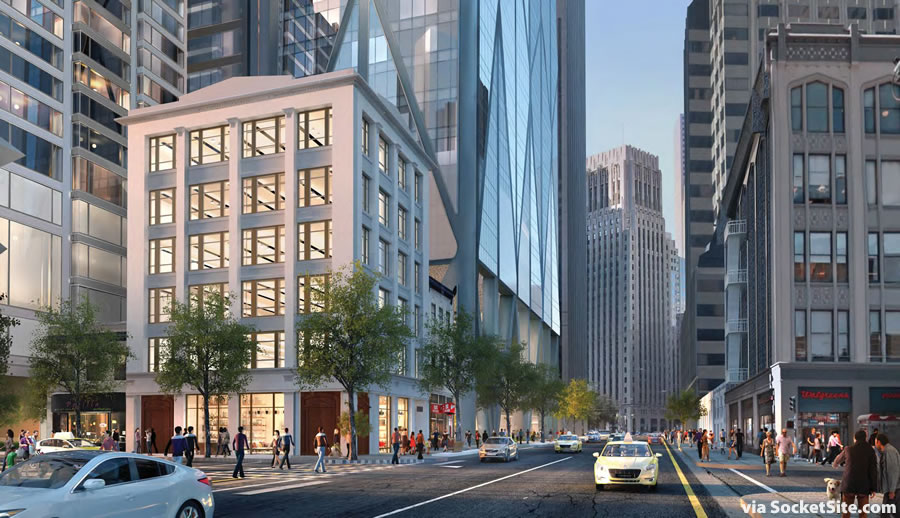
With the plans for the proposed 61-story tower to rise along First Street taking shape, the plans for the grand six-story “urban room” at the base of the building are moving forward as well.

As designed by Foster + Partners, the 19,500 square foot publicly-accessible open space would connect First to Jessie and Ecker Streets, with sitting areas, walkways and access to 9,000 square feet of ground floor retail space between the new First and Mission Street towers and the historic 88 First Street building on the corner which is slated to be renovated as part of the Oceanwide Center project.
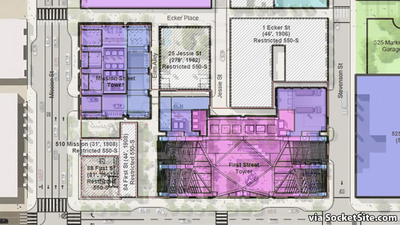
And the un-landscaped area between the building on the corner the towers in the site plan above? Well, there are some troublesome plans for those two parcels as well.
looks like mission isn’t a through street across first anymore – solid yellow line right across mission on first, no overhead wires for 14-mission, not even any cross walks for pedestrians.
Other than that, sounds cool, i’d definitely look forward to not having that fenced off pigeon preserve next to portico’s.
That is an odd rendering- it still shows the Walgreen’s building, which is now 350 Mission (SalesForce Tower).
[Editor’s Note: You’re off by a block. That’s 450 Mission in the rendering above.]
That Walgreen’s (and the historic building it is in) are both still there. The Salesforce Tower sits on what used to be a parking / drop off area for the Transbay Station. Check Streetview- you can see what it looked like before the demo’d the old station.
You’re right.. I was thinking of the low rise Heald College building that 350 Mission replaced.
oh, and what about that plan for the t-shaped building nestled within this plan? Is it still ‘on’? I see the footprint for this rendered still as existing buildings, not this potential strangeness.
[Editor’s Note: As linked above, the concept plans for a 24-story building to rise on those two parcels, which aren’t owned by Oceanwide, remain active and under review.]
My advice: Ensure no inviting pigeon perches.
The street level of 50 1st is incredible. I am so ready for this!
Am I just uninformed or being alarmist, but will not this space be dark, cold and windblown a very good part of the time people are supposed to be “enjoying” it? Have these people thought this out?
I am just referring to how the building meets the street. But I do think the ground floor plaza could be really cool- lots of LED lighting, music playing, fountains, etc.
Perfect…… Downtown San Diego.
Great place for a bum to take a nap too
Minus the good looking people.
no, you’re being a realist.
it will probably be a wind tunnel.
wow, so the plan is to put a massive curb cut on mission street? this seems like one of those moves that planning should nix right away, in favor of a shared richardson entrance to a shared garage. that curb cut is a big step backward for the city’s vision of that part of mission street.
Richardson Street?
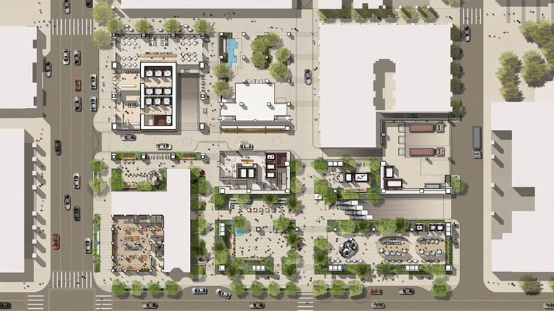
Dumb question: which building in the site plan is 50 First? None of them have the footprint I was expecting.
+1. The bottom shot needs some labelling, I can’t make heads nor tails of it.
If you’re having trouble putting the pieces together, we’ve added a site plan behind the development’s ground floor/landscape plan in a gallery above.
What sort of assurances will be in place that once this project is approved that this nice architectural feature is not value engineered away? I’m still annoyed at how the new Trinity’s “hole” was removed as it was the best feature of that enormous project. The Trinity Hole also formed somewhat of an urban living room albeit limited to the project’s residents.
Excellent point. I hate this bait-and-switch between the beautiful renderings and what they actually produce.
I always thought of the “hole” as just so much gimmicky. The real attraction should be the plaza.
Maybe, but the point is that the project was approved with the hole, and is being built without, and that’s a significant change to the design.
I recall a wonderful planning story that when one of the University of California campuses was first built they put in the buildings and the streets, but left out the pedestrian paths and other landscape features and just planted sod. After a year, the architects came back and analyzed the paths that the students had worn through the sob and then replaced them with concrete paths, park benches, and dead poet statues.
Looking at these large open and covered areas rendered around the new 1st Street and Mission street towers, you sort of wish they could do something like that here. I suspect that with all the wind studies, shading studies and mock ups in the world, some portions of the on grade site will be quite splendid and others will be dogs, where feel like you are standing under a south of market raised freeway at 2 AM.
Perhaps a year with just cheap cafe tables and chairs left out in batches to see where the public drags them. Perhaps a modern high tech version with GPS enabled patio furniture. You could animate where wandered the furniture for a year (popular places may well be seasonal) and then come in and finish the job.
Further kudos if the developer would use some of the required art budget to hire John Adams to set the animation to music – the Bistro Chair Symphony.
The cheap chairs to see where the public drags them didn’t work out very well at Mint Plaza.
What a unfortunate little plaza-perfectly reflective of the social realities of modern SF.
Tank tops and shorts long known as the ideal foil for arctic frozen shade winds every afternoon. Should work perfect for bums and dealers tho.
is it me? it looks like concerns about the west face might be true. ie. some kind of weird protrusion on the west side of the building.
if you look closely, you can see the support columns also extending on the western side.
gosh, please not another crappy, cheap bank of elevators…
i notice the schematic does not provide details for the elevator core.
i am guessing it is up above in the lobby above the plaza?
personally i would rather see the developer drop the cold and windy plaza idea and open a rockfeller center type of observation deck at the top.
just my two cents…
UPDATE: The Refined Plans for a Grand Six-Story Urban Room