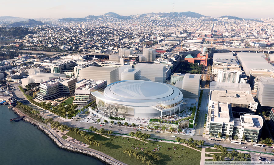
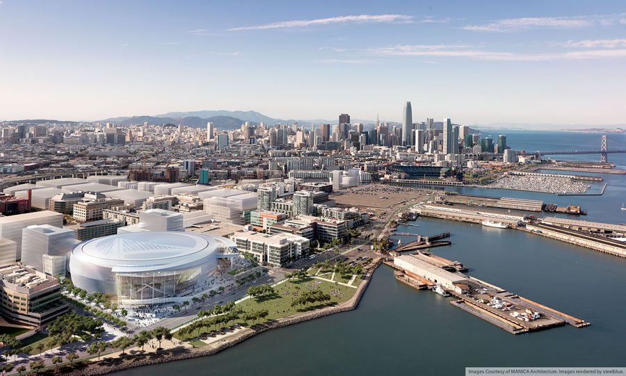
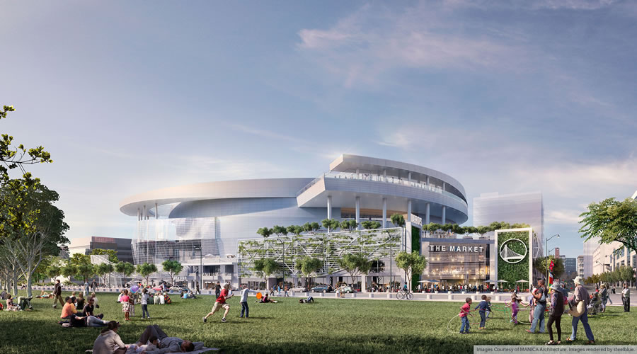
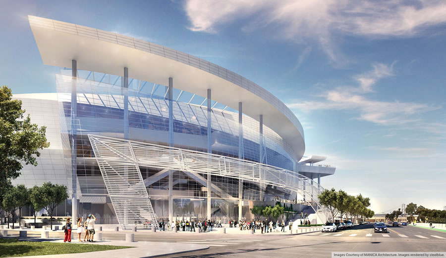
As we first reported last month, the Golden State Warriors proposed Mission Bay Arena has been redesigned to flush-away the snarky “toilet” commentary the earlier design evoked. And for the first time, the proposed arena and adjacent five-and-a-half-acre Bayfront Park which will accompany the development have been rendered in full.
Under the revised design by MANICA Architecture (while Craig Dykers of Snohetta remains a Senior Design Advisor for the project, the Lead Architect is now David Manica), the bulky event hall on the northeast corner of the arena is gone, replaced by a more elegant and asymmetrical Bayfront Terrace, overlooking Bayfront Park and the Bay Bridge beyond.
A 24,000 square foot plaza would occupy the southeast corner of the site, at 16th and Terry Francois Boulevard.
And in addition to the 18,000 seat arena, the updated design includes:
- More than 100,000 square feet of mostly food-oriented retail space
- 3.2 acres of plazas and public space, including the plaza above and a 35,000 square-foot plaza along Third
- Approximately 580,000 square feet of office/biotech/lab space
- Approximately 950 parking spaces for autos in three concealed/underground levels, and
- 300 spaces of permanent valet parking for bikes
The Warriors hope to have the Mission Bay arena constructed in time for the tip off of the 2018-19 NBA season.


This project certainly got boring pretty quickly. This is just not an interesting looking piece of architecture, really at all
If you are not going to provide any more details or information than I, Bob, a random commenter on a real estate website, find this project “boring”, then why even comment?
The photo speaks with such a force and thunder for itself that no more commentary was needed
It is about as interesting as any other boring stadium. Not what you would expect from the architect of major museums. It appears to be largely about a circular movement around the building on a series of standard columns. As apposed to the previous design where the circular promenade cut into the facade. The facade is also appears to be a off the shelf metal panel system as apposed to the previous design, which had a much more unique system.
Unfortunately, and as the article states, this project is no longer being designed by an architect of major museums…
Thanks – That explains it.
I agree. Why even comment Bob? Except to show your disdain, without any serious thought. Typical of most of the armchair critics here: for them it’s simply much easier to look down their noses at architectural design with a sense of superiority. I really wonder why it’s so boring to Bob.
I don’t find it boring. Realizing these are early digital renderings of some broad based ideas, I like these initial ideas: the design will evolve as it should in the complex process. Overall, I like the solid massing and circular shape overlaid with a lighter metal and structural grid; sort of a brise-soleil. The large glazed in portion adds a more “civic” presence than just being a sports venue stadium. It could be a concert hall as well. The upper level viewing platforms offer a dramatic location to view the bay and the city skyline in the background. The light metallic/white colorations of the panels are keeping with the general “lightness” of much of the existing architecture of The City.
Overall, I like it and it offers promise. It’s hardly boring.
It would be far more interesting if it were floated on the bay. Seems plopped down in a grid and doesn’t really breathe in any engaging way.
Don’t click the link if you’re bored of the subject.
yeah it is. it looks really cool.
I like it… it’s no Sydney Opera House, so I still think there’s some missed opportunity here… but that said, I like it overall.
the previous version at pier 30 was superior to the sydney opera house. and much superior location for transportation. thank the nimbys
Have you ever been to the Sydney Opera House – you know, the place a 10-15 minute walk from the hub of all ferries, a train station, and the entire Central Business District?
yes, i’ve been to sydney 3x. pier 30-32 is equally close, if not closer to core of SF as opera house is to core of sydney
I think it is an interesting design. I am tired of commenters saying a project is boring or not taking advantage of an opportunity. When you say something like that you need to defend you opinion by give more detail on what is missing. Any one can say it is bad, but I pay a lot more attention to people who can explain their position. Otherwise your just a whiner.
Oops. How did I miss this?
But you’re not explaining why it’s interesting either… it goes both ways
I don’t think it’s an interesting design. I am tired of commenters disagreeing with me on everything. Everyone must listen to me. Either that, or you’re a whiner.
I’d prefer it if the swoopy forms coming off the main oval were cantilevered instead of supported by those columns… Unrealistic wishes aside, it’s definitely an improvement from the last time. I do miss how pure and monolithic and smooth the original (pier 30-32) design was though. There’s a lot going on on the side facing the park, but I guess that’s lively and interesting in its own way.
So much for Snohetta. Too bad. Guess the Warriors don’t have to try so hard in this location.
We are witnessing the tortured death of a good idea, slowly replaced by a loud, theatrical mess that is reminiscent of something that Ellerbe Becket/Yazdani would have pitched back in the 90s.
Ignore the applied distractions and study these images as a distilled idea. What are we left with? A hockey puck with program stuffed into leftover spaces. That might be ok on its own, but all of the unnecessary layering reeks of cheap glitter.
Compare that to the Warriors’ current home, a simple, elegant, functional and unapologetic modern object, who’s beauty and meaning are born out of honest expression rather than desperate, wild and embarrassing gestures.
Very nice. Having the vistas of the stadium face the park along the Bay looks fantastic. The Warriors listened to the public, relocated, designed a building within codes, and it’s their money. Build it.
They listened to a vocal minority of the public.
There, fixed that for you.
Very vocal minority riled up by a rich and even smaller minority of the public.
I like the design very much (unlike the addition to the San Francisco Museum of Modern Art by the same folks). The design has a great sense of movement to it. If it looks like this rendering it will be a winner for me.
Too bad that silly people focused on the original look. I’m sure any day of the week I could see a toilet seat in the shape of a cloud.
no way dude. it looked just like a toilet. but agreed on liking the new design.
Looks kinda Richard Meier to me, with all those white rails. It’s OK but definitely not as cool as the original.
Now that you say that, it does remind me of Meier! Especially the thick, blunt ends of the swooping deck.
Maybe this is the architecture universe’s way of balancing things: Snohetta is set to replace Meier for the Van Ness tower, so now their big arena design has morphed into something Meier-esque.
Looks much better this time.
Surprisingly, the renderings are missing the “Dot.com Arena” giant signage and the giant LED marquee billboard and whatever other colorful magical junk they can think of to sell to sponsors. And probably some crappy public art too. All these will lead to the usual sensory overload that comes with any new arena. I guess it’s all part of the bait and switch public approval process.
Oh no, Lights and signs! Advertisements, and art! In a city! At an arena!!!! The horror!
“Sensory overload”? LOL…what do you expect from an arena? What do you expect from one of the biggest and densest cities in America? Constant peace and quiet, and everything to be tailored to your own personal tastes?
Looks too big for the parcel to me
I question the idea of putting a public facility like this next to a major hospital and medical center. People leaving this building will be very noisy at night.
The NOP for the Draft EIR mentions problems with access by emergency vehicles as a”significant” impact. Traffic could be insane.
The location is set. Move along.
Yup, just an occasional critically ill child stuck in traffic… no problem.
It’ll also cast eternal shadows over our children, block all the views of the bay, and blind puppies with the glare off its cold, soulless facade.
As opposed to building a new hospital on Van Ness (oops, we’re doing that). Or as opposed to building an entire medical center across a canal from the Giants ballpark (oops, we’re doing that). There’s nothing different here than occurs in every major city in the country – do you think hospitals in Manhattan are on quiet country lanes?
Besides, the most recent news that I’ve seen about someone who needed medical attention being stuck in traffic was due to protesters in Berkeley on I-80… that’s a far more serious (and pointless) exercise that getting worked up about some urban infill…
Van Ness & Geary will have dedicated lanes that are free of traffic (except for a bus every couple of blocks) in both NS and EW directions. Seems like an excellent location to me.
You’re referring to the Bus Ridiculous Transit, I assume, which won’t be implemented for years and has nothing to do with emergency room access for hospitals.
Interesting. Its my understanding that the patient/emergency entrance for the hospital is on 4th street, so the side of the hospital that runs along 3rd by the arena is essentially non-patient/emergency such as the loading dock.
Since when do ambulances whisper?
this looks like a gigantic Audi dealership. off-the-shelf architecture.
There’s only so much de$ign you can do with an indoor arena. If all the critics have a better idea, put up or shut up.
the better idea is the previous design in the previous location
The more I see, the more I’m reminded of what a truly awful location this is for this use. I know that ship has sailed, but it doesn’t stop me from lamenting it. NOT close to BART, On muni lines that can’t hope to handle a crush load of concert goers, a fair hike from Caltrain (which isn’t all that useful for night events anyway). It’s just the worst of all possible worlds, and will encourage WAYYYYY too much driving.
Boo Nimbys
[Editor’s Note: Warriors’ Plan For Managing New Arena Traffic In Mission Bay.]
i weep every time i think about what could have been
The original location and design was iconic and worthy of what San Francisco should be, this is now just sad. How is Los Angeles able to build L.A. Live with hotels, towers, shops and entertainment and we can only get this?
LA’s political world isn’t as overrun with ultra-rich fake environmentalist NIMBYs?
I’m honestly surprised people still complain about L.A. this and L.A. that. I find over the past few years, L.A. is far more livable and enticing than San Francisco. I’d give up SMUG for SMOG any day.
I have a difficult time complaining about minute design elements when we’re getting a brand new, privately funded, and much needed (imo) arena in SF, not only for the Warriors, but many concerts and other large events as well. I agree, this location isn’t as dramatic as the original, which I supported, but this is still a great location, and unique in many ways. Here’s to a 2018 completion.
Don’t worry, if you don’t like it. Today stadiums are obsolete in 25-30 years and replaced. Start planning for the new one.
Anybody know when the tie-up between the San Jose Sharks and SAP Arena is up? I can see the powers that be making a run at the Sharks to play at the Warriors arena once it’s ready. In case you’re wondering, I don’t buy into “the Sharks will never move.” Never is a really long time. I’d chase the Sharks to play in San Francisco if I had the chance.
Just read that the new design was revealed at the Dogpatch Saloon. There has to be some style points given for that one…
How about rotating or making the Windows bigger so it faces the bay. Also somehow make the viewing deck accessible to the public? Right now it looks it only access from the inside.
I think they should be the San Francisco Warriors
I note that they have plazas on the eastern side. These seem useless to me: are there examples of plazas that are well-used, which are directly opposite parks that have a lot more space, across a multiple-lane road? I like the corner in front of the Giants stadium, but that is a gathering space which is not repeated right across the street. What’s the point of this one? I feel like the space may as well be built up to be something useful.
I’m bummed out that Narc-Issus LLC’s designed lost. I preferred its inverted pyramid with the basketball court on top and the court’s clear floor viewed from below by patrons sitting within the inverted pyramid, who’d also see a hologram of the game suspended in the center of empty pyramid space. The only entrance would’ve been the tip of the inverted pyramid, but its spoke/star escalator running at 23 mph solved that, powerful, effective people! The plague biotech research lab’s cold storage facility on the second level was problematic, but the second design phase rectified it by combining the plague storage with the chimpanzee dissection lab next to concessions in partnership with the San Francisco zoo. What people don’t realize is that Biff and Penny, those ole wealthy City patrons who coined both of the City’s new monikers, “Beverly Hills of the North” and “the Suburb,” stomped on this plan in exchange a huge donation to anti-fog research. Sorry, everyone, for not posting earlier about everything else, too. My bad.
And what was your point in posting this nonsense at all? Tell us again.
Ugh! A clearly arena structure for just such uses. I guess that was alright for the original proposed site and the tired old “iconic” Sydney Opera House comparison.
However, for this location I would much prefer an actual building purposed for arena uses. A building connected to its neighborhood. Both evocative of its historic uses and it’s new neighbors. More so the emerging Dogpatch than Mission Bay.
That would be a true challenge to great architecture.
You mean, sort of a AT&T Park or Camden Yards for basketball? A neo-retro-throwback to industrial era architecture?
That could be cool, though I have no problems with this design either.
Something more forward thinking but within the context of its setting as a part of the City.
It’s nice. Reminds me of the American Airlines arena where the Miami Heat play. There’s also a park on the waterfront as well. Way to go!
I had a chance to go the the AA Arena several times. It is truly an ugly building. And no one ever goes to the surrounding parks when there is no game/event – even though it is on prime waterfront. What a waste of space. It could have been so much better.
I like it, better than O.com! 14 in a row baby!
Although the first design was really amazing, the Warriors did not deserve the prominence of the first location, especially because SF lost their 49ers to Santa Clara which is embarrassing and shameful.
Personally, I really like this current redesign and think it’s suited for the location. Maybe it could use a couple of pedestrian bridges or underground walkways for the bay side park. This is going to be a very beautiful spot.
They’re still the “San Francisco” 49ers. And SF is far from the only city to have a pro sports team playing in a suburb rather than the city itself. It would have been nice for the new stadium to be here in SF, but you bitter people who whine that they’re now the “Santa Clara” 49ers are annoying.
But yeah, I agree that the arena looks good. In terms of public transit, the location isn’t the best, but it’s not bad either. At least it’s not isolated like Candlestick was.
i dont consider them the SF 49ers anymore. They are the san jose 49ers.
Everything about that stadium is geared to silicon valley execs., including the location. it take 2.5 hrs to get door to door from the city on game days. in other cities, such as NY, there is an easy way to get to METLIFe. not here.
plus, since harbaugh made the unforgivable mistake of benching alex smith for colin sackernick, the niners have been hard to respect and follow
Minor correction: the Niners stadium is in Santa Clara, not SJ. True that the location is geared towards Silicon Valley.
santa clara, san jose. same thing.
It looks pretty cool from the new waterfront park perspective — could be even better if one of the swoopy elevated platforms made a (bridge) landing in the park so people could access it without crossing four lanes of traffic.
UPDATE: First Peek Inside Warriors Arena, New Designs For Along Third.
Agreed that better connectivity to the waterfront should be incorporated into the arena design.
A quick glance at the renders alongside Google maps and I am noticing that Terry Francois Blvd. will have to be torn up and straightened out in order to accommodate the 5+ acre Bayfront Park. That is a golden opportunity to get creative with streetscape design. The 4 lane through traffic plus loading / drop-off currently shown leaves much to be desired in regards to pedestrian safety after a game lets out.
I like it. It looks like the Ontario airport.
The park by the water looks amazingly boring though.
950 parking spaces.. for an arena for how many people…?
300 bike parking spaces.. oh YEAH!… Why not add 500 skateboard parking spaces and another 300 scooter
Its official SF PLANNING department is STUPID and for sale to any developer with a checkbook.
The plus side of this, in 10 years all the urban planning school across the world can use the Mission Bay, SOMA, Eastern Neighborhood development as a perfect example of BAD CITY PLANNING and how to ruin a world class city.
I agree – 950 parking spaces is ludicrously too many. Should be more like ~200 or so. The area is drowning in enough traffic already.