Having unveiled the site plans for the Golden State Warriors’ proposed 12-acre sports and entertainment center to rise in Mission Bay last month, we now have the concept designs for the development to share.
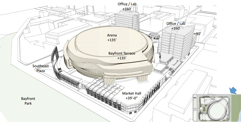
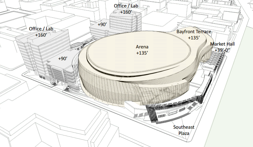
As designed by Snohetta, the 18,000-seat arena is sited on the eastern portion of the Mission Bay site, with two office buildings on the western corners along Third. Up to 90,000 square feet of retail would be concentrated within the ground floor of the office buildings and in a Market Hall along Terry Francois Boulevard at the east end of South Street.
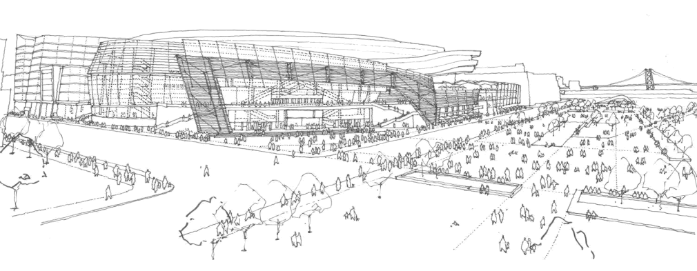
The Southeast Plaza at the corner of Terry Francois Boulevard and 16th Street would overlook the new 5.5-acre Bayfront Park to be built between the Warrior’s arena and the San Francisco Bay.
And in total, the Warriors’ proposed arena development includes over three acres of plazas, landscaping and other public space on the Mission Bay Blocks 29-32 site, with its Main Plaza (which would be roughly the size of the paved portion of Union Square, or Rockefeller Plaza in New York), behind a little “Gatehouse” building along Third.
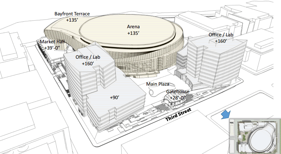
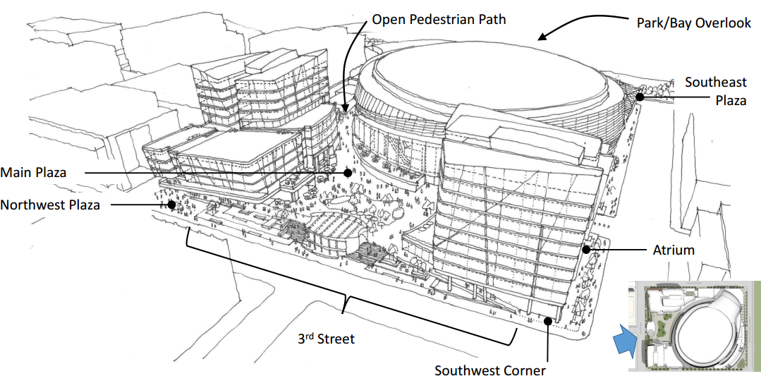
What’s the purpose of the “Gatehouse” – Warriors/event ticket sales? Or specialty retail (coffee shop, or sports store)? Seems like an odd thing to plop there, makes the plaza behind much less inviting and public (in spirit).
The Gatehouse will make the plaza more secure and prevent bad behavior by outsiders lingering and causing trouble.
Or, it will create a break in sight lines between the street and the plaza, allowing off hours “shenanigans” to go on in the plaza out of sight of street traffic.
There are plenty of plazas with no security concerns and no restricted entry…
Amen
Hey, I think I see a BART station there as part of a new transbay tube! Oops, my mistake.
Lol. Who would be paying for that?
This is just not as exciting as the pier 30-32 location.
I agree. But, I think that seeing a final, more refined render would help show off some of the Snohetta-esque play, in consideration to scale and materials… I look forward to seeing how everything works with the public space across Terry Francois, on the bay, as well.
agree with R… they really need to make this work with the public space across Terry Francois. as it is now it looks like the entire complex turns its back to the park.
The southeast plaza has a swoopy “grand entrance” feature that seems to address the bay park pretty well.
Not even close
it looks even more like a toilet depicted this way. heh
Yea, it’d almost be difficult for it to appear more like one
But at least it looks like one of those cool Japanese toilets…
agree Ivan. the pier 30-32 stadium and location was iconic. bye bye to SF’s Sydney Opera House with great public transport. Hello to EveryCITYSTADIUM with little public transport
All of these short, squat buildings around the arena obscure it and just make it generally less impressive than when it sat surrounded by open space in the previous design. I get that they have to fit all this stuff in, but couldn’t they concentrate the height on the third street side to make passing through the towers more dramatic, and make the park/water side more open? The low market hall and southeast plaza entrance could be better absorbed into the form of the arena, instead of having the arena look like it just crash landed on top of them. At least then we could have an iconic view of it from the park.
Agree. And would be nice if the Arena-facing sides of the towers mirrored the curved edge of the arena, to accentuate the shape. This really does feel like an ovoid plopped onto the street grid without a lot of thought.
This building will be a block from the new Muni tunnel that will hopefully be working the year after the building is first used, correct?
Sorry, I’ve not heard about a muni tunnel a block from here, could you please provide a link to info? Thx!
The Central Subway tunnel will be across the channel at 4th & Brannan, but it is true that the “short” line that effectively doubles rail frequency on the T Third between Chinatown and southern Mission Bay has a stop directly across the street.
The T tunnel starts (or ends, depending on your point of view) on 4th street, just south of crossing under the eastbound Bay Bridge approach. Heading south, its just the normal T Muni surface rail line down 4th.
This is correct. I don’t think the T will run along the waterfront once the Central Subway is open. It will just run from Sunnydale to Chinatown along 3rd St., 4th St. and the Central Subway. Hopefully with bigger than 1-car trains on event nights!
Mission Bay is begging for a signature building to stand out from the architectural blandness. So, I have two
problems with the current design. First, it is hidden away behind the front buildings. Second, it doesn’t have any memorable architectural feature. An understated design was appropriate for the previous pier location; it didn’t need to compete with the City. But, here, it should stand out. The Sydney Opera House and the Bird’s Nest in Beijing should be models for what can be achieved. So far, the most memorable feature is its remarkable – and unfortunate – similarity to a toilet.
Absolutely. This design is serving me some “SF Live” realness. Any future changes to this design need to address that fact and the toilet bowl comparisons. Snohetta’s original stadium rendering remains to me more interesting than anything else after.
Southwest corner should be empty / plaza or 12′ high structure at the most.
Arena appears to be crowed by buildings.
The area should be “showing off” the grand structure of the ARENA.
I disagree. You’ve got the whole bay-facing side to show off the area unobstructed. The 3rd Street side is appropriately where the site integrates into the urban fabric.
This isn’t an either/or choice. It can be distinctive on both sides.
Something like this would be more distinctive.
Looks like Darth Helmet
I don’t know what the zoning permits (and to lazy to look), but it would be nice to combine the two towers. This would provide a nicer proportioned tower while freeing up some open space at grade.
great idea
Why do we need a Warriors Stadium? Cant they go elsewhere? San Jose is hopping…
San Francisco is the only city of its size without an arena. Because of that you have to drive to an venue OUTSIDE of San Francisco every time you want to go to a concert. It would be nice for San Francisco residents not to have to do that just to go to a concert.
san francisco is the center of the Bay area and the warriors are currently the best sports team in the bay area. it makes a lot more sense to be in SF than oakland for marketing and profitability from non-game events. we also desperately need a place for concerts and events in SF
“Best sports team in the Bay Area”??? When was their last championship, exactly?
agree with foggydunes and wiger toods: make the tower (or towers) more iconic and better proportioned, and make a very grand and clear view of the arena from the park. its such a mishmash of buildings right now, make them simpler and more visible.
Another mediocre architectural proposal. Endemic to San Francisco. Sad really. Mission bay will provide a lot of jobs but at the street level it is emerging as a windswept bleak landscape.
Snohetta – please consolidate all of these buildings into fewer, more iconic/beautiful ones with better open spaces around them.
Why does it look like a toilet?
Look at the overhead view. All it lacks is a toilet paper holder.
i don’t know what the design process is like, but is it too late to start fresh with a design tailored to this location instead of trying to make the older design fit? i hate to admit that it really does remind me of a toilet, which is sad considering how nice (simple, pure) the older arena design was.
It will probably look better from the bay, if you’re in a boat. From Third Street it is hidden and dull. I would say “pedestrian”, but not many of those will make it to this location.
I disagree with the comments regarding iconic towers. It makes sense for the Third Street side to blend in with its surroundings (as dull and uninspired as those surroundings are). And from the street level the buildings will be plenty high to frame the arena. Something with the drama of the Sydney Opera House might have made sense at the old location, but not this one, and the Bird’s Nest is on a completely different type of site.
I feel like a lot of developers and architects purposefully give us trashy, silly architecture as a last word backhanded slap against the ridiculous process that they are put through by the planning and backwoods NIMBYs in this city. This toilet is a prime example. Intercontinental Hotel is another one I can think of.
Folks, none of you will ever perceive this as a toilet bowl, unless your flying around in the “Goodell must go” banner airplane. You will experience this building from grade level and how it engages the public at grade is really the issue here. Not it’s bird’s eye view.
True, but all it would take is one televised aerial shot of the arena during a big game or concert and the entire nation will perceive San Francisco’s arena as a toilet. Wouldn’t exactly inspire civic pride…
Right. A nickname can stick. And the sportscasters will love it because they can say, “Warriors flushed that one away,” and “Warriors went down the drain.”
Too late, the “it’s a toilet” meme has gone national: Designs for the new Golden State Warriors arena make it look like a giant toilet.
Also being referred to as a toilet on Curbed SF (and so probably the national Curbed sites too). I think at this point they’re going to have to change it, before the spin gets out of control.
The toilet shape of the arena is symbolic. With an additional 18,000 sports fans loitering in the area and not enough public bathrooms, Mission Bay will become a giant outdoor toilet.
simplify. lacks the grandness and clear vision of the pier 30-32 design.
The site is much too crowded … get rid of the office towers altogether and create some actual open space !
Yawn. Good thing the average buildings hide the round thing. Unless the skins are amazing and glow and pulsate in the evening or according to the weather, this is wholly forgettable. But maybe dullness isn’t so bad here sort of continues the utter soulessness of Mission Bay.
Okay reality check ,
The open space is equal to Union Square that is more then enough for the project also,
I would love to see taller towers, but that would exceed current zoning and could delay this project by a decade
What is not being taken into consideration is the massive Water Front Park , but is being shown in the 4th image
it might not be ideal but its a decent design, and what have since the pier design was made impossible .
The office towers are there because they help make the project profitable. 500,000 SF of office space will bring in a large steady cash flow. I’m sure Snohetta would have liked to have filled the space with a sculptural plaza, but there are bills to pay.
San Jose is hopping? Surely you must be kidding. And if you’re talking about the Sharks arena, it’s 20 years old, obsolete, and too small. What we need is for the Sharks to move to the Snohatta arena…
would love to the sharks in SF too
At least Los Angeles allowed the Staples Center (L.A. Live) to include a 54 story tower.
Looks like it’ll be in almost constant shade. That plaza is going to be pretty nippy.
I’d only change the location of the office and allow the arena and plaza to cover the entire north part of the parcel. In other words figure out a way to allow us to see the area as it seems blocked by the office space on 3rd
i agree with you.. The outlying buildings make the entire project look squished and are unnecessary to this project.
They need to be removed, reduced, or at the very least, redesigned to look like they enhance the areana not detract from it.
And they should have done the Pier 30-32 site. I hate the whiney special interest groups in SF who don’t care about the good of the City.
Ownership has turn it’s back on community that has supported a loosing franchise for with top five attendances. The current location can be reached by train plane boat or automobile and home in hour also what city needs job and financial support than all they are could have been done with fickle fans from San Francisco they don’t have passion to support a team at the worst time like east bay fan cause some else to do I San Francisco if loosing
It’s losing not loosing. FYI.
It’s not like they’re moving to Seattle or something.They’re moving 10 miles away. Those passionate East Bay fans can catch BART/MUNI over to games just like fans from SF have been doing for years.
Except that the new location isn’t connected by decent public transportation. That is the huge problem with this site, as many of the comments point out (and pointed out when the pier location — which was perfectly located for transport — got ditched).
Agree that the new location isn’t as ideal as Pier 32 in terms of transit, but disagree that there isn’t “decent” public transit to the site. We all know the T is far from perfect, but by the time the arena opens the track loop on 18th will have been completed which will help operations wise. Also the first batch of new cars light rail should be delivered by then as well, which help help make sure they always have 2 car trains out there for events. And Caltrain is not that far away either. So again the transit options won’t be as robust as we all would like, but not as horrible as some are making them out to be,
the walk from BART to the Oracle arena is farther than the walk from light rail to this location
Except that BART can handle a lot more people than SF’s light rail.
UPDATE: Warriors Mission Bay Arena Design: Another Perspective.
An appeal to the Warriors: Please turn the toilet bowl into a flying saucer. Let us soar with the Warriors rather than flush down the toilet. Get rid of this out of place and out of code Viewing deck protrusion (the Toilet Tank).
Not every design need a city view! Plus the Giants may yet block it!
And it is zoned 90 ft, so what is your excuse for asking a zonal variance? It adds no functional benefits to the Arena, your reason for being here!
a suggestion if you insist on a deck: Get your viewing deck in the shape of a saucer, drop it down to 60 or even 90 ft and make it face the Bay and the Port, or go all the way around and make it a 360 degree viewing deck! Now we will talk of a space ship, not a toilet!