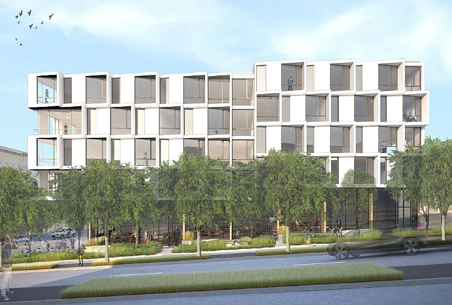
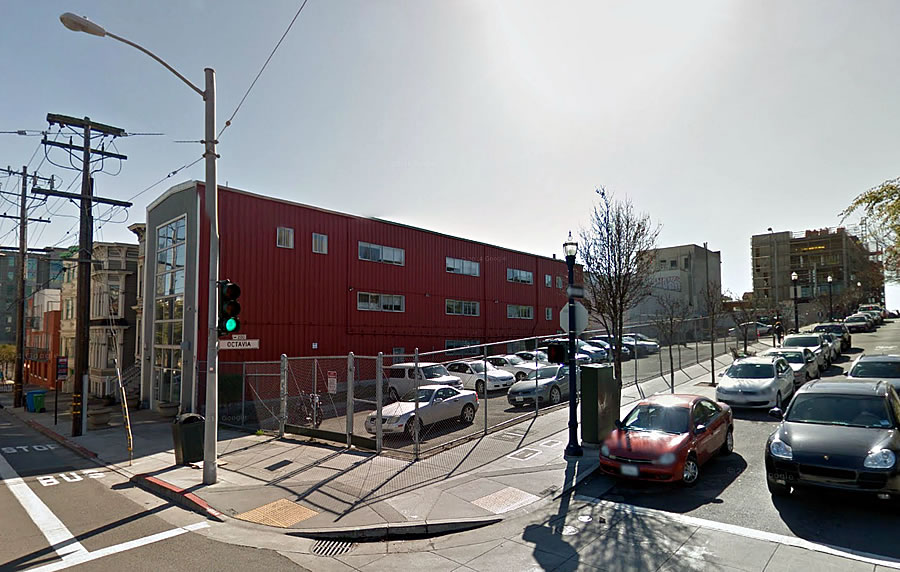
With the development team and concept design for the building to rise on the slender former Central Freeway Parcel T – fronting Octavia Boulevard between Page and Rose – having been selected by the City earlier this year, the project’s Planning Department review is now officially underway.
Designed by Edmonds + Lee Architects, the modern building will rise five stories with 26 condos – a mix of studios, one-bedrooms, and twos – over a ground floor retail space and underground “storage” for 13 cars (including 6 spaces dedicated for car sharing to mitigate the loss of the existing car sharing spaces on the site).
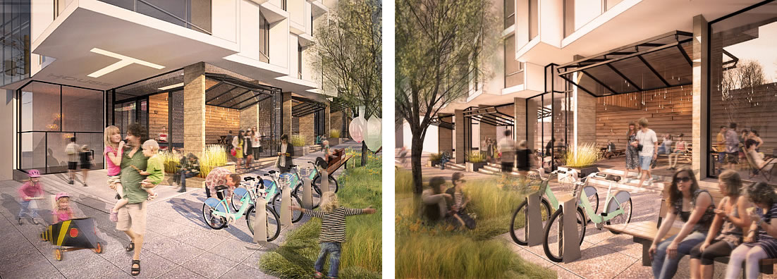
And once again, the retail space will stretch the width of the block and has been “designed for a future community beer hall concept,” perhaps to mitigate the inevitable loss of a certain biergarten space down the Boulevard on Parcel L.
From the architects with respect to the design:
For the facade treatment, our [design] directly references the tradition of the Victorian Bay Window, however, rather than simply replicate the prescribed geometry, our proposal…is of an abstracted composition of three-dimensional, articulated bays that use depth and repetition to provide visual interest.
And from the Planning Department’s preliminary review:
The Planning Department is generally supportive of the proposed project architectural idea and expression but recommends further explorations of the mid-block shift of pattern, the use of the projections as balconies, and the compliance of the projections as bay windows. The Planning Department would like the sponsor to further explain or consider how the views to Patricia’s Green and sunlight orientation can adjust the angles of both the glazing and wall portals.
Linden Partners, a joint venture of DDG and DM Development and the development team behind 8 Octavia, 400 Grove and 450 Hayes, is aiming to have the Hayes Valley Parcel T project ready for occupancy in 2017.


Nice…now let’s build ALL the other vacant lots along Octavia!
Would be easier to do that if we could get the Planning Commission to stop micromanaging things like bay windows.
Kind of looks like Yerba Buena Lofts.
Looks somewhat mid-century to me.
That it does and it looks quite nice. Stands out in a sea of dull design these days.
“The compliance of the projections as bay windows”??
Wow.
“The Planning Department would like the sponsor to further explain or consider how the views to Patricia’s Green and sunlight orientation can adjust the angles of both the glazing and wall portals.”
Generally the planning dept is less offensive than the Supes, etc. But this sounds like they are all up in the architect’s/developer’s a**.
Sad about the biergarten – the kind of thing that makes SF (and this neighborhood) so unique and desirable (along with Smitten’s and the other I guess temporary installations). Hoping all of that gets incorporated back into the neighborhood somehow.
If these “projections” comply as bay windows, then that is a meaningless standard. There is nothing at all bay window like at all about those windows/projections. I don’t think that bay windows should be required here, but it silly to say they are required and then allow something that clearly isn’t a bay window.
Not sure that it is so clear it is not a “bay” window. It looks like a bay window to me, not a Victorian one, but still a bay window.
It might be helpful to clarify that “bay windows” in this case means that they’re hanging over the property line. That’s why Planning gets to restrict the design so much. If you stay on your own property (and loose the square footage), you get a lot more leeway with the elevations.
It looks like the windows are angled but not actually projected out. The projecting bays are more like inaccessible balconies or simply dramatic decorative frames.
Wow, this will only have 7 parking spaces for tenants.
How do developments like this with limited parking work? Is it first come first served? Or are the spaces auctioned off to the highest bidder? Is the parking space permanently attached to that unit number, or can the owner sell the parking space or the unit separately?
Does the use of the word “storage” regarding car parking mean this project will be using stackers instead of individual spaces?
Perhaps is means that residents will have to crush and grind their cars into metal shavings and store them in urns on their fake-fireplace mantels.
BobN wins the internet today 🙂
No, it means tenants will have to carry their Smartcars up to their own units. Bay windows in SF are great because they take advantage of the free airspace. In Amsterdam, building owners used to get taxed based on the frontage of their buildings. So, the owners wised up and decided to build narrow buildings which are set deep.
You will also notice that old buildings in Amesterdam lean outward toward the street the higher up the are. The footprints on the top floors are higher than the bottom floors, since only the land space was taxed.
Great. Such a relief from that collagesque aesthetic you see everywhere these days…where building facades are composed of a patch work of multiple meaningless materials. Look forward to seeing this built!
looks great!