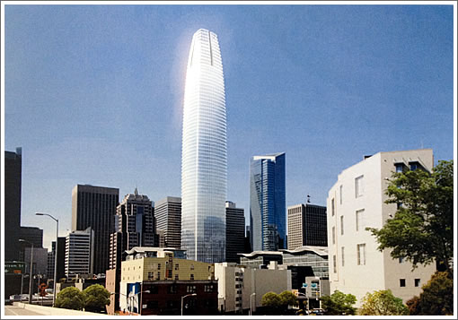
While the design for San Francisco’s Transbay Tower to rise on Mission between 1st and Fremont Streets has shrunk from 1,200 to 1,070 feet, the proposed 61-story tower will still cast new shadows across San Francisco, shadows which can be problematic for developers and fodder for litigation.
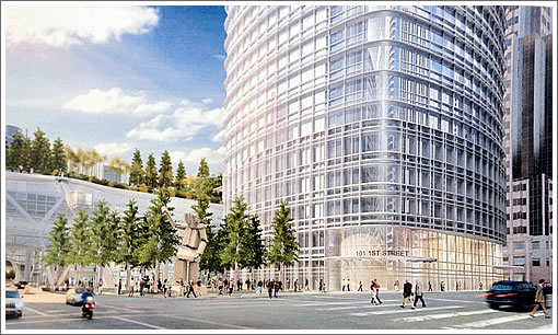
The proposed tower will yield 1.37 million square feet of office space; 10,600 square feet of retail; 39,370 square feet of subterranean parking; and 28,300 square feet of public open space, including a 24,000-square-foot Mission Plaza at the corner of 1st and Fremont featuring a funicular connecting the plaza with the 5.4 acre City Park above the Center.

This week, San Francisco’s Planning Commission will meet with the Recreation & Park Commission to consider the Planning Department’s recommendation that the cumulative shadow limits governed by Proposition K (the “Sunlight Ordinance”) be revised upwards for seven downtown parks to allow the development of San Francisco’s Transit Center District to reach its full potential, including the Transbay Tower to be tagged 101 1st Street.

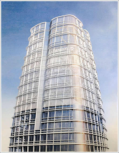
As plugged-in people know, while the tower will rise to 1,070 feet, the roof height of the building will only reach 912 feet, a mechanical parapet will reach 970 feet, and a metal lattice crown will comprise the final 100 feet. A close-up of the tower’s redesigned crown:

SHADOWS! NOOOOOOO!!!!!!
This is a big city folks, deal with it. If you want uninterrupted sunshine, move to the burbs!
Well now that we can see that the slot is on four sides of the crown it looks less like a giant lingam.
The crown seems to allow air to pass through and that should decrease wind load somewhat. The original design entries for this site included wind generators at the top. I guess that’s fallen out of fashion.
This looks like the prehensile end of a robotic arm. Like the ones at Foxconn.
I hereby baptize this building “4Prongs”
Enough about the crown (which is both tacky and tacked on). Can we return to the street-level issues? The concrete man on the plaza may actually be uglier than than the funicular is silly. The latter reminds me of glass-walled elevators on the sides of two-story motels in Nevada.
I really like the concrete man. He pays tribute to the old terminal.
The funicular is stupid. Waste of money and very inefficient way to get people on or off the roof garden – useless in an emergency. And I agree with the others about the concrete man. What happened to the glass canopy that was in the original renderings??? That would have been a much more welcome public benefit – a large, rain-protected city plaza that could be used for events.
I don’t know why I continue to be excited about this project. The design is so obviously derivative of the architect’s earlier work in other cities; the tower looks less elegant in its shorter iteration; and, I hope to Jesus that odd sculpture in the front is not included. Now, I have to settle for what is supposed to be a signature tower in our city named 101 1st Street? Surely we can do better.
I like the concrete man. He reminds me of Rusty, the huge animated character that was such a big success at AT&T Park.
It’s a super handsome building, and will look great on the skyline. I can only assume they know what they’re doing with the latest crown iteration. At first glance I preferred the unbroken sweep of the last version, but with the right lighting this could be awesome.
I’ll also agree with everyone else re: the concrete man. Super ugly in renders, but we can only hope he’ll look better in reality. Tim Hawkinson is pretty talented.
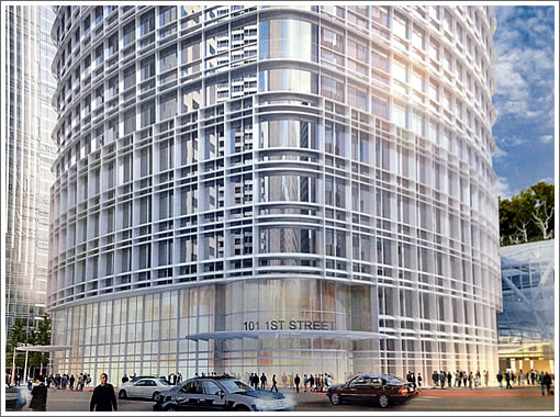
What an underwhelming street entrance and lobby design for what is hoping to be San Francisco’s tallest tower. Compare this to what was the SOM design with huge soaring lobby with water features, digital art wall, seating and cafes.
Is the funicular acting as some type of homeless screening device? But how?
What was also a “green” wind power generating tower “crown” has now been turned into a tall screen to hide HVAC equipment and other mechanical systems.
What a shame.
I can’t wait to see it built! I’ll have front row seats from my office.
Re: shadows
My very last peek-a-boo view of the BB will be gone forever once it’s built. 5 years ago I could see 1/3 of the bridge. Now I can still see a tiny vertical slice. I also realized this building will be casting a shadow over my office part of the morning but will probably reflect afternoon sun.
It would’ve been nice if there was a residential component to it.
Looks like one of those sand worms from Tremors. Why do the insist on making it glow in the renderings? It simply won’t look like that.
I’m very concerned about the shadow. I’m just so frightened it will envelope me. It will be there every day but at least it won’t be there at night. Oh my.
Is it just 61 stories. The rendering is off as the Millenium is to the right and it is 60 stories yet looks like about 60% of the height of the new tower.
^Residential stories are but a fraction of the height of office stories. The rendering is correct in scale.
Hadn’t thought of that.
Wasn’t it supposed to be 100 plus stories at one time?
I knew they cut the height back but didn’t realize they took 40 stories off of it.
It won’t be that much taller than the TA pyramid now. It too has an ornamental top.
Sort of unimpressive given the derivative design and the scaled back size. Given this is, or was, supposed to be SF’s signature office tower.
[Editor’s Note: 71 stories within a building height of 1,200 feet was the maximum ever proposed: San Francisco’s Transbay Terminal Design Proposals: Highlights.]
It gets worse every time I see a new version. It’s gotten to the point that I don’t care if this gets built or not — still excited about the new terminal though. I never envisioned being so uninspired by a new tallest building in the city.
I agree with Turin. Such a lackluster proposal. This thing is just going to get worse and worse as time and lawsuits progress.
Wow, this is increasingly depressing. I thought we were getting a new tallest building, but instead we’re still slicing off stories on this ugly [building]. At this point, the whole project looks like a well-planned waste of tax dollars with no real benefit to the greater community, aside from the free housing the junkies will receive. At least LA, Chicago, New York and Seattle know how to build skyscrapers. But hey, we’re a ‘world class’ city no matter what, right?
Maybe lawsuits and shadow issues will block it indefinitel. One can hope.
The Transamerica building faced similar criticism before it was built. I guess some things never change. Among them is scepticism of all things new.
“Wow, this is increasingly depressing. I thought we were getting a new tallest building, but instead we’re still slicing off stories on this ugly [building]. At this point, the whole project looks like a well-planned waste of tax dollars with no real benefit to the greater community, aside from the free housing the junkies will receive. At least LA, Chicago, New York and Seattle know how to build skyscrapers. But hey, we’re a ‘world class’ city no matter what, right?”
You have no idea what you’re talking about, apparently. This WILL be the tallest building in SF.
“Still slicing stories”? The height was chopped from 1,200′ to 1,070′ over a year ago now, nothing more has been removed, and 1,070′ would still be the tallest building in SF by 220 feet.
Also, there is no housing included in this tower, so I have no idea what you’re talking about when you mention “free housing for junkies”.
Furthermore, this is not at all a “waste of tax dollars with no real benefit to the community”. Quite the opposite, as revenue from this building will be used to help fund the Transbay terminal, which is currently under construction (and which proved a new park and improved transit connections), and the building would also add over 1 million square feet of office space to downtown (which does have demand for it currently), as well as some retail. And those businesses that move into the tower will of course be paying the city money through taxes, and contributing to the local economy.
As for the new crown design. Not bad, but I liked the original design better. And I’m glad there’s been a lack of dubious penis comparisons in the comments this time.
I’m glad to see the close-up views. The detailing looks like a rounded, white version of Pelli’s JP Morgan Chase Building on Mission, one of my favorite recent towers.
Is Pelli trying to make this look like 15 Penn plaza on purpose?
http://www.archpaper.com/uploads/VornadoPelliTowers.jpg
I don’t know, did Gehry make the Bilbao Guggenheim look like Disney Concert Hall on purpose? Good architects have styles and vocabularies that make their work distinctive. Like a writer with a unique voice or an artist who masters a technique, we don’t disparage them for it. It makes their body of work cohesive and not subject to mimicking random styles (as lesser architects might).
“Is Pelli trying to make this look like 15 Penn plaza on purpose?”
Here’s how I see it:
Is the building similar to 15 Penn? Sure.
Is it the same as 15 Penn? Not at all.
To me, It’s similar to it in the way that the Empire State Building and Chrysler building are similar. Yeah, they’re both tall art deco towers with setbacks running up the tower, and pointy spires, so they’re quite similar…but at the same time, they’re obviously quite different. Same deal with Transbay vs. 15 Penn. Transbay has a similar overall shape as 15 Penn, but it also has rounded edges, a different base, a different crown, etc, etc.
I feel like people are being overly critical of this thing. If we had never seen the amazing SOM proposal, I have a feeling many of the haters would be ambivalent about this less-amazing (but still nice) pelli tower, or even supportive of it.
Good architects don’t rip themselves off.
Take SOM for example- a real world class architecture firm that has produced inspired, original designs for decades.
Pelli and Gehry are one trick ponies.
Some people have bought into the whole “starchitect” phenomenon. I personally don’t conflate “good architecture” or a “good architect” with buildings that force the viewer to recognize it as a specific architect’s work.
I don’t embrace of the fairly recent trend whereby the architect decides that satisfying their ego and building an immediately-recognizable visual “brand” overrides the desires of the client/owner/resident/tenant to have a functional building that contributes to and has some relation to the built environment to which it is going to become a part.
Architects aren’t singers or writers; a building doesn’t stand alone, to be considered completely by itself.
That said, Pelli Clarke Pelli Architects isn’t anywhere near as insular or personality cult-focused as Frank Gehry, even though he says he’s offended by the use of the word “starchitect”.
Well. Just to add to and amplify what cbf wrote above. The rooftop park is part of the larger transbay project and looks to be a substantial real benefit to the greater community.
From the architect’s website:
This is the part I’m most enthusiastic about apart from the potential for a high speed rail connection.
SOM have recently diversified in style but they have decades of “copycat” pure modernist towers as their legacy. They were quite consistent for decades because they have a strong philosophy about what architecture is and what it should do. That philosophy is visible in their work. That’s what I expect from good architecture firm.
I read on another site that if Hines can’t come up with the deposit before tomorrow’s TJPA meeting, they may scrap the Hines proposal and start the bidding process anew. Please, please let that happen, and then please let the SOM team bid again. Could we be that lucky? I’d be doing back flips if the SOM design was moving forward.
Pelli is hardly a one trick pony. They have been designing superb modern structures for many decades, without worrying about the latest trend or movement. Their work is always clean, timeless, elegant and urbane.
This project will get built, as designed by Pelli. The SOM tower could never meet the strict budget requirements.
This great Pelli project will be an outstanding addition not only to our skyline, but to the pedestrian and transit component to our city.