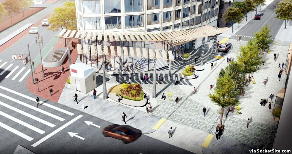
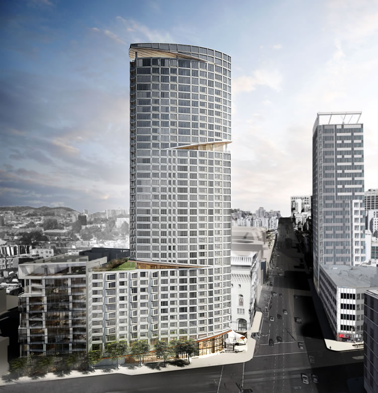
The plans for the proposed Oak Plaza to be constructed at the intersection of Market and Van Ness, at the base of the proposed 310-unit One Oak tower to rise up to 400 feet in height, have been substantially redesigned for the third time.
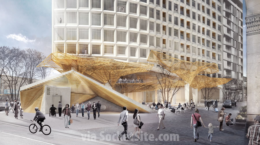
As originally designed by Snøhetta, the proposed plaza included a forest inspired canopy and a functional amphitheater enclosure with terraced seating above the escalator and stairs to MUNI which were to be relocated from along Market Street but connected to the existing platform below.
Last year, the proposed Oak Plaza canopy was redesigned, the amphitheater enclosure was abandoned along with the proposed relocation of the existing MUNI stairs along Market Street, and the Muni elevator was moved across the Street to the base of One South Van Ness Avenue.
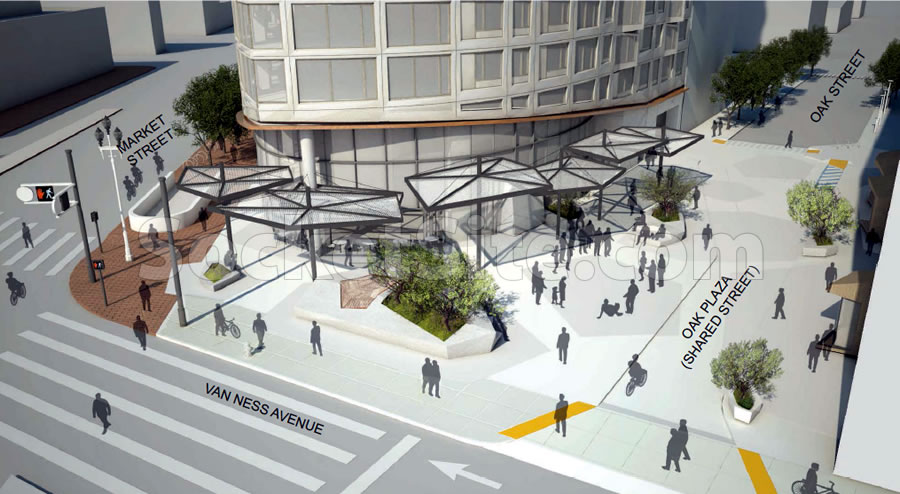
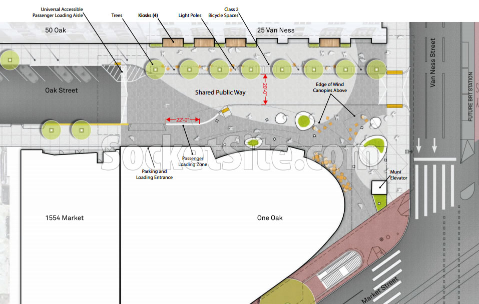
And now, the MUNI elevator is back to where it currently sits but without the fancy enclosure, the wind canopies have been redesigned as pergola-like structures with perforated metal blades, and the continuation of Oak Street as a shared public way has been widened, as has the sidewalk on the north side of Oak.
Speaking of the north side of Oak Street, the re-refined plans include 90-square-foot retail kiosks to be set within four of the seven recessed archways along the southern façade of 25 Van Ness Avenue, kiosks which are intended to activate the proposed Oak Plaza with a flower stand, coffee stand and/or the like.
And on a related note, the proposed number of underground parking spaces for the One Oak tower has been reduced from 155 to 136.
Like the kiosk idea – we need more of these in commercial deadzones like Civic Center Plaza.
I think this looks amazing. I dont know why they keep redesigning it, but my only guess is to drive more cost down. Either way, in my mind all these smaller details you all are arguing about are pretty trivial IMHO and net net this will be very good for that intersection.
This redesign is much better than the last. Hopefully, they stop here and just build it.
Moving the elevator was no doubt an incredibly expensive proposition, but keeping it at the corner as-is, with no incorporation into the plaza, is plain offensive. Like, “Fontana Tower of Van Ness and Market” levels of offensive.
If elevator stays where it is, ideally it could be integrated into a new commercial kiosk, like the ones proposed along Oak
seems like a missed opportunity — you could at least turn the elevator towards the building, and try to make a space out of it. now it’s just a no man’s land with random pimples of green. the canopy looks a little better though — that first one by snohetta reminded me of a student’s project who just learned how to use some fancy modeling program. canopy also seems like a missed opp — why not some art?
whats the over under on how long it takes for this to become a homeless encampment once it opens?
+/- 30 minutes, -140
Issues about what they are doing, or not, at street level are secondary. Look at the rendering. This awkward stumpy looking behemoth will hulk over the streets below. This building exemplifies the total lack of appropriate density and bulk controls in SF. Appropriate, common sense controls have gone away as developers have squeezed every possible unit out of virtually all projects – with the City’s blessing.
Gone, long gone, are the days of sensitivity to density which allowed places like Transamerica Park, BofA Plaza, Chevron Gardens and more to be created. Nowadays “open space” is 200 square feet on the 20th floor which is technically open to people passing by on the street 200 feet below.
Addressing this building as proposed – the podium should be no more than 4 stories. That would allow for a somewhat more elegant/set apart tower component. The bigger issue is, however, that a building this size should not be allowed on such a small parcel. This demonstrates the need for major changes to the planning code. For starters, a large building’s footprint should be restricted to just a portion of the buildable parcel. Say 80% – pick your number. This would “force” more refined, contoured and people-friendly structures.
A second benefit of restricting the footprint is that the space freed up could be used to, this is a good example, widen the sidewalks. Including more greenery (preferably shrubs) artwork and water features and truly providing for a people pleasing streetscape.
A change to the code will only come with a new regime at City Hall and at planning. The good news is that the up-cycle is over and it’s possible this project, as envisioned, will not get built. Even if it does, the coming lull in development demand in SF should be used for the city as a whole to look back and address all the negative aspects of the recent boom – a key one being the bulky boxes and towers that now mar much of the downtown and SOMA areas – and to make sure these mistakes are not repeated in the future.
So you basically want squatty towers in parks like in Vancouver resulting in zero walkability. Tall thin towers on small lots makes for a vibrant 24-hour city that can support good public transit. You could probably put two such towers on this lot and make the taller than 400 ft. (maybe different heights for interest).
Less impressive with each pass. Also, I’m sure those kiosks will be about as successful as the kiosks down inside the BART stations. It’s funny that architects in town would complain that planning is tying their hands from pursuing really great work, when it seems to me that it’s really developers wanting to save a buck that leads to mediocrity.
Correct me if I’m wrong but these new kiosks are going to be built into/onto an existing building. I wonder what’s in it for that building’s owner!
I always love the renderings that include a ton of people walking in short-sleeve shirts like they are in a playground.
All this development and still no canopy for the Muni station.
All this development and no serious transit capacity increase?
Muni expanding its train fleet by 40% with more reliable models seems serious to me.
That means nothing. You’re adding more trains to an already overcrowded tunnel.
Untrue. Currently, T is routed with N through South Beach to the Market St. Subway; once N-S spoke opens @ Central Subway, there will be reduced usage through Embarcadero.
It is an oversight that the add’l Subway entrance was excluded. Most usage from Market St. comes from N/S of the thoroughfare; the subway portals are all E/W currently. Annoyance means another Lyft Line / Uber Pool ride…
Actually, it means a lot. Reduction in breakdowns, more reliable service, less money spent on maintenance, trains with a theoretically higher capacity, etc. The tunnel is crowded, yes, but it’s not like trains are backed up all day, every day. As I’ve said before, the M Market concept would be a huge improvement to managing traffic within the tunnel.
Also Van Ness BRT will cut north/south ridw times by 30%.
This will invariably be years behind schedule (namelink). Imagine CACs have been set up for all these changes for over a decade.
N-S between North Point and Van Ness, you mean. Big deal. It does nothing to solve transit capacity issues at The Hub.
So true. There is no commensurate – to the office/residential development – transportation system development in sight. Many of these proposals are little more than window dressing.
Look at the TTC – massive development and yet no HSR or CalTrain electrification. The TBT is truly the world’s most expensive bus station.
The PTB won’t rectify this – it’s up to the voters. A freeze on all new development in SOMA and the Hub area (excluding all affordable projects like those built by Mercy Housing) until real transportation improvements are in the process of being built – no more flimsy promises off something 10 years down the road.
Caltrain electrification seems to be happening. 50 years too late, but at least it’s happening.
The total new population for this Hub area will be 12,000. I can imagine the uber and lyft trips and deliveries to this area…currently not there. Gridlock regardless of VN high occupancy bus, MUNI and BART underground….it will happen particularly beginning at 4pm each day. Watch.
I like how the renderings show shadows from the trees and the canopies but not from the building itself. SF being 37 degrees north of the equator – the sun is never directly overhead…
And how the trees on Market are perfectly erect, unlike the windswept, sickly sycamores that currently line our city’s “Main St.”
And why no trees shown on Van Ness? What is up with that?
Other projects in other locations are getting built while this one keeps getting redesigned. I’m beginning to believe it’s a pipe dream and will never get built.
Very Nice, and hopefully 50+ years from now when its revised another 10 times, approved then appealed then reapproved, and permits issued, I will see it from my beautiful skyline view.
This seems like a missed opportunity to do something truly noteworthy.
Certainly, the Snohetta design was the most interesting. But there is so much innovative work being done around the world – see the new Symphony Hall in Hamburg – it seems a shame not to create a signature structure.
This thing went from amazing to le snore.
The instructions for every iteration appear to be “cheaper and less interesting”.
So very nice to design sweet public space for the Street People to destroy. Trees and shrubs? Torn our or pulled down. Windows and walls? Pee and other human fluids will soon put an nice patina on them.
The hyperbole here is astounding.
(1) I live at NEMA. NEMA, Twitter Building, 101 Van Ness, and even Fox Plaza have been remarkably efficient at keeping the surrounding areas of their buildings free of needles, pee, encampments, drug dealing, and street behavior by employing 24-hour private security. There is no reason to assume One Oak won’t do the same.
(2) We use that MUNI stop all the time and sure, rush hour is crowded, but it’s far from busy during any other time including weekends. We always walk right on and get a seat.
(3) For every tower that gets built here, and I’m including the mid-rise projects on Hayes and Market, you’ll have more new residents activating the streets and parks. This project (as well as the 12-story Emerald project on Hayes) will act as a further bridge between Mid-Market and Hayes Valley, allowing more seamless travel between the hubs and adding demand for the Mid-Market retail and dining scene, which definitely need it (although the bars seem to be doing fine).
(4) Small space retail has already shown itself to be wildly popular in this area (see both Blue Bottle locations, the Poke Bar at the Market, Ritual Coffee/Smitten at Hayes Valley, etc). If they nab the right vendors, those kiosks will be a big draw.
I’m all for it…I just want it built!
ahhh some sense here! and you live in the area! thanks JWS for some logic here!!
Would love to see the Civic Auditorium converted to a hotel or something. It would be nice to get Civic Center plaza in on the activation. You could keep the retro facade and put up 10-12 stories behind with 400-500 rooms.
The Civic Auditorium actually fits a great niche for concerts, falling in between Oracle and the Fox Oakland for crowd size. I don’t see why we’d need to change it to a hotel.
Hey I’m your neighbor.
I largely agree, and I really hope the kiosks work. As you say, it comes down to the right vendors. The amount of vacant retail spaces in our neighborhood is horrific. 1455 Market booted out Lunch Geek, McDonalds, and the flower shop, and we finally got an awesome noodle shop, but it took forever and everything else is still covered in “for lease” signs. Mavelous and Little Griddle have been boarded up for well over a year, Bon Marche was a bad idea in the first place, and the restaurant space on the ground floor of NEMA never even happened. The right vendors can have lines out the door here, but landlords are just holding spaces empty.
My other problem with this design is a real lack of loading space. It’s bad enough around NEMA, which at least have a (usually too small) white zone, and a huge mess at Argenta. Uber and Lyft aren’t going away, so it’s worth planning around the fact that people will want to be picked up and dropped off and design accordingly, or it will just be double parking city. Forcing everyone to approach from Van Ness (narrowed by BRT), drive through the shared space area, and hang out in a 2-3 car long loading area isn’t going to work; that whole shared space is going to be filled with cars.
The proposed Oak Street plaza will be in the shadow of the proposed tower directly south of it most of the day. I find the renderings very misleading.
why would they want the elevator right outside? only homeless use them as portapotties! the homeless will hang out right outside. having the steps to muni will also bring the indigents. & crimes. they need to add 3,000 watt lighting to make it so the homeless do not want to sleep on their sidewalks, but Jenny freidenback will attack anyone that wants to protect themselves & their investments from her $$$ industry!
Hopefully this design comes to nothing. The public spaces are minimal, with essentially no improvement to the Muni station. And the main objection remains this would be an undistinguished tall ugly blob next to the beautiful Beaux Arts building. Plus the mitigation of the wind tunnel effect seems inadequate to say the least.
Agreed. No matter how much lipstick they try to put on this, it is flawed from the get go. An “ugly blob” as you say which, if the City and developers have their way, will be replicated on the adjacent corners of this intersection. This is much too massive for the tiny lot. It’s been delayed and redesigned so much one can maybe hope it never gets built. The downturn in SF development will likely/perhaps stall the HUB and the Central SOMA plans long enough to have both visions rethought – the City needs to go back to the drawing boards on these plans are produce significantly scaled back and sustainable alternatives.
The sickly Market Street sycamores are a know issue for 30 years, and yet they keep planting new ones as if something will change. Every one of those eyesore trees should be removed and replaced with a better tree for Market. They don’t seem to take, unlike the Calif St. or GGP trees. Or, maybe they all need to be pollarded. Don’t know. But they certainly diminish any cohesion a good tree will bring to a major street.