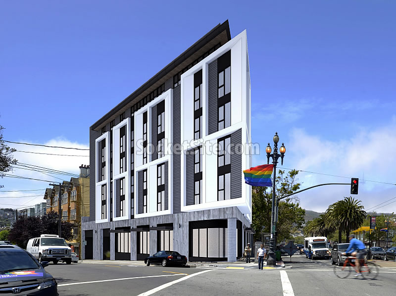
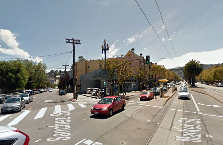
Following Starbucks’ failed bid to renovate and occupy the existing retail space on the southwest corner of Market and Sanchez back in 2013, plans for a six-story building with nine condos over a ground floor commercial space to rise on the irregularly shaped 2201 Market Street parcel emerged.
And while their concept designs for the parcel’s development have been kicked to the curb, Edmonds + Lee Architects have drafted a new set of plans for the site and the development team is actively seeking the necessary variances to proceed.
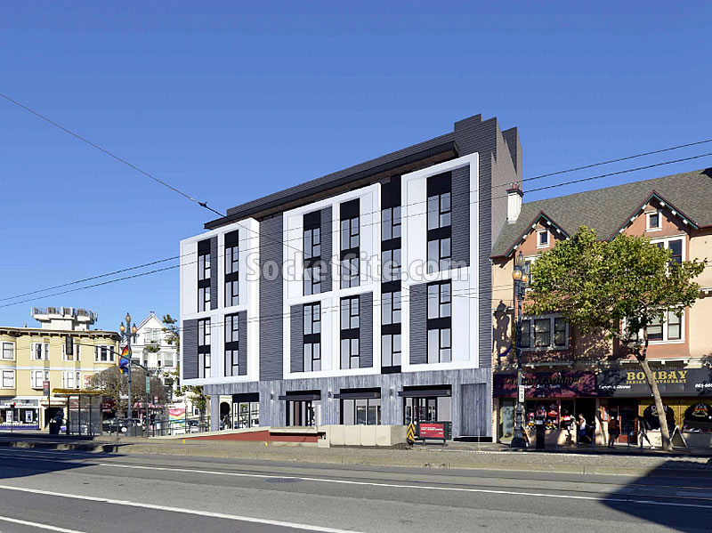
The revised plans for the parcel include 14 condos over 3,200 sq. ft. of ground floor retail space and a basement garage for four cars. The six-story, 65-foot-tall building would cover the entire lot and is designed with bays that extend beyond the property line, necessitating a rear yard modification and variance from the requirements for obstructions over streets and alleys.
San Francisco’s Zoning Administrator is slated to issue a ruling on the requested variances next week.


Great rendering, glad someone took my advice where the 2013 Chipotle application had failed.
This is a different intersection than the Chipotle proposal.
Yeah, but if it’s in the Castro, it better have a big rainbow flag in the rendering. That was my only point.
what does that mean soccer?
It means deference to local community expectations is advisable in the real estate development process. This advice is especially apropos when such deference can be communicated or signaled by simply adding a cheery rainbow flag to one’s rendering.
Does it have to be gray? The adjoining building is painted in warm tones as is the building across the street. I would like this building much better if it were a deep, rich brown and a pale tan. Gray makes it seem too austere for this location.
i had heard the term cyber-brutalism thrown around and didn’t know what they were referring to until now. Can we tone it down and make it a little warmer? like the neighborhood? looks at the surrounding buildings for cues.
Conceptual design was much more interesting. Agree re: color – will be particularly blah on a foggy Castro day.
Overall, I like the direction this project is headed: The sharp, crisp edge at the corner emphasizes the unique shape of that lot on Market St.
The 2 story wrapping of the exterior segments helps to break up the massing and add modulation to the exterior living levels; tall , alternating (metal) panels add to the façade variation.
As for the color, the building need make no attempt to copy or mimic adjacent colors (or materials). It should be seen as a modern building of THIS time. Remember: the surrounding buildings are simply paint on stucco and can be changed at any time by the existing or future owner.
Does this color scheme represent our dystopian future?
I don’t know if colors represent a dystopian OR utopian future. You’d have to ask scientist, I suppose.
As for “everything” being 90 degrees…hmmm. Not really. Go check out the very sensuous and artful façade panels to the new Transbay Terminal.
Also, check out some great work by firms such as Morphosis, Zaha Hadid and Frank Gehry, just to mention a few. 90 degree or orthogonal forms are generally less costly to build, and that does play a strong role in getting projects built, esp here in SF.
Since you are the expert why why is everything 90 degree angles with modern buildings? Are curves now considered vulgar and provincial suburban? I understand any sort of ornamentation or design that is pleasing for that purpose alone is according to the experts
I like the crisp edges (agree with Futurist there) and the segmentation. Agree with others regarding colors. Very depressing on a foggy day. Start with some pale white elements (maybe above, away from the car exhaust) so the building glows a bit more.
I find it depressing on a sunny day too
Different strokes. I like the color scheme, I think the black, gray and white look sharp and clean rather than depressing. Personally I find beige depressing rather than warm.
Love it. And love the two-tone grey. Colors remind me of another building at 15th and Dolores that I think is another welcome addition to the neighborhood.
Only 14 condos really … How about doubling it or triple… SF needs more housing … We finally get space to build so build
“… SF needs more housing ”
Actually, SF needs more affordable housing and more family housing. There is beginning to be a glut of “market rate” condos for millennial coder transients.
SF needs more housing, period.
Yes, for those who can afford it. No more subsidies.
Yes, end subsidies, starting with the most expensive: mortgage interest deduction and prop 13.
How does that assure MORE housing?
And Jake, don’t forget ending all rent control, while you’re at it.
Typical self-centered SF logic. Good, then go make your own latte and home school your child when those who cannot afford to live in your precious, affluent city decide it’s not worth commuting 30 miles to cater to you.
if there were a glut, then prices would come down. thats how markets work
Well, that area is not zoned for 12 story buildings.
Any hope for street trees here? This is my big concern about the front bay projections, since they would reduce the space available for greening this rather bleak corner. The brutality of this particular building is a matter of taste but the public should at least be served by a relatively uniform urban canopy to soften the impact of this kind of structure.
There are trees already there. They’re pretty battered looking, perhaps because the existing building is short and the wind blasts over the building, bending the trees. Lots of Market St. buildings have projecting bay windows… doesn’t seem to limit the trees.
The bleak corner will remain bleak. Just enlarged bleakness. It’s going to age about as well as the Galaxy theater did.
It looks like it would block out light, and visibility. Using the lamp post for scale, this is a deceiving monster.
From the Market street side, it’s whatever, one more modernist ugly building that could be worse….from the Sanchez Street side, it’s an assault.
Block out light to where, the sidewalk? Buildings tend to do that. If you are talking about the windows on the adjoining building, they are in a light well (it is called a “well” for a reason).
Have you ever been assaulted? I have to imagine no, as you would not throw the words around so lightly.
Ever hear of the phrase “assault to the senses”?
Block out light to where?
Block out visibility to what?
Light to where? Who needs sun light, right? Who needs to see past buildings and get a sense of surroundings, am I right?
you must be high on something. Blocking light of whom? This building should be 12 stories tall.
Only thing wrong with it is that is too short and looks like a boring building, i.e. same style as all the new condo buildings near by. But again, only boring buildings can get approved in this city.
If by “same style,” you mean “flatirons,” yeah, that kinda goes along with gore-point blocks.
It’s an odd lot size, but the rendering looks good. Appropriate scale/height for the area. Face it, folks. This isn’t a designated historic district so don’t expect any Victorians/Edwardians popping up. It’s 2016. This type of architecture, like or leave it, is what’s going up these days. As for greening, the entire length of Market St. is one huge wind tunnel. The half dead sycamores listing at 30 degrees are proof enough. However, there could be some street-level planters or something that can show off some native foliage.
Love your landscaping suggestion.
dull witless design. this is what our tech overlords and their willing collaborators give us? if they are going to f*ck us, can they do so with a building that is not so boring, drab and pointy? This is going to be so easily mocked and look dated in just a few years.
Pointy?
Yes, definitely all pointy architecture should be banned from SF.
It should be pointy right down to the ground. Or at least they should alter/remove that hideous round cement column. Ick.
Wait, when did “Tech Overlords” get into architecture and design? In what way is “tech” to be blamed for this building?
I like it – shape, massing, facade, and yes, colors. Please approve and build it.
Block out light? block out visability? deceiving monster? This site is zoned for 65′ and this design is 65′. Market St. is 120′ facade to facade; Sanchez St is 75′ facade to facade. The diagonal to the building under construction at the NE corner of Market and Sanchez is 250. This building is in fact a tiny event in a vast sea of openness. Are you blind or just afraid of change?
I’m not afraid of change, I just oppose that change which doesn’t fit within it’s footprint. I could care less what it’s technically zoned for.
Do you actually travel up Market St. ever?
Like it, build it. Would be great if it was taller. Jeez, if there’s a spot to build taller places, it’s on market right next to great transit options.
Plus, more units generally = more people and higher density = better stores / better activity along this area.
No, DanRH: zoning does not allow for taller at this location.Zoning is the law. Want to change it, then work toward petitioning the Zoning board to change it.
Also, no proof that I know of where more people/density equals better stores/activity. What is a “better” store anyway?
Corner groceries, a hallmark of living in a city, and one of the great things about San Francisco, absolutely depend on the number of people who can walk to them.
As the western part of the city hollows out (e.g., houses that once held Mom, Dad, 2 kids, and maybe grandma) and now have an aging couple), you can see its effects in the corner stores, in the parks, in life on the streets, in Muni ridership stats.
I would love a local grocery there, or a neighborhood restaurant.
UPDATE: Castro Development Closer to Reality