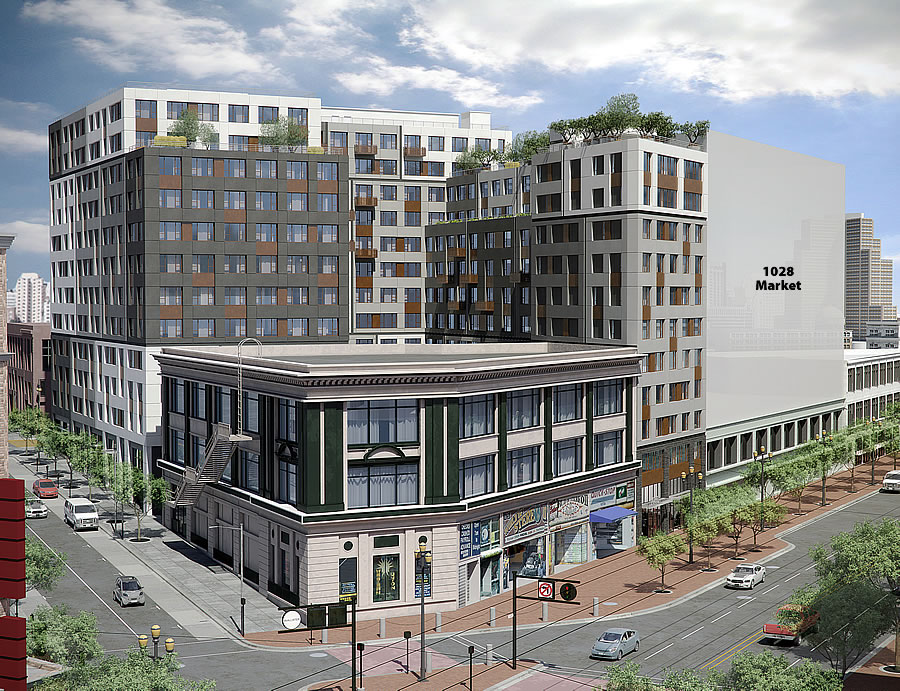
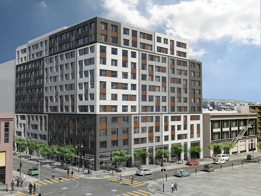
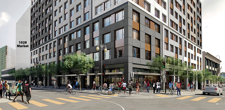
While facing an appeal related to its expected environmental impact, Shorenstein’s proposed plans for a 304-unit apartment building to rise up to 12-stories at Jones and Golden Gate Avenue, with a skinny namesake spur at 1066 Market Street, are likely to be approved by San Francisco’s Planning Commission this afternoon.
In addition to the 304 apartments, 36 of which are currently expected/required to be rented at below-market-rates, the Mid-Market development includes a subterranean garage for 102 cars and 304 bikes, and 4,500 square feet of retail space on the ground floor of the building.
Shorenstein has already filed the paperwork to secure the building permits for the development, assuming it will be approved, and construction is slated to take 21 months to complete once the ground is broken.
And as massed above, plans to raze the adjacent Hollywood Billiards building turned food ‘Hall’ at 1028 Market Street and construct a 13-story building with 186 units are in the works as well.


Ahhh, it would appear that Arquitectonica will once again grace this beautiful city with their unique site-specific design… I would have thought after Trinity and 1401 Mission (now OLUME, whatever that’s supposed to mean), they would have been run out of town. Their work in other cities is so much more interesting, so I wonder if these designs are the result of local politics. Ugh.
You don’t like architectural copypasta?!
Architecture is overrated.
I doubt local politics has anything to do with their designs here. They started in Miami which is about as far from San Francisco as you can get. I don’t think they understand the city nor care to.
Yeah they’re kind of all over the place – especially when it comes to midrises. They architected the Lumina which turned out to be pretty nice to look at. But then they also built some lego-inspired monstrosities in Mission Bay and pretty much ruined that neighborhood.
I can remember when we were thanking the architectural gods that Arquitectonica saved the Infinity from the original Heller-Manus design.
How could you improve upon a “site-specific” design? Whether it succeeds or not is another matter.
Ooh lookie, another rendering with trees on the roof!
Too bad they didn’t/can’t secure rights to the rooftop of the building in front of them. Would have made a nice big terrace for residents.
Hey, I kinda like it. Good use of the land for much needed housing.
Color blocks. How 2010. Looks like an office building. Nothing unique among the units to distinguish them from each other. “Hey, I live in the third Lego piece from the left on the 4th floor.” For the size, it should have incorporated more interesting detail and/or setbacks.
They may actually be using a design for a building they built in 2010. Ctrl + C, Ctrl + V, done!
Boring but utilitarian.
YES!
Definitely uninteresting, but given the disaster that is this stretch of Market, it’s so much better than what exists today
completely agree, and this area seriously needs gentrifying. hope it gets built fast
Again, I like it. It certainly doesn’t look like an office building – the facade and fenestration will look very modern residential. It will be a 110% improvement over what’s there now. One of these decades, this town might begin to look like a real city. Build it, please.
Holy SH*T that’s ugly. Why are all new SF buildings hit repeatedly with an Ugly Stick (or worse, the Blandness Stick)?
Another ugly steel, concrete and glass eye-sore …. do these architects ever live in prison-looking buildings? NO balconies!
Too bad the great architecture of the past is disappearing, absolutely no soul to this horrid-designed unhuman monstrosity. I’d pick the ugly buildings that are there now, at least there’s some passion to them.
re “ugly steel, concrete and glass”, is there some other building material available that I’m not aware of? What’s the practical size limit for wood?
There are no buildings currently there.
balconies are so crucial…can’t understand why they are never included in new designs.
Brutalism blocks.
I love the facade. The slightly irregular arrangement of shapes a playful feel to something that would otherwise resemble the Borg.
I very much like the look of it from Market Street but the Golden Gate and Jones elevations are both too austere in design yet idiosyncratic in the illustrated color scheme.