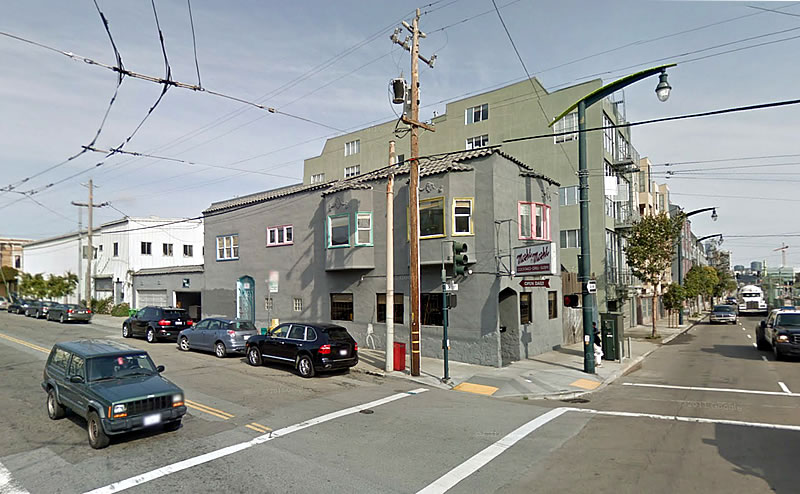
Plans to raze the two-story Dogpatch building on the northwest corner of Third and 18th Streets which has been home to the Moshi Moshi Cocktail and Sushi bar since 1987 are moving ahead and applications for all necessary building permits have been filed and triaged.
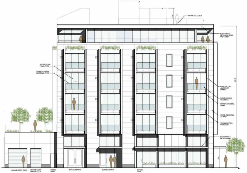
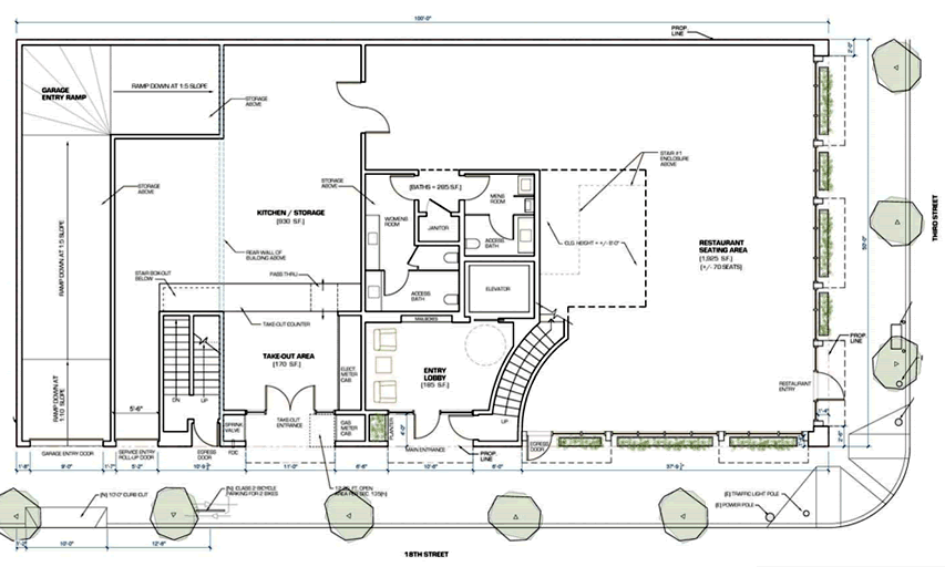
As proposed and just granted an Eastern Neighborhoods Plan-based exemption from having to complete a lengthy environmental review, a six-story building with 19 residential units over 3,000 square feet of ground-floor commercial space will rise across the site, along with an underground garage for 12 cars and 19 bikes.
As noted when we broke the news about the development last year, the new ground-floor space was designed specifically with food service in mind. And as a plugged-in reader quickly added, the owner “has every intention of re-opening Moshi Moshi in the new space,” the plans for which now include a dedicated take-out area along 18th Street as well.
Moshi Moshi would have to be closed for around 16-months in order for the new building to rise.


Sadly another cookie cuter proposal that looks no different from almost all of the rest. No better than all the rest.
Housing is needed. Going to the code-compliant height is fine but…
Can someone at Planning or whatever ask for a bit more? Isn’t that part of their job?
Like why not an angled roofline? Like why the “de riguer” faux Bay windows yet again, like why not awnings over the windows – something, anything original and appealing.
IMO a hundred years from now the architecture being done on these medium sized projects will be looked upon with as much disdain as what happened to the Sunset. Like what were the City PTB thinking.
Can you point out some projects in SF that are good representations of what you are thinking? I read a lot of requests similar to yours but no examples to show people how it may be done within the Planning Department’s constraints. Thanks.
In the context of SF there is precious little to point to. As to good architecture. Which is sad and few of the “build it” folks seem to care. But that is another argument.
I will point out one recent proposal. Medium/small project. No faux Bays, an interesting take – off-take – on a flat roofline. Nice earthy tone to much of the exterior façade.
Materials is key—especially for an area with so much historical reference / points of inspiration. I get that housing is essentially a big box with holes cut out of it for light (according to many), but why not assert more energy into contextually relevant design elements?
It’s the same design!
That looks like a ton of other designs… David Baker comes to mind.
Thanks.
It’s the natural result of having to make designs that please everyone in town hall.
This. Why would you risk a delay to your project when you know full well that everyone will weigh in and dumb it down regardless? Why not just save the step, make it vanilla and unoffensive and move on?
Because that gave us the Richmond District specials we have to live with now. Those buildings will last well into all our lifetimes and only future generations will ever see those come down. Mostly anything of this size built in the past 10 years looks dated already. Hell, it looked dated and boring the minute it was built.
This is one of the few times I agree with you Dave. All new development in SF is monotonous. 40 ft stucco cubes, occasionally theres some protruding window treatment. If they were going to go down that route, they might as well keep it urban looking with more red-brick.
This may well be the best looking building on this block. Cookies sell well and cutters allow them to be sold at lower prices than artisanal, etc.
As for “historical reference / points of inspiration”, this was originally developed in the 19th century as cheap housing for the factory workers of Potrero Point, more a point of perspiration than inspiration, historically. Never has outgrown that and doesn’t look likely to. Though the 21st century “factories” are office and medical buildings, this is still a dogpatch.
The key materials and designs of dogpatch housing have been whatever was cheap and quick to build at the time. Clusters of Pelton cottages remain nearby. Couldn’t ask for much more formulaic cookie cutter contextually relevant historical design signifiers. As long as the interiors are cramped, this will fit right in.
agree with you. This is a MUCH nicer looking building than whats there now and most of the buildings in the neighborhood.
On the whole I like it. It’s nice that it incorporates what looks like a large, useful commercial space, and not just some box-checking, tiny token space. So I’ll just complain about the SF standard of putting a one-story garage next to every corner building: it does nothing for the aesthetics, and it’s a waste of a lot of potential apartment space. Older apartment buildings without that ‘feature’ look and work just fine.
The one story garage is a setback requirement to provide open space, light & air for the residential units above.
The look doesn’t concern me, its the street level commercial / kitchen places that I detest in these new buildings. I think more thought should really be put into the street level spaces
I know this sort of construction needs to happen in the city, but I’m still a little sad because I grew up with that restaurant.
I’m glad the new owner wants to re-open it in the new building.
UPDATE: Development to Replace Dogptach Institution in Play