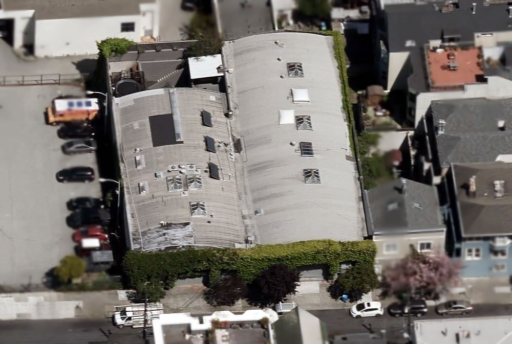
The former furniture warehouse 67-69 Belcher Street, which measures nearly 19,000 square feet and was slated to be demolished decades ago, was acquired by artists Spaulding Taylor and Win Ng in 1977 and converted into an art gallery (69 Belcher), studio space and a one of a kind, roughly 8,000-square-foot loft residence (67 Belcher) designed by architect Ira Kurlander and Johnathan Straley.
With Ng having died in 1991, Taylor sold the building for $1.75 million in 1996. The property returned to the market listed for $6.9 million in 2007 but failed to sell. And the building ended up trading for $9.35 million in March of 2016, repositioned as a development site, with a 40-foot height limit, and listed for $12.5 million in the fourth quarter of 2015.
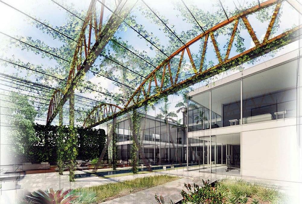
With a new set of plans to completely remodel and further expand the residence having since been drafted, the property returned to the market listed for $10 million last year, offering “endless development possibilities” and flaunting the concept designs for building “the coolest house in San Francisco.”
Reduced to $7 million this past February, the sale of 67-69 Belcher has now quietly closed escrow with a reported contract price of $4.9 million.
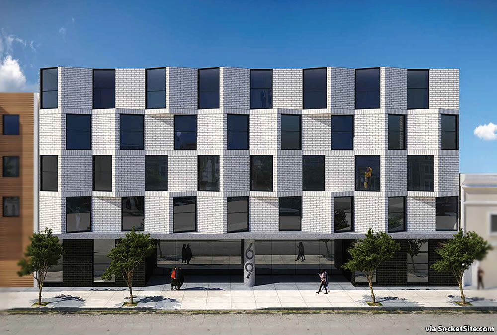
At the same time, a new set of plans for a modern five-story building to rise up to 52 feet in height across the site, with up to 36 residential units and parking for 17 cars, have been drafted by Stanley Saitowitz | Natoma Architects, as newly rendered below:
We’ll keep you posted and plugged-in.


Long ago I crashed “here” as a tourist: pal owned it. I do recall a gorgeous truss roof. Not sure how it might evolve or pencil in but I like the first drawing better, where the trusses manage to stay, with the housing beneath.
I think it’s unlikely anything presently there will survive if Stanley Saitowitz gets his way. He’s the quintessential ego-centric architect (although he doesn’t have a license, here at least) and if he’s ever done anything that amounts to adaptive reuse, I am not aware of it and I would be surprised.
My personal hypothesis is that the reason why Natoma Architects loves these cast concrete sarcophagi so much is precisely because they would cost so much to tear down (compared to the present building here, for example), and so the completed buildings will be around to remind future archaeologists of the lack of taste so widespread among real estate developers during the period in which he practiced.
Licensed or not, they produce great designs, and have created a vernacular for SF despite all our strict planning/building rules. Keep it up Stanley & NA!
It’s a shame they aren’t building something larger on this site. This area has good transit access and walkability and would benefit from additional housing, especially if they can add some BMR apartments as well.
As outlined above, the site is zoned for development up to 40 feet in height. And in fact, the 52-foot-tall development as rendered above would require a density bonus for the additional height.
Interesting points and observations, Thank you. I am in favor of 100 percent affordable housing with no parking. I advocate a generous basement for utilites, storage, water storage… etc., and to include wind turbines on site, in addition to the required solar panels.
And don’t forget an organic asparagus farm, kombucha distillery, and community space for organizing to overthrow capitalism…
You made me laugh out loud.
It looks like the top is missing on the Saitowitz rendering…..
Agreed. This design doesn’t comply with the area design guidelines, which require a clearly-defined base, middle and top.
His work always feels for restrictive and heavy handed. If I only saw the rendering, I’d assume this was a parking garage.
Thank you for naming this.
I think the windows are poorly rendered in this image. The black windows are giving the building a menacing look. It wouldn’t really be like that. I rather like the concept though. It’s bold and simple. If detailed well it could have a very timeless quality.
I actually like Saitowitz’s buildings from the outside. My issues are (1) there is not nearly enough closet space / cabinets, and (2) his bathroom choices generally make me feel like I stepped into an ADA compliant unisex bathroom you’d find in a commercial building.
A great San Francisco development story writ small, at least, single parcel. Artists adapting from the industrial use, handing off to Internet Money (presumably) and now the gnashing of teeth and puking of funds to try to redevelop the lot into more housing than that for which it is zoned.
It seems to me like the proposed Saitowitz box is a 2018 solution to a 2015 problem in a newly-vacated 2021 San Francisco. With changes in demand for housing somehow having actually affected consumer prices, it’s not clear that “the numbers” would “pencil” to develop a building on this site.
Who wants to live in Eleanor Rigby accommodations? I don’t think this story ends with the proposed building. I suspect there is still more appetite for a ridiculous house instead.
By the way the “money-lost” lede seems uncharacteristically buried here. Am I reading correctly that the recent sellers really bought the place for $9.35mm in 2016 only to sell it for $4.9mm in 2021? Now THAT’S what I call investing!
[The rendering for] 69 Belcher is an optical illusion that makes me feel dizzy.
Pretty fine spot of 1981 Class B office space in the rendering. Now to take a long sip of coffee and read the intended use
Agreed, better suited to an industrial zone. On a residential street it is akin to deliberately passing gas in a crowded elevator.
Man that is just an atrociously ugly design that Saitowiz is proposing, like even by atrocious design standards. Like even a KTGY default box looks a lot better than that.
Refreshing design for this very eclectic street. A touch of 50s zig zag is welcomed.
Thumbs up. Modern interpretation of Sf bay window. Although the design a more refine version of what’s been trending, There’s design rigor I don’t see in other projects. Sure is better than the ubquitous stucco boxes with the 3’x8’ rectangular bays.
The whole point of a bay window is that it gets light from multiple sides. Nobody on the interior would mistake these for bay windows.
Stanley Saitowitz buildings are the most hideous eyesores in SF. I thought it couldnt get much worse than 8 octavia, but this is possibly the one to beat it.
Some people disagree with you.