In the works since 2016, the proposed four-story building to rise up to 40 feet in height upon the underdeveloped Duboce Triangle parking lot parcels at 55 Belcher Street, behind the former Blockbuster turned gym at 158 Church Street, was designed to yield a total of 24 residential units, three (3) of which would have been required to have been offered at below market rates (BMR) versus five (5) below market rate units had the total unit count of the building been 25.
Facing neighborhood pushback along with Planning’s “concern,” the building has been redesigned to yield 25 units, five (5) of which will be rented at below market rates if the project is approved, along with a garage for 12 cars (which is up from 10) and 25 bikes.
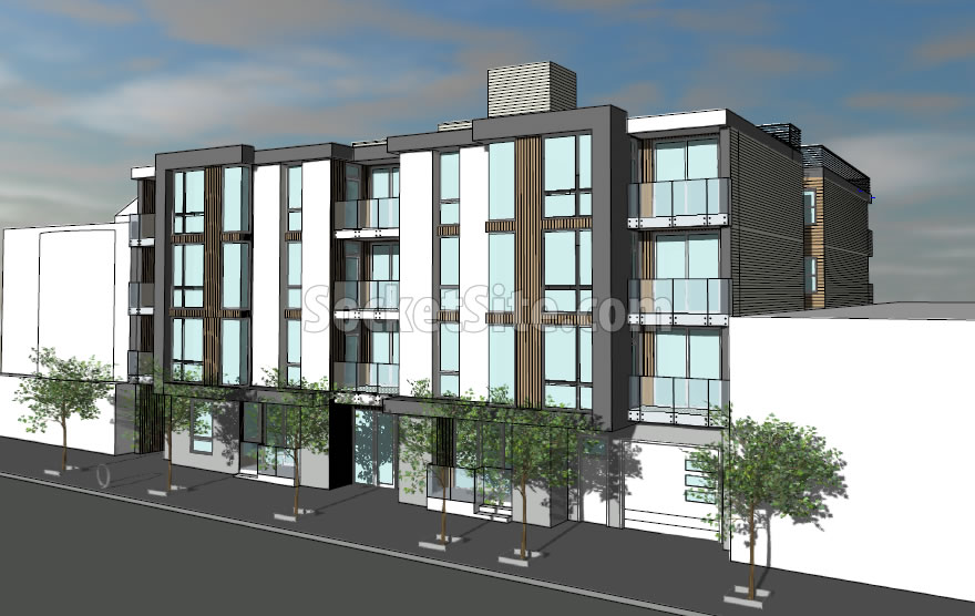
In addition, the proposed building’s façade has been revised “to be less bi-laterally symmetrically and less monolithic…to better relate to the pattern of building frontage widths within the surrounding neighborhood,” as newly rendered by SIA Consulting below:
And while “interested parties” have requested a continuance of the public hearing for the project “to allow further time for review,” the project team is electing to push ahead with a hearing next week and Planning’s recommendation that the development be approved as proposed, having found that the project is not only “consistent with the Market & Octavia Area Plan and the Objectives and Policies of the [City’s] General Plan,” but “necessary, desirable, and compatible with the surrounding neighborhood.”
We’ll keep you posted and plugged-in.
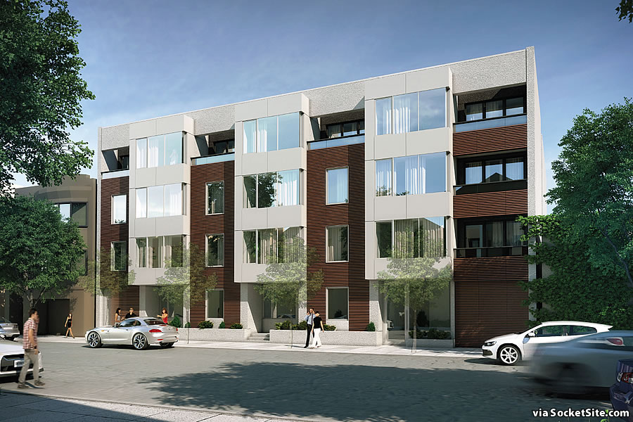
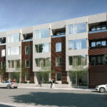
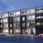
Good work! That’s a pretty (and improved) design and a lot of units on 10,500 square feet with 12 parking places. Including 5 BMR? City and neighbors ought to love this.
Original façade was much better. New façade looks value engineered and dumbed-down.
I agree with you. Original was better.
Completely disagree. The original design was busy and incoherent, with (as noted above) a monolithic feel and a clashing and confused use of materials. The new design is much more rhythmic, and the materials fit the forms of the façade better.
Considering the first sketch was a very rough one done from a more front-on angle, I cannot say I see much “dumbing” down. There seem to be fairly minor alterations–a bit less glass is used and the facade pops out less, nothing dramatically different.
…”revised “to be less bi-laterally symmetrically and less monolithic”
Ok so…which is which?
This would look especially nice if it was cast concrete, especially the window bays, rather than the panel system I suspect will be used. Combined with the natural wood and you have a real winner!
God only knows why people have to have Great Big Windows even when the building is on a narrow little street like Belcher.
Natural light is the worst. It fades our furniture and warms our home uncontrollably. The only thing I hate more than sunlight is garlic bread.
Is your real life name Cassidy the Irish Vampire in Preacher?
LOL. What a trip of a series.
I predict the Planning Commission will have the following comment: The large windows are out of scale with the character of the neighborhood.
Not that the previous design is a beacon of great design but the alternative looks like a slightly nicer rendition of the 1960 – 70s, flat, cheap structures that litter our city. More or a less a modern derivation of this sort of thing. Hooray for design by committee!
I prefer the revised version but don’t see why this includes 12 parking spaces when the site is less than 5 minutes from a host of Muni lines.
the brown color in the revised version is hideous. something lighter or metallic would be preferable
also think this is a perfect location for zero parking, or maybe jsut parking for shared cars. it is in the midst of tons of public transportation