As we first reported last year:
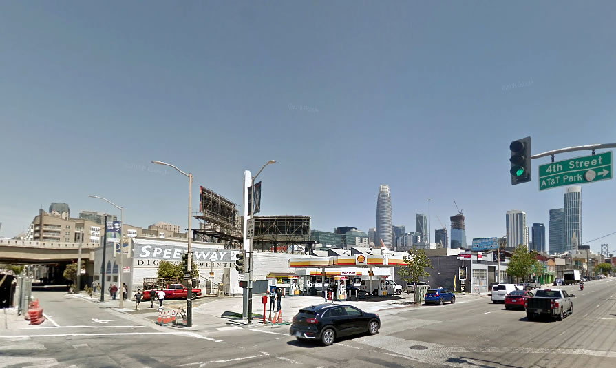
Plans to level the Central SoMa Shell station on the northeast corner of Bryant and construct a modern, 9-story office building on its 598 Bryant site have been abandoned.
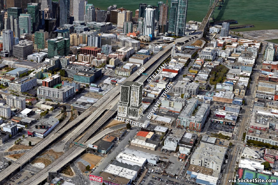
Instead, plans to level both the gas station and the adjacent Speedway Digital Printing building at 475 4th Street have been drafted. And as newly pitched to Planning, the parcels would be merged and a 20-story development would rise up to 209 feet in height on the site, leveraging California’s Density Bonus Law to build above the site’s 130-foot limit.
The development as envisioned would yield 280 apartments, a mix of 168 one-bedrooms and 112 twos, over 5,600 square feet of replacement Production, Distribution and Repair (PDR) space at the corner of 4th and Stillman and a basement garage for 36 cars and 147 bikes.
A third parcel, 181 Stillman Street, upon which a little commercial building currently sits, has now been rolled into the project site as well.
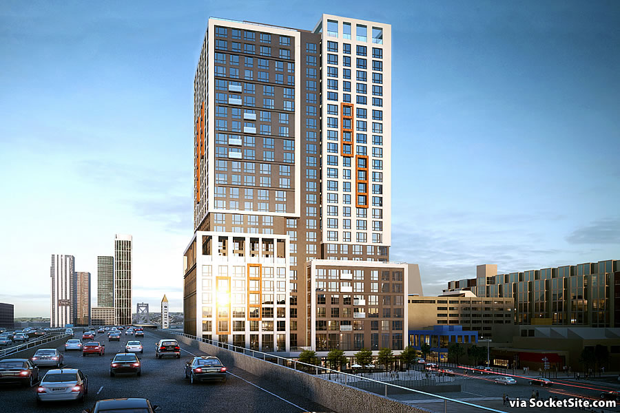
And as newly rendered by BDE Architects below, and now formally proposed, the 25-story development would rise up to 260 feet in height, with 353 apartments (a mix of 47 studios, 164 one-bedrooms and 142 twos) over 5,700 square feet of replacement PDR space and off-street parking for 34 cars and 166 bikes.
If approved and the ground is broken, the 598 Bryant Street project would take around two years to complete and 54 of the 353 apartments would be required to be offered at below market rates (BMR).
We’ll keep you posted and plugged-in.


Is it appealing to live right next to a freeway? What about the noise and pollution and underwhelming view of I-80? What about the first 5 or so floors that will be directly fronting the freeway? Those will be hard to rent and perhaps will need to be offered at a discount. The design is mediocre – almost cut a paste. One suggestion, set back the freeway fronting side of the building 40 or so feet. Plant it with fast growing freeway friendly redwoods. It is done in the south Bay quite a bit. A double or triple row to create a green wall between the building and the freeway.
I don’t think they will have any issue renting those units. Look at 1 Rincon selling units fronting the freeway, along with Rincon Green and Yerba Buena Commons renting units facing the freeway. No issues. Build it!
If you’ll pardon the pun – and I think redwoods would be a poor choice (for a variety of reasons) – you’re missing the forest for the trees: if I’m reading this correctly, someone is actually abandoning an office proposal for a residential one (!!) I’m not sure if this should be interpreted as someone (finally) listening to us 🙂 or a harbinger of an impending collapse in the commercial market 🙁 , but certainly THAT’s the real story…not how much the building is set back.
“What about the first 5 or so floors that will be directly fronting the freeway? Those will be hard to rent and perhaps will need to be offered at a discount”
Yes, I think that discount is named BMR units – they need to build 54 of those.
Easy problem, relocate the Bay Bridge farther south so it aligns with 380 on north side of SFO and you will make me a happy camper from the East Bay. As I have BART to help get me into the city or to a ball game
Not only is that not easy, but it’s also a terrible idea. The roads on either end can’t handle it. Plus, you know, induced demand is a thing for freeways.
Well he did say “relocate” — demand would presumably not be induced if capacity were ultimately left unchanged 😉
thats great if those are cheaper, then [it] will provide an option for those who cant pay full premium. thats how a market works
Lining up smog-eating redwoods against the freeway is a great idea. Redwoods are the only trees which can help clean up the air from this immense source of pollution. Of course, the supes won’t do it. Too reasonable. And we the citizens of SOMA do not deserve cleaner air.
“smog-eating redwoods” ? Which species is that? Sequoia antismogeum? Please provide a source that proves “Redwoods are the only trees which can help clean up the air from this immense source of pollution.”
THAT looks like a great project
Looks awesome. Build it!
Nice this part of soma should have towers this size and something much taller in the middle to peak the tabletop
This Shell is the last surviving of my 2 favorite gas stations in the area. The one at 8th & Harrison closed already. Sad that this one will soon be gone as well.
let’s shed a tear for gas stations of yore. ….OK, done – now let’s move on to better things. Yay Housing!
That particular Shell is or used to be a tourist trap of sorts by charging the highest prices in SF. 8th & Harrison was my preferred one, so I’m happy to see it go.
Shell at 8th and Harrison is being renovated to serve hydrogen vehicles as well as ICEs. It’ll reopen eventually but not sure when.
Now all the remaining gas stations can charge the highest prices!
More importantly, the map in the upper right is working!
Some good news, finally
Hey i remember when SF dept city planner susana montana told me that she would never recommend/support any building above the freeway height so drivers into the city would enjoy the views of our skyline…LOL good ol’ susana!
Hopefully this project doesn’t cast any shadows on the freeway
-__-
No shadows, but drivers will be blinded by reflected sunsets.
Nice of them of them to admit to this by including it in their planning artwork.
Much better project. Blando design, but we could use a ton more boring housing in this town. Let’s get it approved and built.
I can’t wait for the day when we all have to drive OUT of San Francisco to gas up our cars. Should only be a few more years at this rate.
Given Lyft, Uber, Muni, GoBike, Jump Bike, Scooters and ability to walk, very few cars in SF never get to leave SF. I bet anyone who drives out of SF fills up outside the city where traffic is lesser and prices are better.
Exactly. One word: Costco
Could just have gas delivered to you perhaps. For a fee, naturally.
Or could do like Tokyo does, gas stations are permitted on the first floors of buildings.
Gas needs to go. Cars in general need to go, but gas cars really need to become extinct before we do.
I’ve seen better designs on my nephews etch a sketch!!! Cookie cutter big glass box with a splash of early 2000’s orange to be edgy and cool. Someone spent too much time with legos.
This project will be a wonderful addition to the neighborhood. First, it’s on the Central Subway line! Second, its streetscaping improvements will go along way to making this intersection/highway off-ramp more pedestrian friendly!
You know what would go good here? A Christmas tree lot.
80-adjacent parcels should be upzoned. Taller buildings make sense here. Now let’s get this albatross capped and build a ped & bikeway.
I preferred the gas station…
You must live in your car?
So I’m guessing that widening the freeway/bridge is never going to happen?
10 years from now it’ll be flying cars and portals. The highways that aren’t torn down will be converted into landing strips or parks. The future is coming.
Why would they ever widen and elevated freeway is a major bridge? When is the last time that even happened in the Bay Area. Serious question because I honestly can’t recall it ever happening.
Great Location!!! But it does look like a stack of used amazon boxes.
I’ve started to call it “Revit Orange.” You see it on every other modern housing project in the city these days. Not every building needs to be a masterpiece, but all of these projects are just repetitive now from the way they break up the massing right down to the paint colors.
The orange frames on 4 windows basically says “we aren’t confident in our design so we’re tying to distract you from it.” Can you imagine if the Lever House felt the need to outline a few windows to break up its curtain wall?
Agree. I wonder if there was some architectural handbook that came out 10-15 years ago that talked about using orange an an emphasis colour, maybe as a snappy exciting new option.
It’s all over San Francisco and it’s ridiculous.
We have been fighting this since parkmerced changed the white simple design to autumnal colors. Than ocean ave than JHSF in excelsior and bridge housing on mission and numerous prior posts on socket site someone learn about color please!!!
Oh yeah, enough orange already
Is it better than nothing?
BUILD IT NOW
Another development in need of a shadow study. I love the photo of this project. Will be Exhibit “A” during the appeal. Thanks for providing. That clump of trees in the upper right is a park operated by SF Rec & Park. This project is one block away, at 250 + feet tall it’s going to cast a long shadow to the east.
The other project in question is at 4th and Brannan, current site of Wells Fargo Bank.
BOS just upheld an appeal for a project on Folsom across from a PUBLIC park under the jurisdiction of Rec & Park because project projected a shadow onto the park.
Shall be interesting to see if the BOS stands by and allow the two projects I’ve sited above to cast their shadows on the park I’ve noted above.
That “clump of trees” you cite is venerable South Park.
Which just underwent a $4,000,000 million dollar renovation.
Contrary to popular belief the majority of people who actually live on South Park are Seniors, disabled and minorities who live in 10′ x 10′ SRO rooms and use South Park as their living room during the day.
Something tells me that the BOS and community will not stand by passively and allow South Park to fall into the shadows of developers. Many of these poor people living in the SRO’s were formally homeless, don’t they deserve sunlight?
Except the tower itself won’t cast a shadow on South Park. Do you no understand how the Sun’s position in the sky works? This is the ultimate type of NIMBY nonsense, claiming X will happen when it is pretty immediately clear that X in fact won’t happen.
Landlords charging outrageous rents are what made them homeless and are forcing them into SROs in the first place.
sunlight for more than 1 hr a day is bad for kids. families should want more shade. dont use kids as a fake front for your nimbyism
dont think the homeless care too much
Based on my personal experience, South Park is predominantly used by tech office workers for lunch and informal coffee meetings throughout the day. Check it out on Google Maps, street view confirms who the current users are, as does visiting the park!
Nice addition to the area, esp with the proposed tower on the north side of the highway at 4th and Harrison and the recently announced plans for the lot at 4th and Brannan (not to mention the surrounding Flower Mart, Bay Club and 5th and Brannan lots).
There are buildings that look like thoroughbreds, and some look like a cow, but this build out looks like a donkey.
Very boring human storage box.
Fits into the same stable as the bread boxes in Mission Bay.
Calling it a donkey is being generous. As other West Coast cities are building some thoroughbreds, SF is stuck on stupid when it comes to urban design. The SF boosters will then point out donkeys in Seattle, Portland and LA which misses the point. Those cities are doing some fine architecture and yes some not so good. But SF it is virtually all not so good.
You constantly say this but never provide any actual examples or explanations. Impossible to take a position like that even a somewhat seriously.
3 in LA – and thee are plenty more – Walt Disney Concert Hall, Getty Center and the coming “jenga” tower. Google the LA skyline and compare it to that of SF. LA’s is much more interesting and varied. Not a single building built in SF in the last 5 years is remarkable. But for the Jang tower, but its potential was not attained as it does not spiral inwards to a top crown. Salesforce – almost as bad as the BofA tower. The TTC towers are noteworthy not for their architecture but for the fact that one of them is leaning.
The “one” of them that is leaning is not part of the TTC Scheme (a term I use deliberately for all its implications)… it was built independent of that.
@Notcom – a difference w/o a distinction. Scheme, no scheme – the TTC area and its towers are architecturally sterile. Devoid of any redeeming value. A step backwards from 10 years ago – before the “gap” between Market and Rincon Hill (a nice dip accenting Rincon Hill’s towers) was filled in. It is now all a tabletop with the Salesforce tower jutting up. A skyline accent ripe for the obvious joke but lacking anything otherwise noteworthy. Give me the gold rush city to the north – heck, give me LA.
The Salesforce tower is beautiful.
Good looking building, and I’m picky.